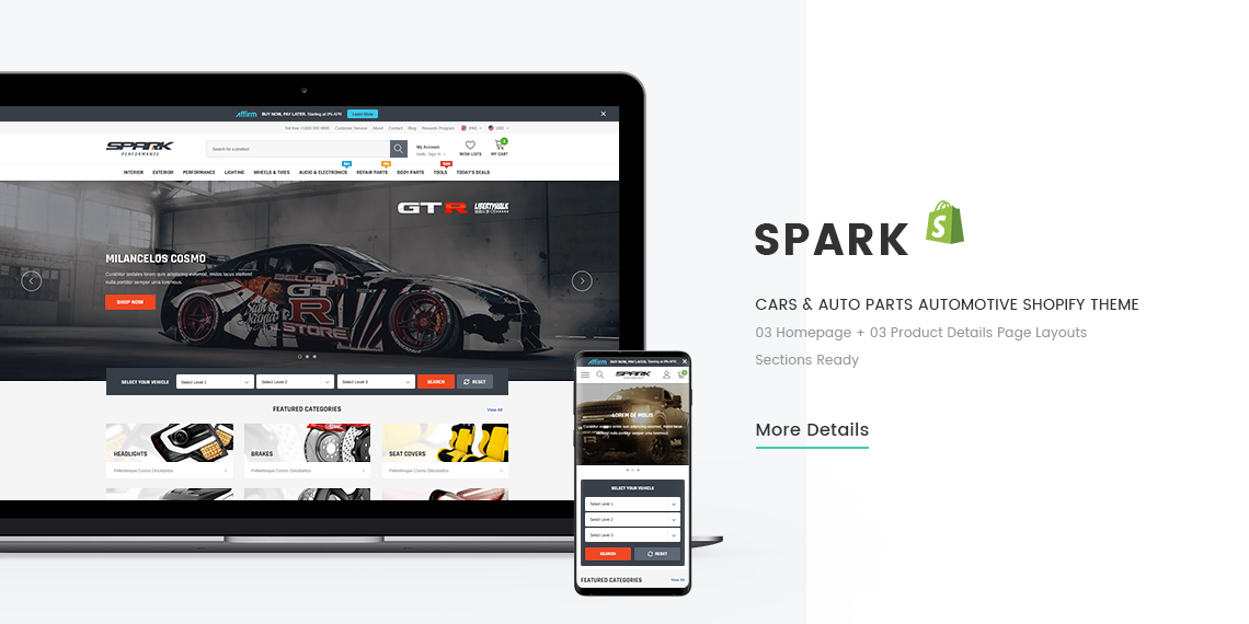
Spark - Responsive Shopify Theme User Guide
- September 01, 2021
- Version: 2.0.0
- Email: support@halothemes.com
Thank you for purchasing Spark template. If you have any doubt about this template or you find an issue, please read our FAQs issue page:
https://spark-theme-automotive.myshopify.com/pages/faq
.
If you cannot find your answer, please feel free to send us a message: support@halothemes.com
Below you will find the documentation for how to use the template.
-
Theme Support:
Many support and technical questions will already be answered in this documentation, so please read our Documentation first. Please read carefully and follow from Top to Bottom, you will find the detailed instruction to setup each of element in theme.
If you can’t find the answer you’re looking for, please feel free to send us an email to: support@halothemes.com
All of your emails will be reviewed and checked carefully. However, based on the number support tickets and the nature of the request itself, the response time can be up to 1-2 business days. At weekends, our support is also limited because Customer Service Dept., doesn't work on the weekend
A supported item includes support service for 6 months from the purchase date. You’ll also have the option to purchase the support extension up to 12 months if you want. If your support time is expired, please extend your support time to continue getting the support for item.
-
Item support includes:
- Responding to questions or problems regarding the item’s issue and its features
- Fixing bugs and reported issues
- Providing update versions to ensure compatibility with new software versions
-
Item support does NOT include:
- Item customization & Installation
- Setting up your store
- The theme is customized without our permission
- Support for third party customs/software/plug-ins
- Teaching you HTML & CSS etc.
If you want to custom this template, make a new Shopify template for your store or further services. Please don't hesitate to contact us: support@halothemes.com
Installation
SHOPIFY
We advise reading and familiarizing yourself with the Shopify Manual. It is an extremely well written and thorough guide to understand the Shopify platform, written by Shopify themselves. It will help you understand many aspects of customization for your theme as well as using Shopify in general.
1/ Download the package from halothemes.com (the file is in zip format)
2/ Extract the file you've just downloaded.
3/ Find this file: spark-x.x.x-sections-ready.zip in the folder Spark Sections Ready X.X.X, then you just need to upload spark-x.x.x-sections-ready.zip file to your Shopify store.
With x.x.x is the number of the current theme version
Install Theme
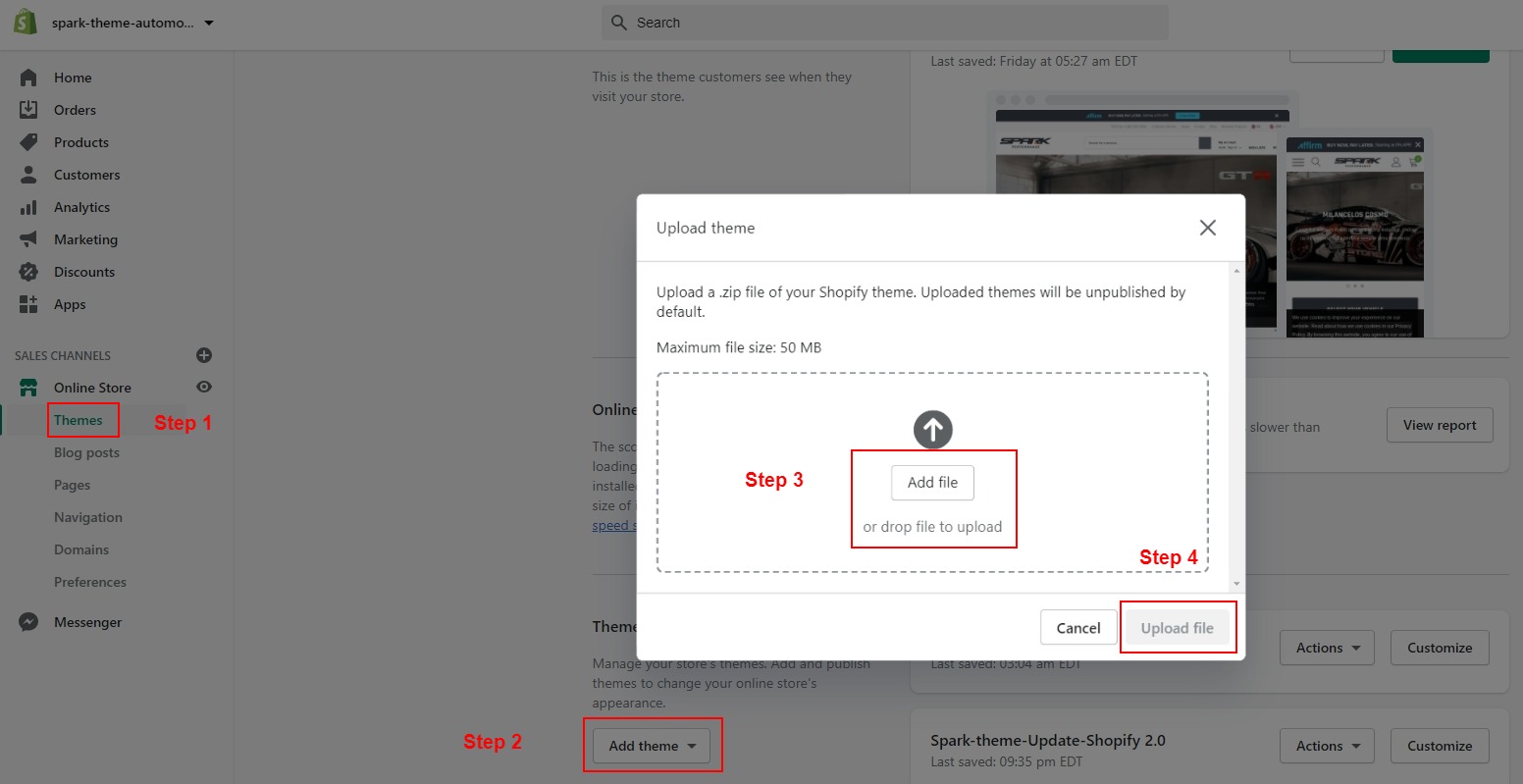
To install the theme:
- Please log in to your Shopify store, click Online Store.
- At Theme Library, click Add theme, choose Upload zip file.
- The Upload Theme dialog displays. Click Add File or drop file to upload to select the .zip file you want to upload.
- Click Upload file.
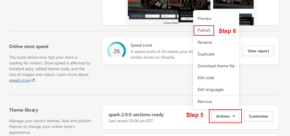
- Wait for the uploading process finishes, you can select Publish button to publish what you have just uploaded to be an active theme.
Updating theme without losing old settings
Remember: Our instruction below is only applied for updating theme source losing settings in Theme Editor. All of customizations you made in js or code files will not be updated and you need to re-do
If your store is using Spark 1.0.0 version and you would like to update to newest theme source to have all of new features or new layouts. Please follow below instruction:
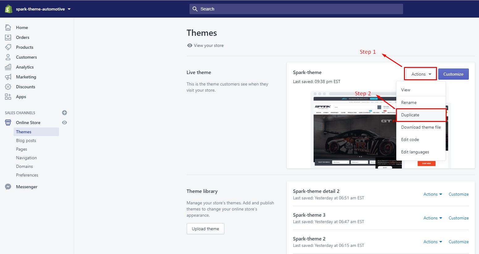
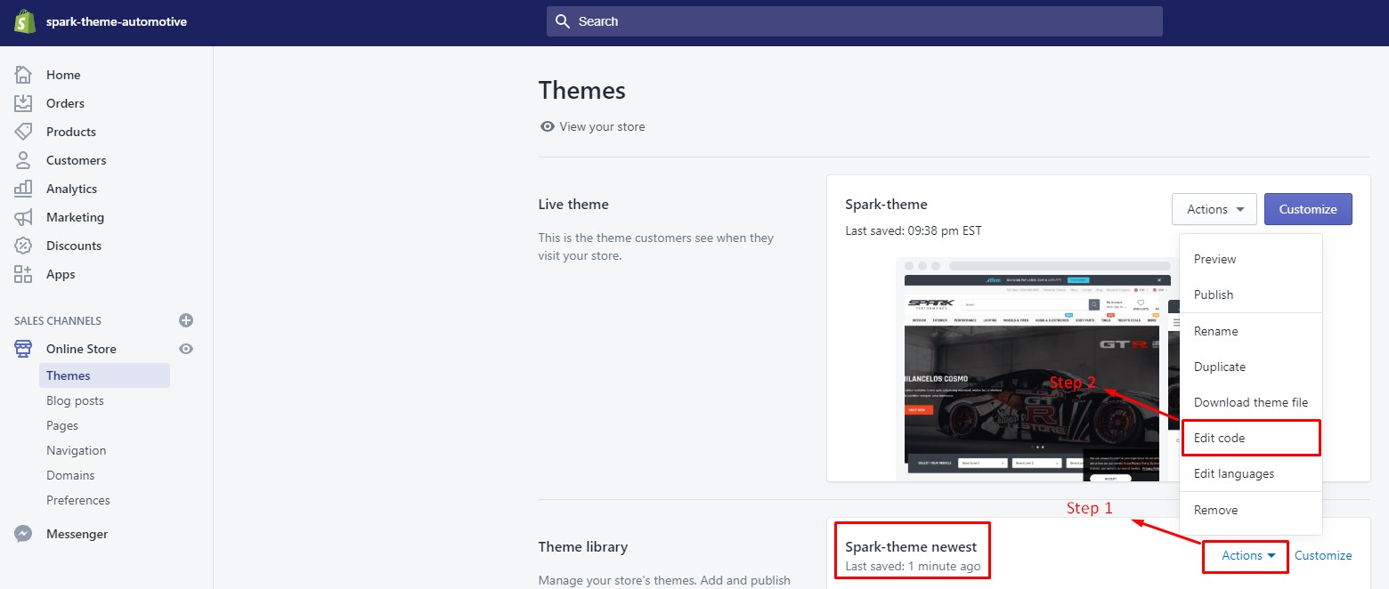
Firstly, please backup your current theme source. You should duplicate your current theme
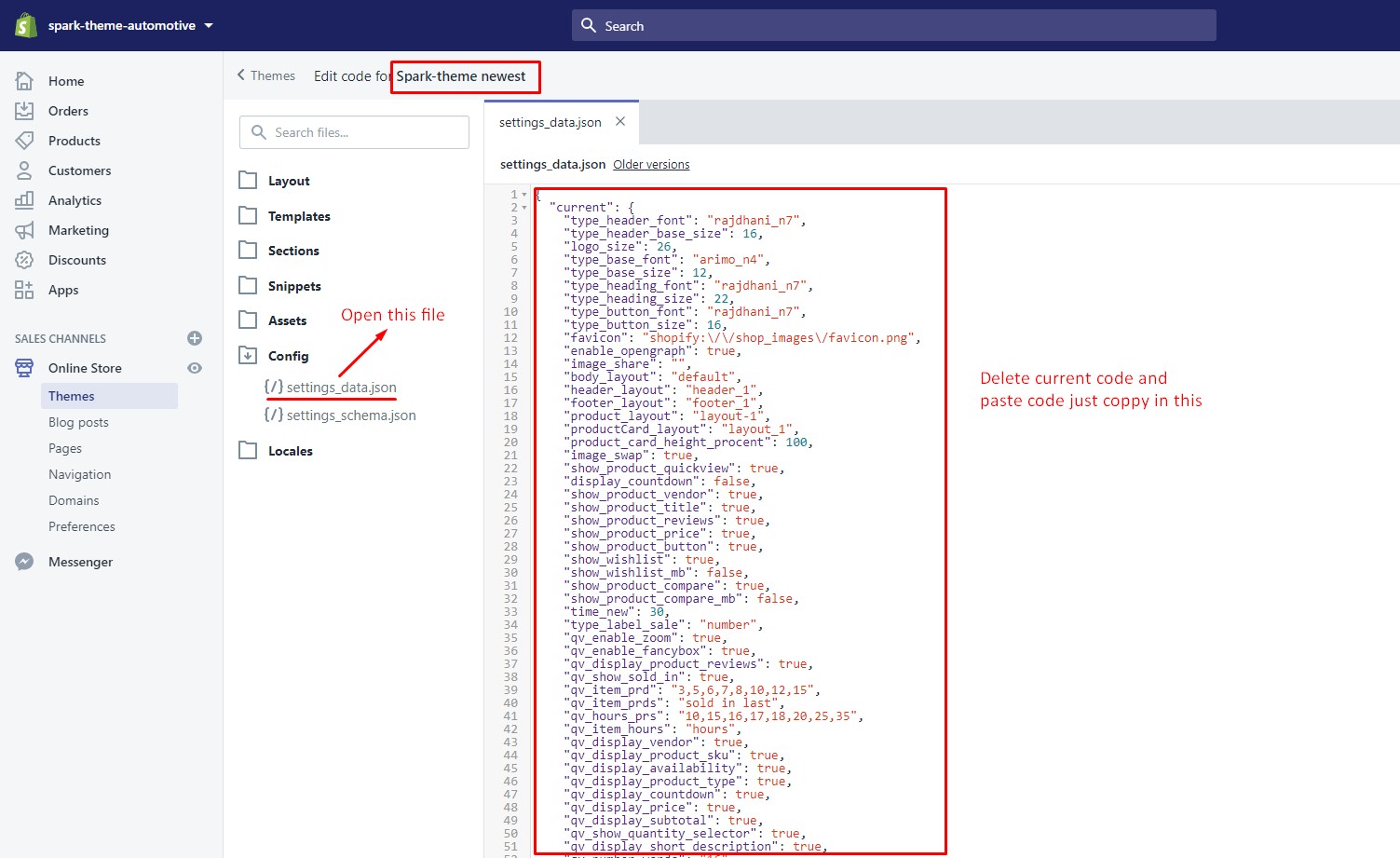
Then, go to Edit Code -> open this file settings_data.json and COPY ALL
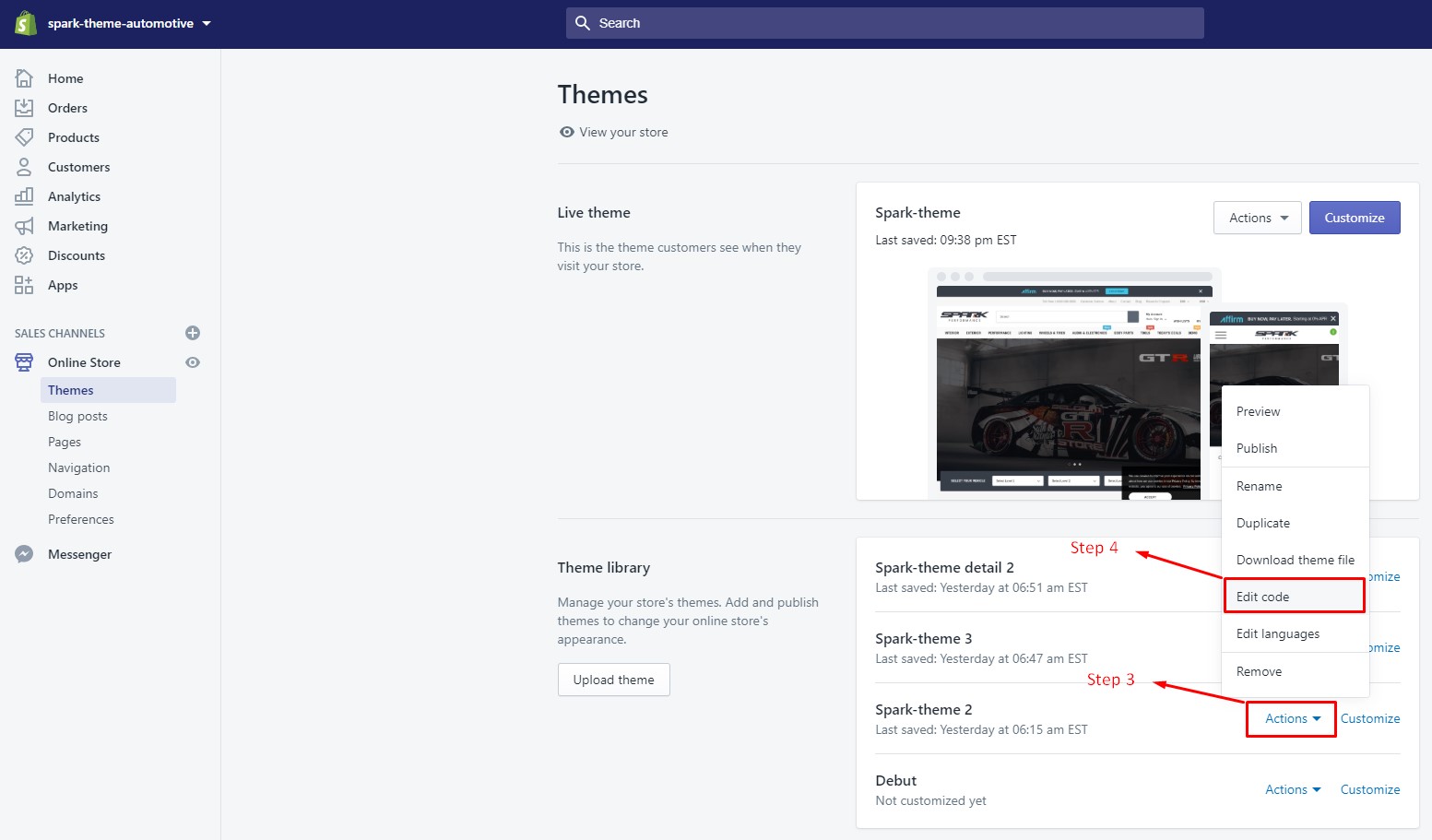
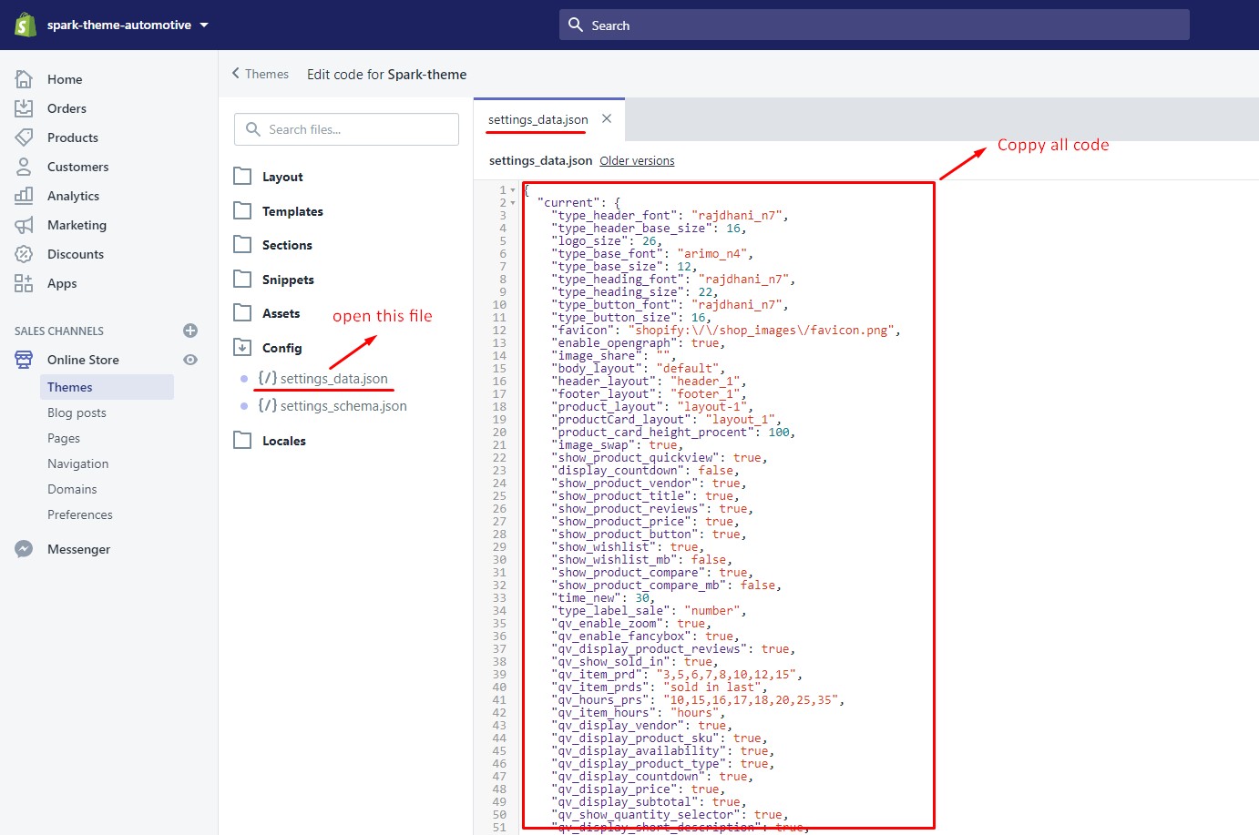
After that, please go to Newest theme source which you just installed into your site. Go to Edit Code -> open this file settings_data.json , delete and PASTE code you just copied into this file
Install Apps
Set Product Review
To have product review feature, you can install this free app below:
Or use this paid app: Growave for the advanced Review function and get 30-day Free Trial for HaloTheme's customers
Growave Product Review is an excellent app for review function
Get App - Growave Product Reviews
Translate Language
To Switch languages in which you wish to translate your store’s content
Section On Every Page
- Shopify 2.0
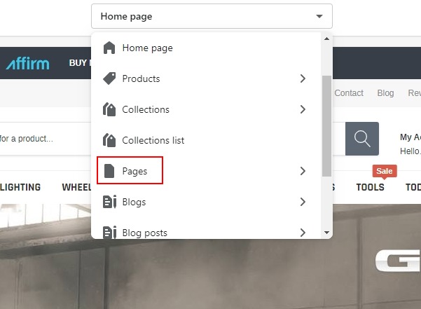
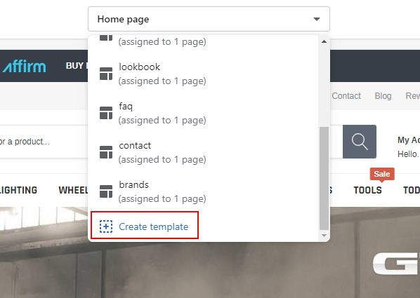
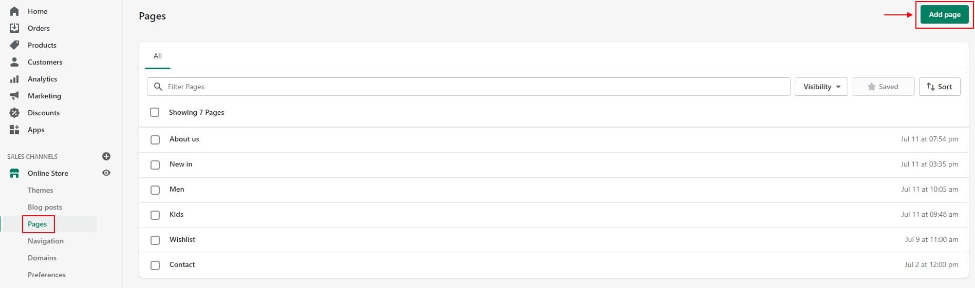
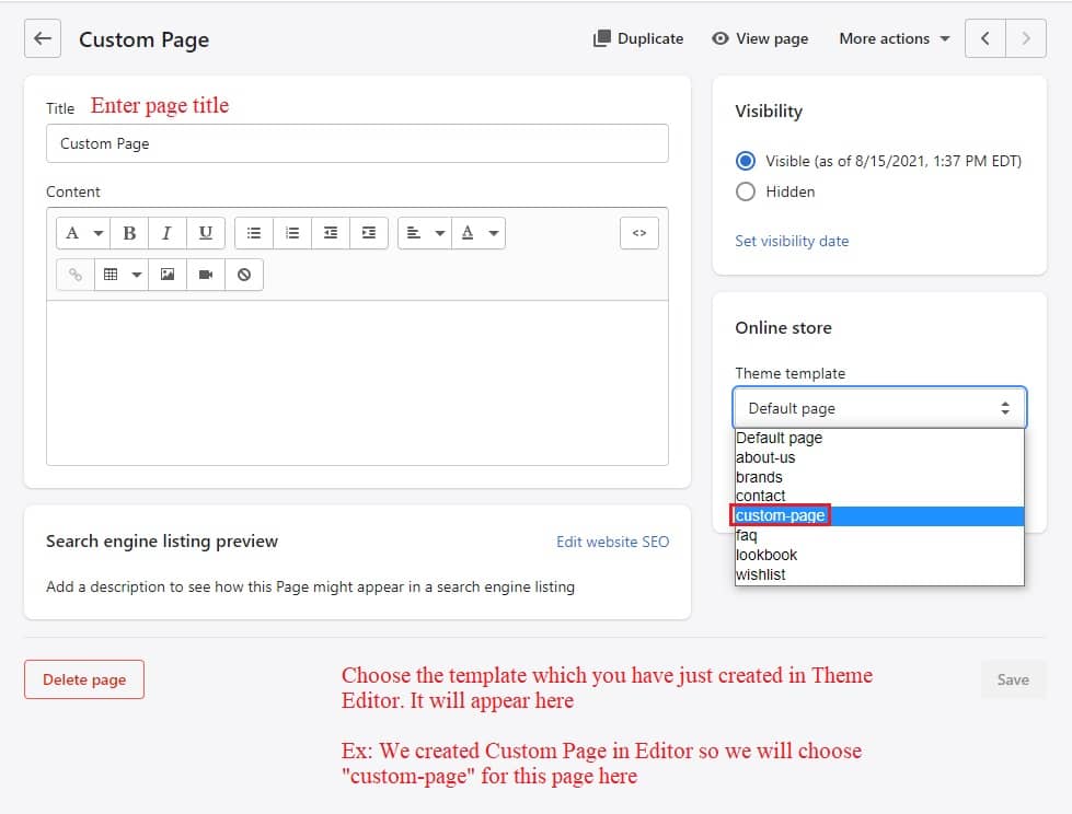
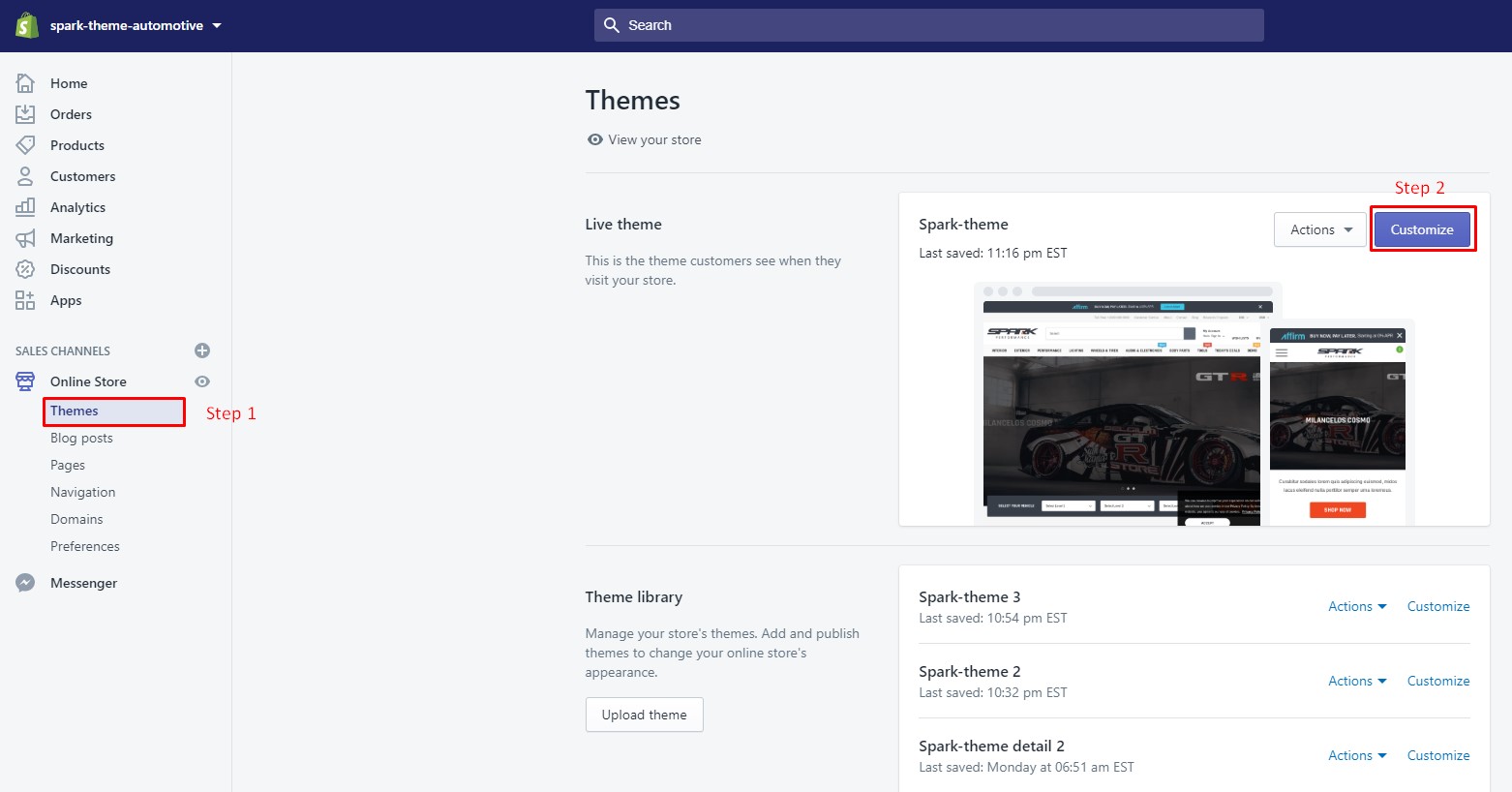
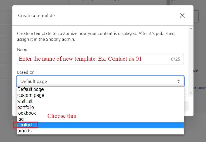
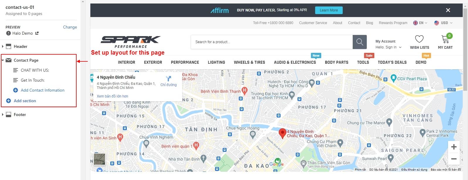
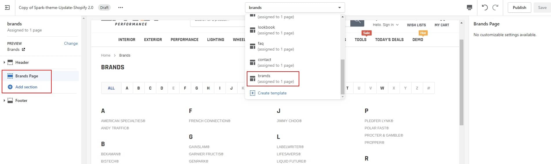
- Step 01: In Theme Editor -> Choose Pages from the dropdown window -> Choose Create template
- Step 02: Exit Theme Editor to go to Pages in Online Store -> Click Add page to create your page.
Spark has been updated to Shopify 2.0 to support the latest shopify version: Section on every page with many enhancements
Online Store 2.0 introduces a new JSON template format that lets you add new and existing sections to most pages in your theme, and add and remove sections from any page directly in the Shopify theme editor.
This feature lets merchants personalize many more aspects of a store without relying on a developer. It also lets developers build maintainable themes with more modular components.
Please follow instruction below to create page and add sections to every page you want
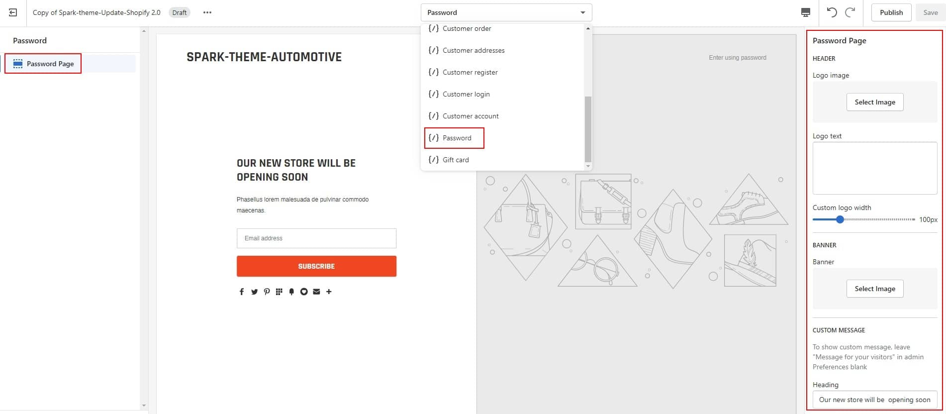
Please note that some core pages such as: Password page, Checkout page, Account page, Order page will not support Sections on these pages due to the structure of Shopify
Remember to save your changes
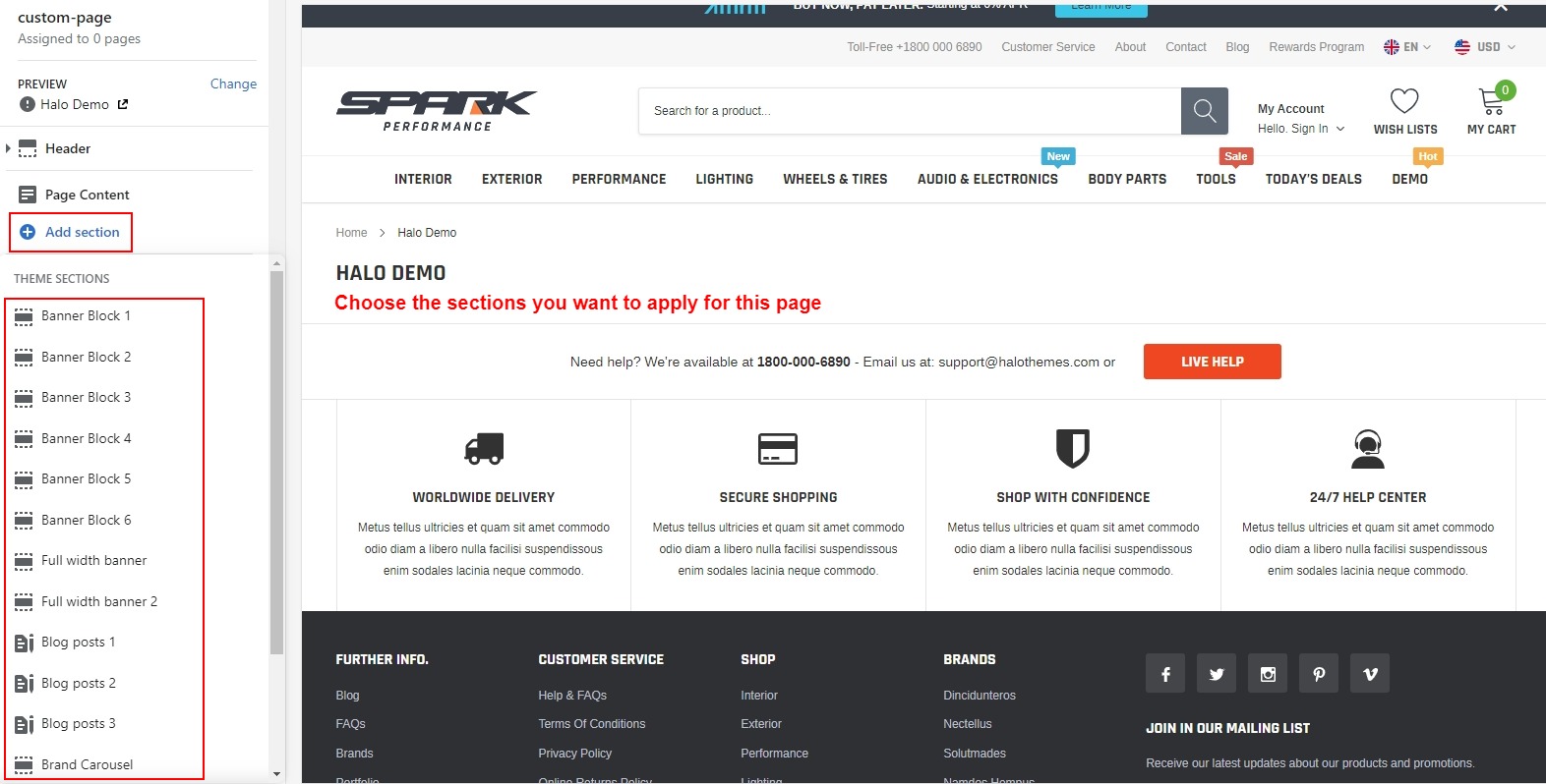
Pro tip: You can go to any pages in Theme Editor and Add Section for page, drop and drag sections to create the layout you want like on Homepage.
Home Page
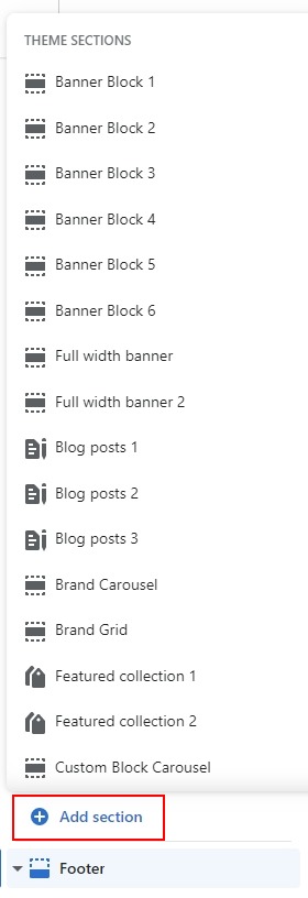
There are 30 main sections of Homepage (not include Header and Footer) which you can setup for your own Homepage Layout.
30 main sections are below: In settings of Themes --> Customize --> Click Add Section:

Home Page Demo
Spark gives you 3 available Homepage layouts and you can create many other different Homepage layouts for your site based on 31 sections + Multi Headers and Multi Footers.
Please notice that: There are 02 ways to setup Homepage layout for your site:
01: In settings of Themes --> Customize --> Add Section:. This way you can create your own homepage by choosing the sections you want. But if you use many sections, it will take time to load in admin page.
02: You can import Homepage layouts from our Preset we will guide you below. This way helps your admin page load faster.
Settings Data for Themes
To Settings Data for Homepage Layouts, please follow below instruction.
-
Please click this below Download button to download the corresponding json with Homepage layout you want. (The download button only works if you are viewing the Online Document. In case you are opening offline document, please skip step 1,2,3 because when clicking this below Download button, it will open the json right on current page, all you need is just copy and paste into settings_data.json)
- Download selected preset.
- Open downloaded file in the text editor.
- Select ALL and COPY
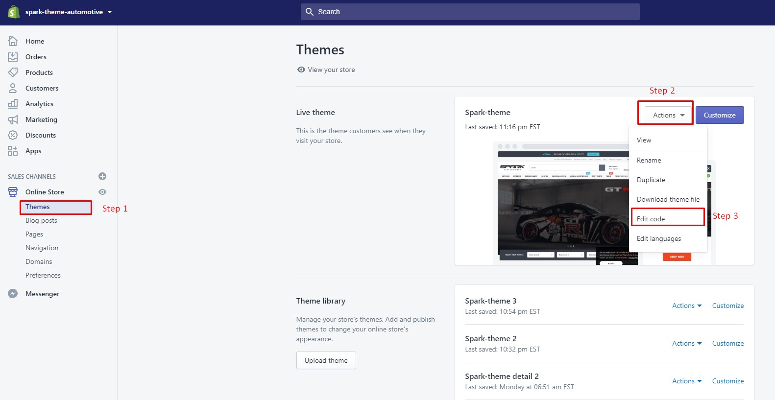
- Go to Actions --> Edit Code
- Find folder Config --> Open file settings_data.json --> Select ALL and delete. Paste copied preset from external file.

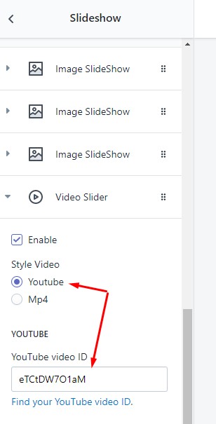
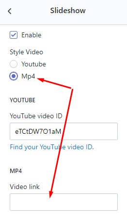
Slideshow Video Setting
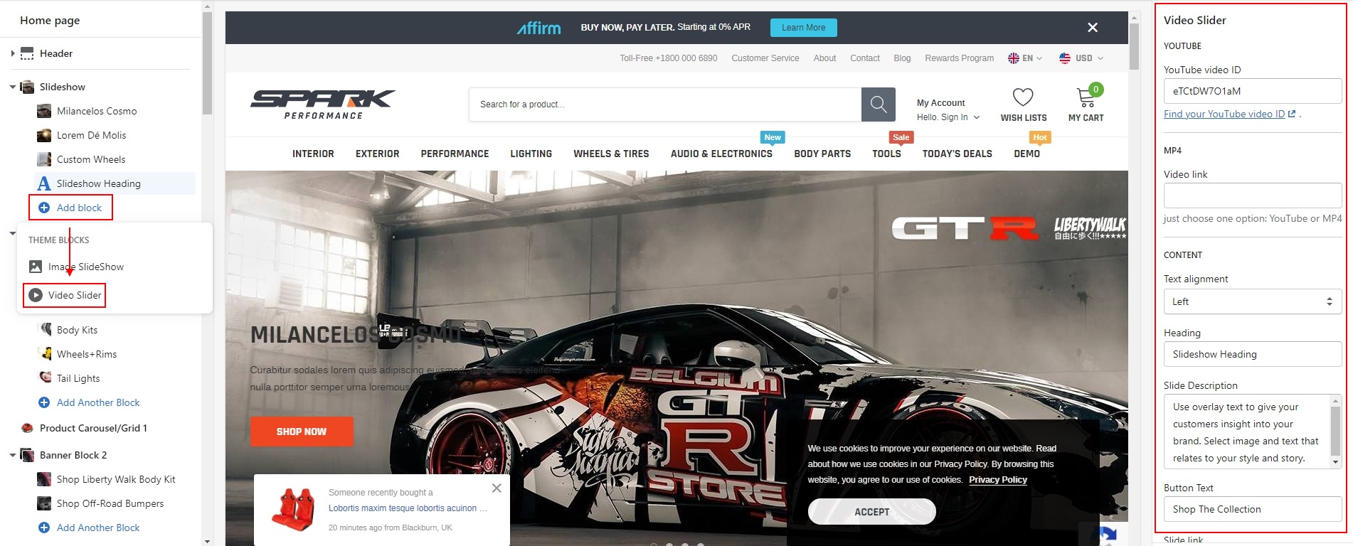
Configure Video Slideshow
You have 2 options to show video for Slider: Using a Youtube video or a MP4 video.
1 - Configure Slideshow with YouTube Video
You can go to this link to know how to get the ID from Youtube.
2 - Configure Slideshow with MP4 Video
Please refer this instruction video for your reference about how to setup a MP4 video correctly for Slider in Spark theme.
Here is a video for your reference.
Product Labels
There are some products label such as: Custom Label, New, Best Seller. To show these labels for your products, you need to add tags for products.
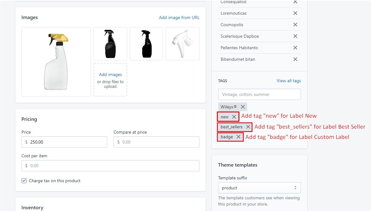
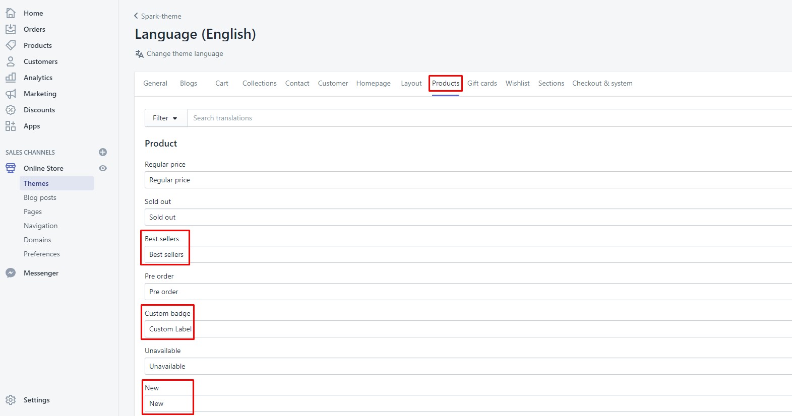
To change name of label, you can change in Edit Language
* Note: With New Label. Spark has 2 ways to show this label for products.
01: Show label by adding tags manually like our above instruction
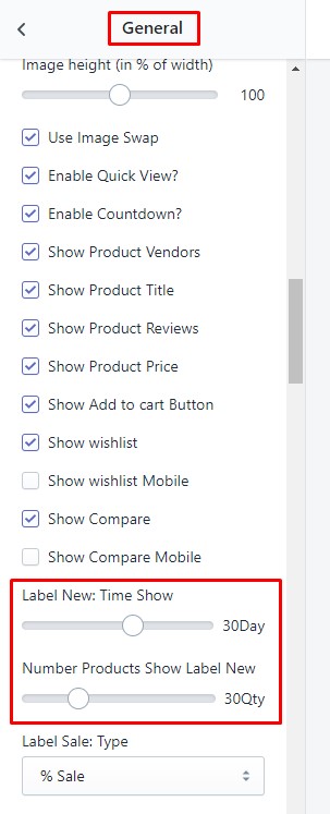
02: Show label automatically. When you add/import your products into store, Label New will be marked for the certain number of newest products in certain time which you will setup in theme settings below.
With automatic way, when there is no products are imported in the certain time, it will not show automatically, you can use manual way to show new label if you want to show for your products
Products which are added tag "new" will always show label new for products until you remove tag
Configuration
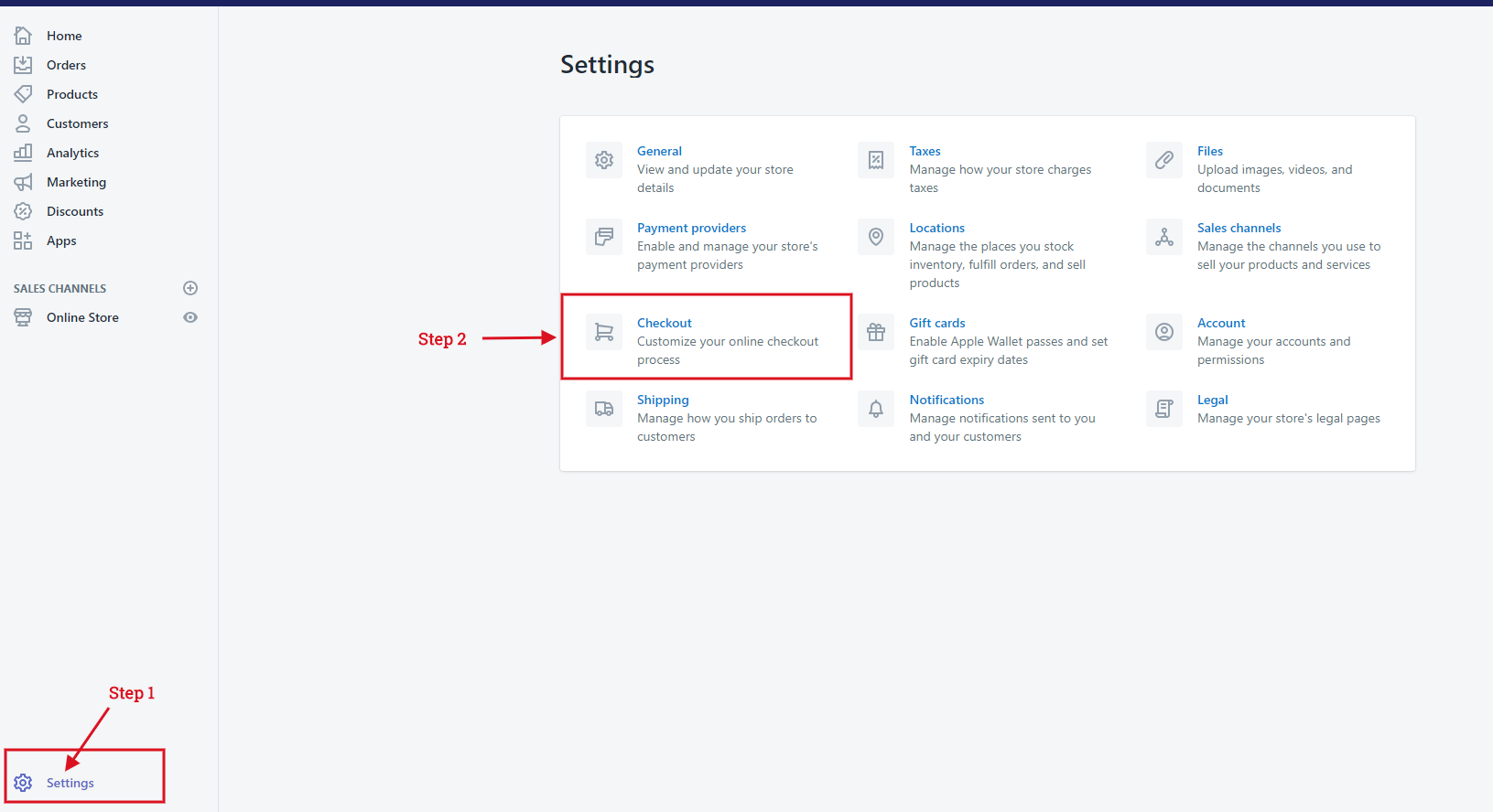
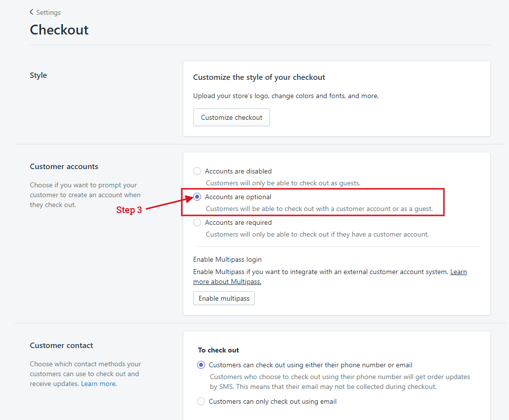
Enable Customer Registration Form
- From your Shopify admin, click Settings, then click Checkout.
- Scroll down to the Customer accounts sections.
- Check Accounts are optional and click Save.
Setup shipping rates
To enable shipping calculator, please configure your shipping rates by following below guide:
Configure Currencies
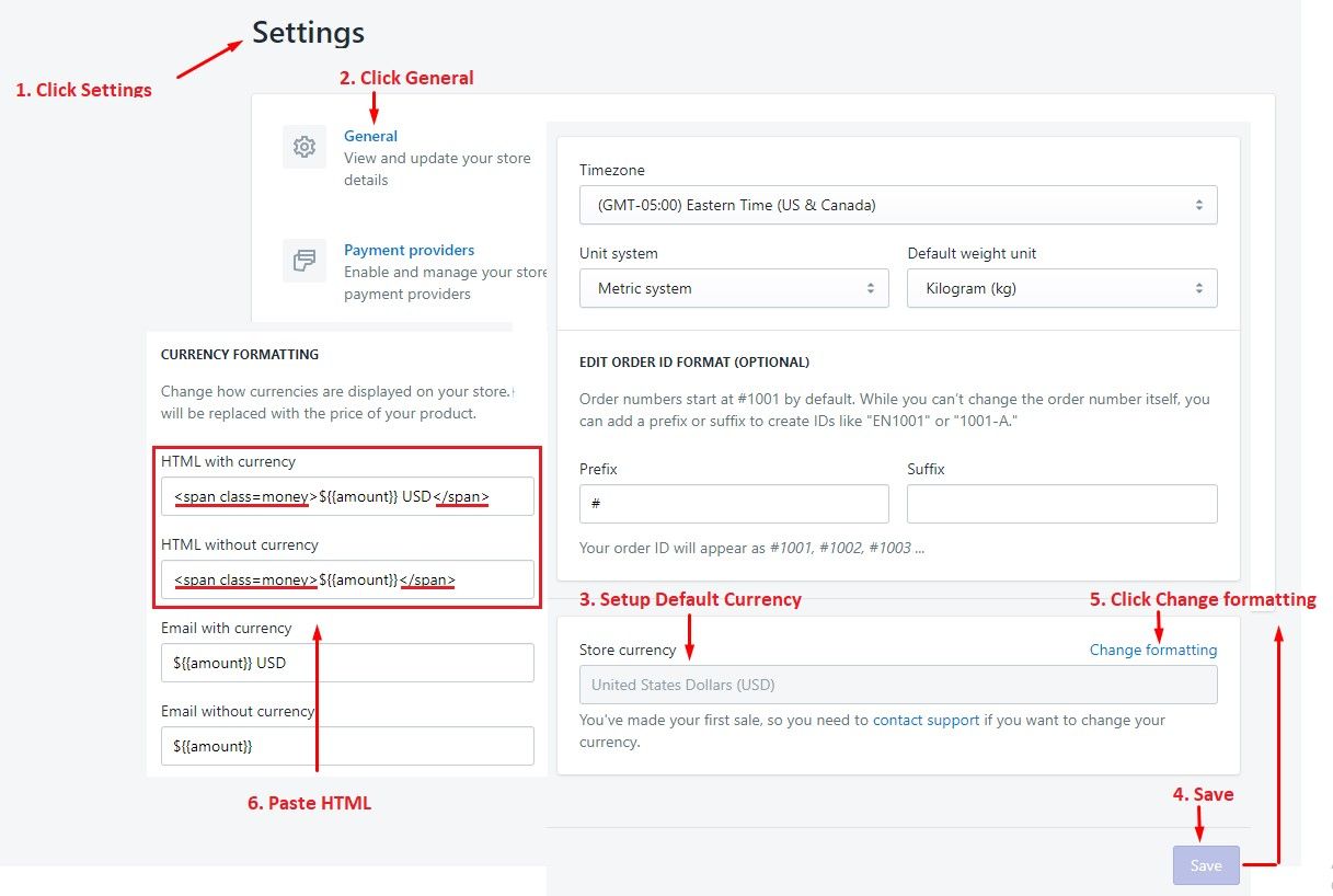
Editing the HTML for currency formatting
- From your Shopify admin, click Settings, then click General:
- Scroll down to Store currency area, you'll see your Currency setting.
- Click Change formatting to open the Currency Formatting sections.
- Find HTML with currency and HTML without currency formats in the sections.
Multiple Currencies and Automatic Currencies
Spark supports Shopify multiple currencies as well as built-in currency features. Please follow our instruction below to choose and setup
You only can use 3 options separately, and you only can combine option 2 and 3. Don’t choose both of 3 options or choose option 1 of Shopify payment with other options
01: Shopify multiple currencies:
This feature is only available for stores using Shopify Payments for a list of supported countries. Please follow instruction of Shopify to enable Shopify Payments.
- How to enable Shopify Payments
After you already enable Shopify payments correctly, go to Theme settings -> Money Option to choose this option:
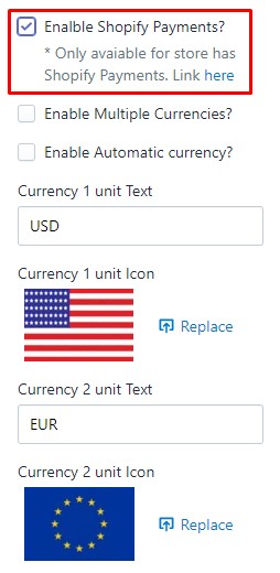
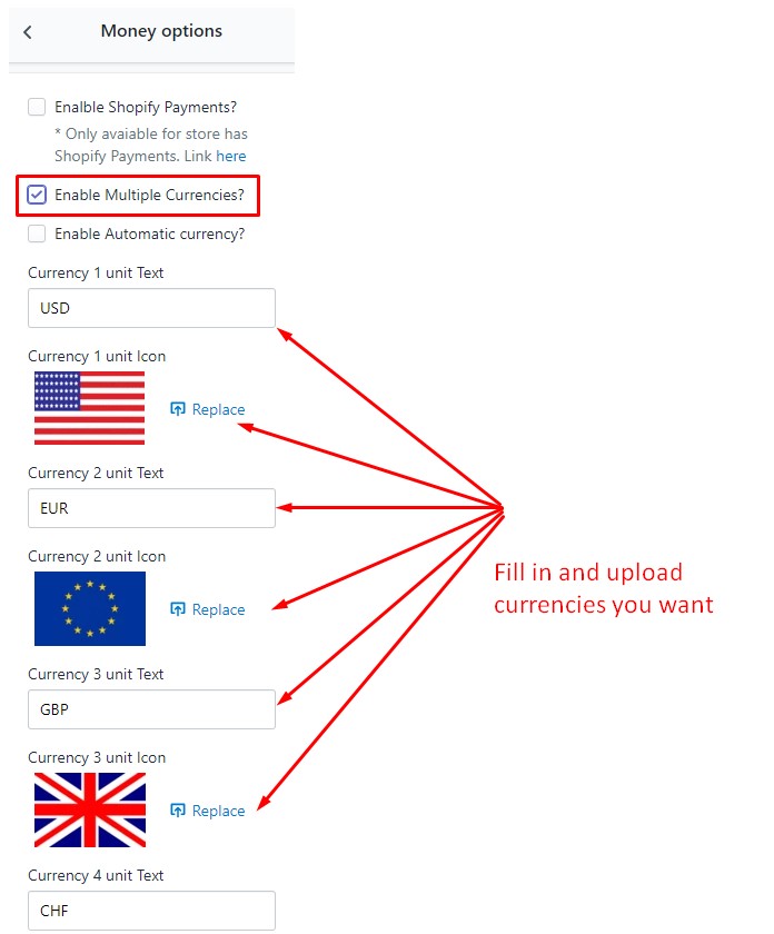
02: Multiple currencies:
This feature is built in feature of Spark which allows you to show multiple currencies on your site (Note: This option will not have automatic currency feature by location)
Go to Theme settings -> Money Option and choose: Enable Multiple Currencies?
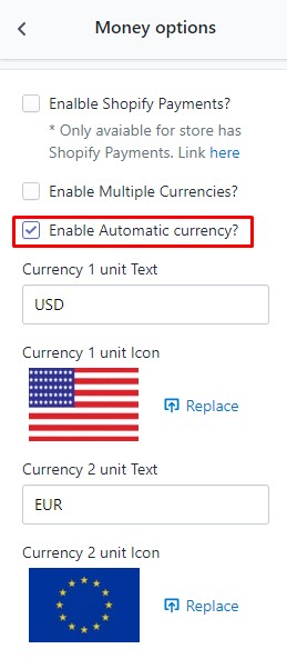
03: Automatic currencies by GEO location:
This feature is built in feature of Spark which allows your customers to see the item price on their own currency. When you enable this feature, currency selector on your site will be disabled, customers will see price in their currency by location. (Note: At checkout page, currency will be the default currency of your store)
Go to Theme settings -> Money Option and choose: Enable Automatic Currency?
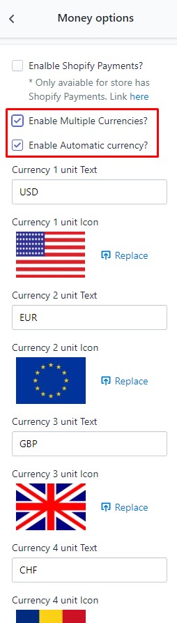
04: Automatic currencies by GEO location for a group of currencies you want:
This feature is the combination of #2 and #3 above. It will help you allow your customers to see the product price in their currency within a group of currencies you want and setup in theme setting.
Go to Theme settings -> Money Option and choose both of these options: Enable Multiple Currencies? and Enable Automatic Currency?
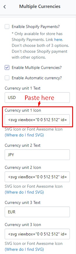
How to upload currency icons?
Please go to Multiple Currencies in Theme Settings -> Click "Where do I find SVG"
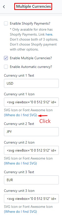
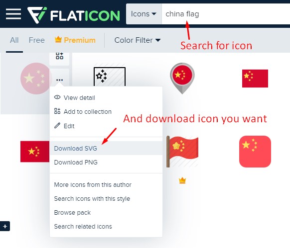
Open your downloaded icon file on Notepad and copy code then paste into text box
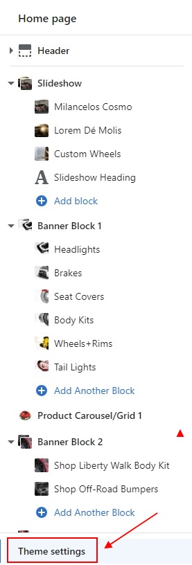
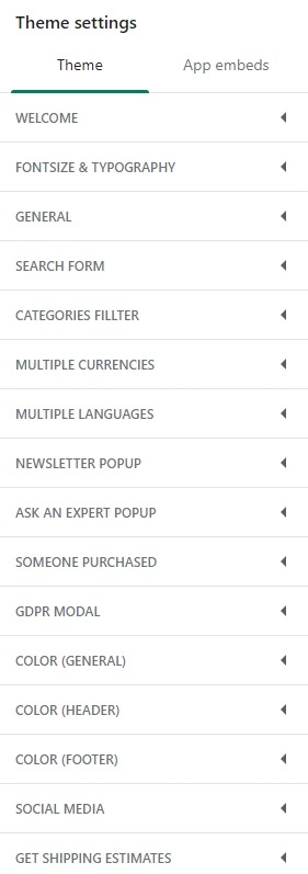
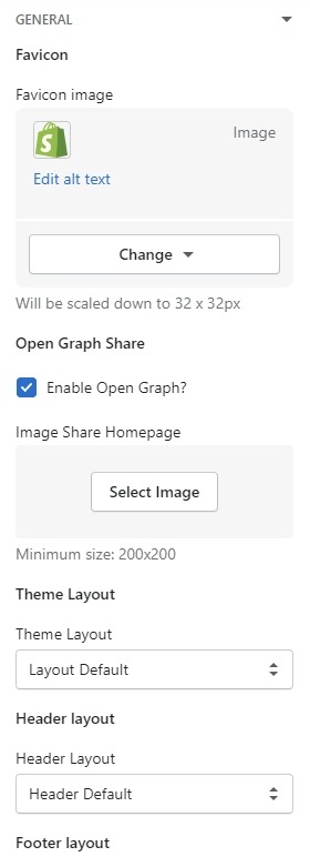
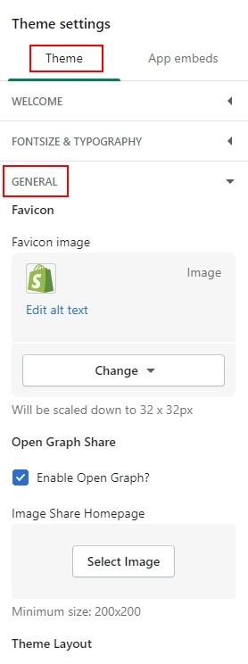
Theme settings
From your Shopify admin, click Online Store. Click Customize for the theme you want to customize. Click Theme Settings at the bottom of the left sidebar in Editor window.
You will see the settings open on the right sidebar in Editor window
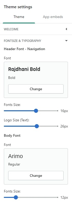
FontSize & Typography
In Theme Settings Tab. Click FontSize & Typography
You can change FontSize & Typography for header, body, Heading and button
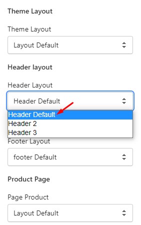
Multiple Layouts
In Theme Settings Tab. Click General.
In this, You can change layout for header, footer, product detail page ...
Please notice that you can adjust the product image height if your products are rectangle
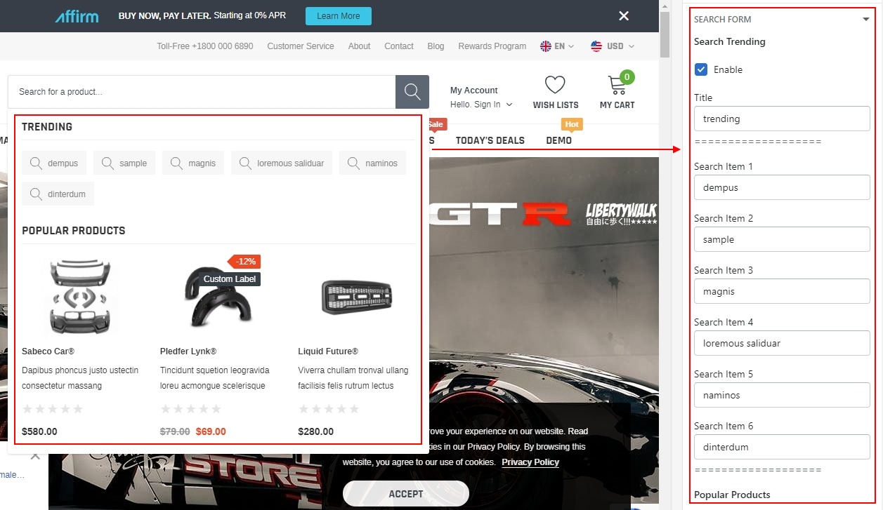
Search Form
In Theme settings Tab. Click Search Form
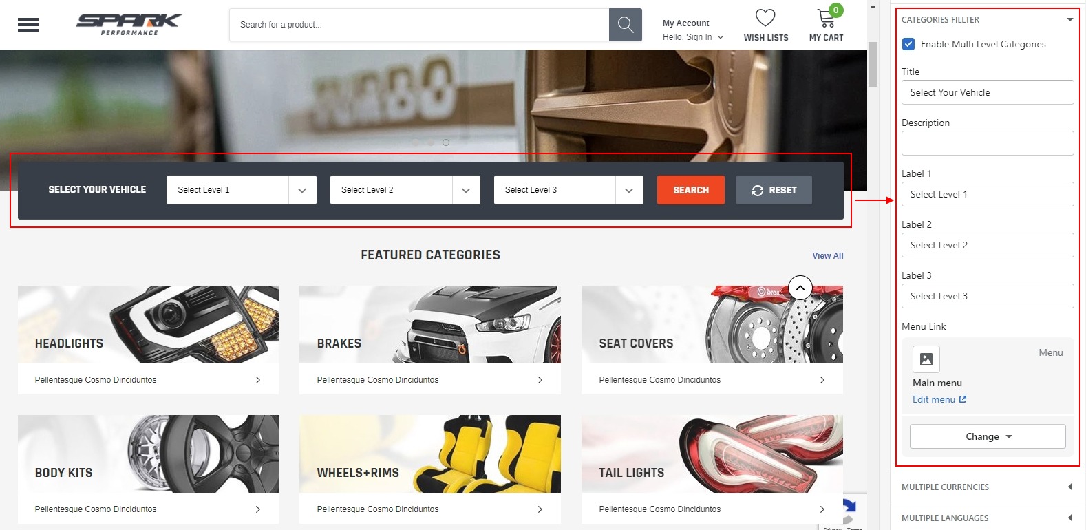
Categories Fillter
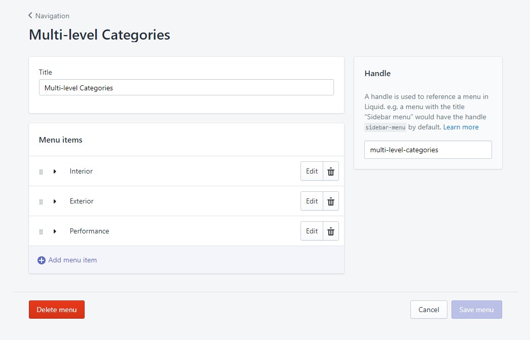
Spark offers Multi Level Category Filter module for free. To edit and setup this module on your site, please follow our instruction below
- First: Please go to Navigation to create menu you will use for this module. You only can use 3 levels of filter options corresponding with 3 levels of menu
- Second: In Theme settings Tab. Click Categories Fillter
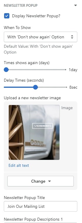
Newsletter Popup
In Theme settings Tab. click Newsletter Popup. Follow to enable/disable popup and edit text in popup.
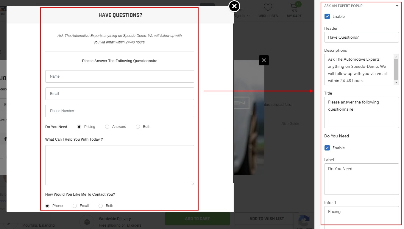
Ask An Expert Popup
In Theme settings Tab. click Ask An Expert Popup. This popup will be applied for 2 pages: Homepage and Product Detailed page. On Product Detailed page, when your customers submit form, you will be able to know which product they are referring to
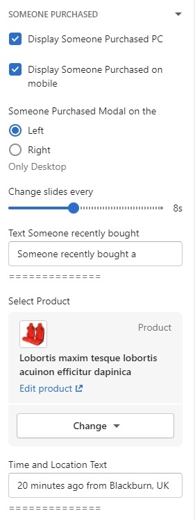
Someone Purchased Popup
In Theme settings Tab. click Someone Purchased Popup
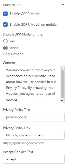
GDPR Modal Popup
In Theme settings Tab. click GDPR Modal Popup
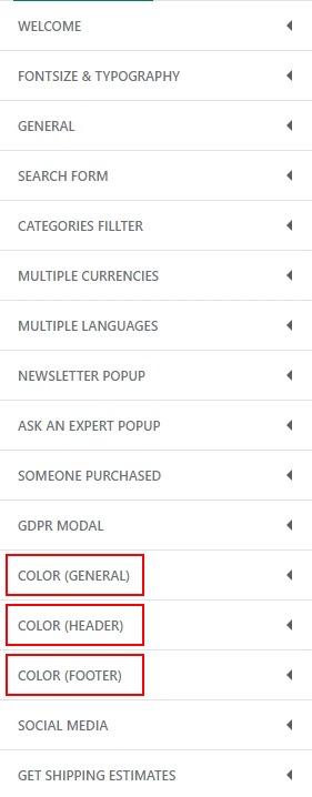
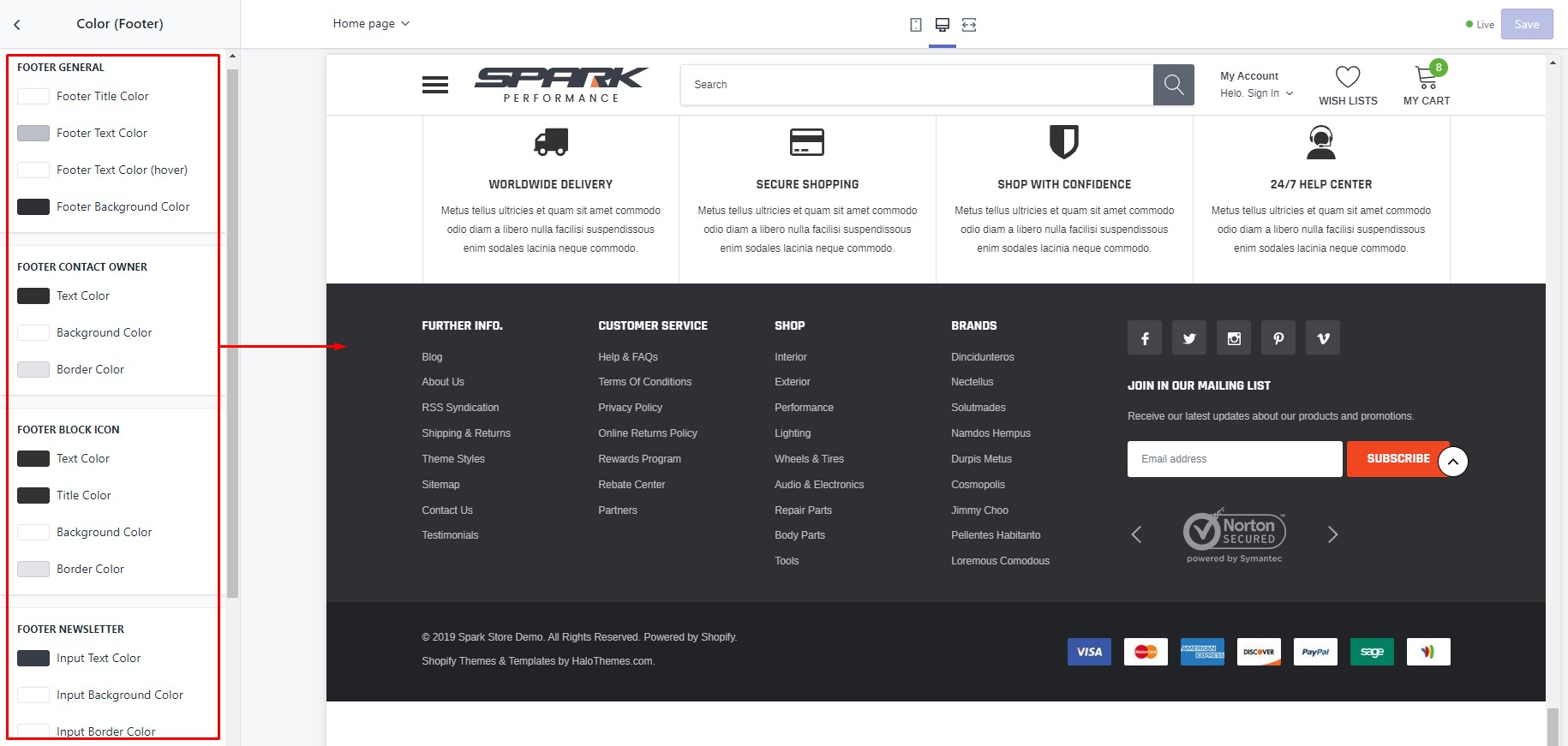
Color Settings
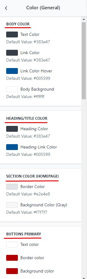
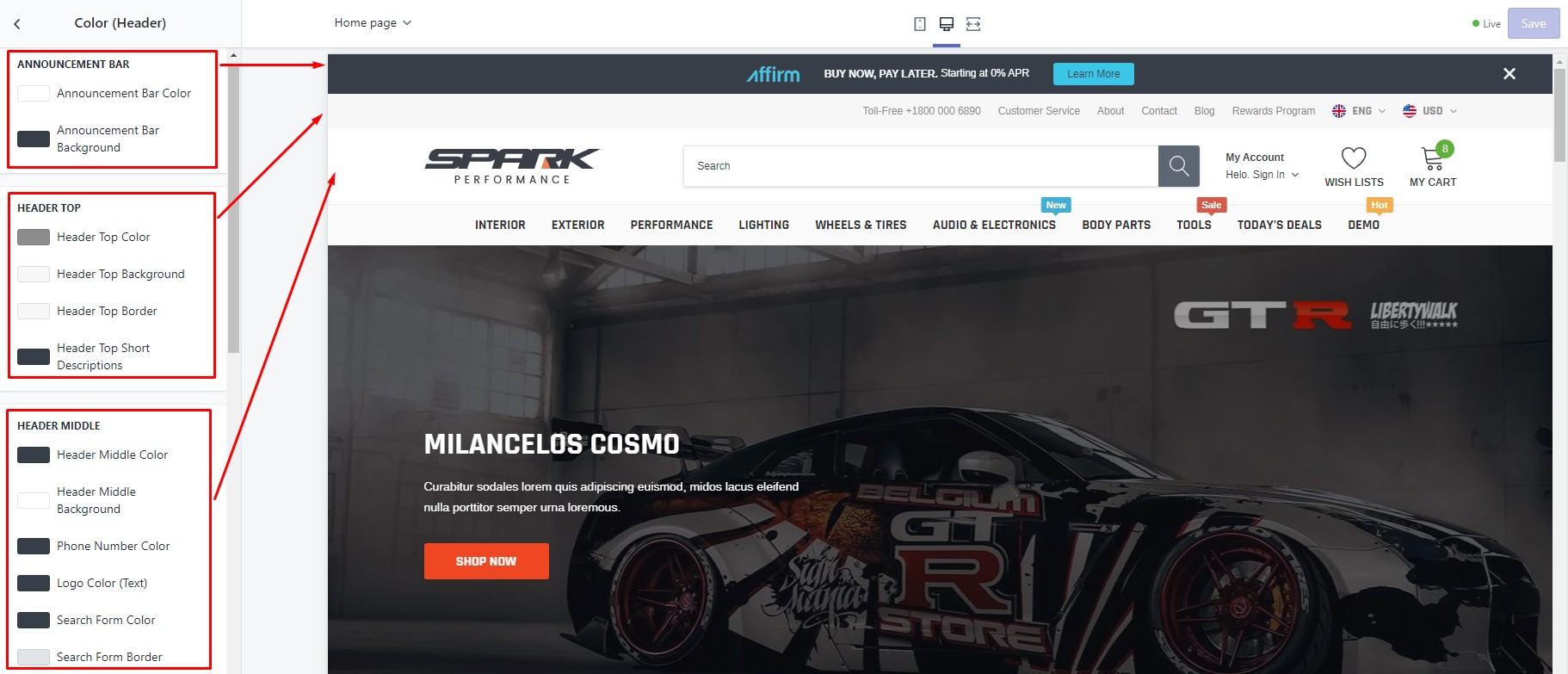
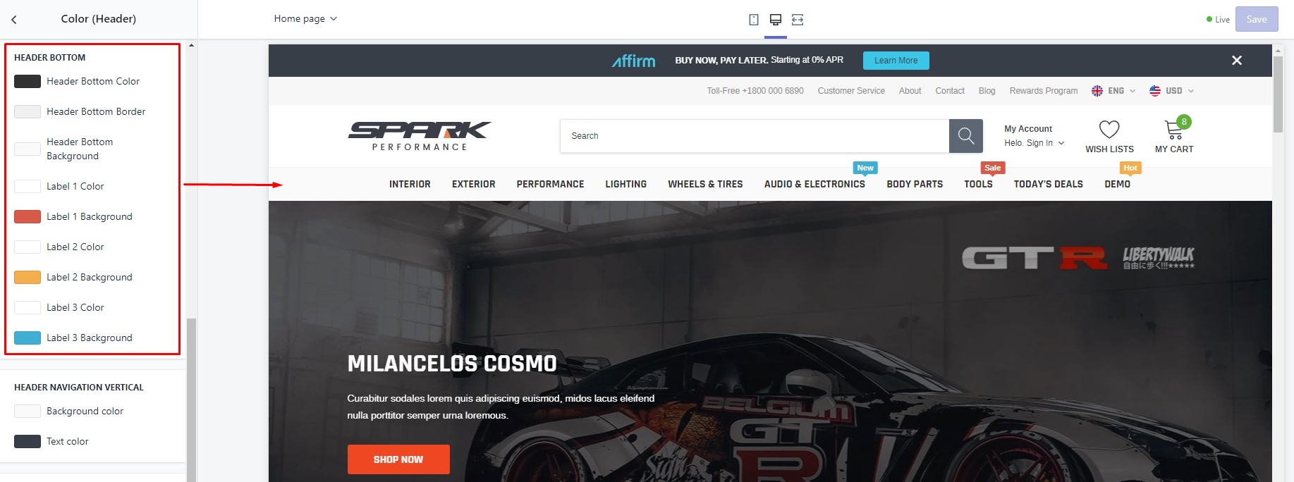
In Theme settings Tab. click Color (general), Color (Header) or Color (Footer) to change color for your theme.
In Color (general), You can change color for Body, section, heading, Button or Product Cart.
In Color (header), You can change color for Announcement Bar, Header Top, Header Middle, Header Bottom or Header Dropdown/Mega Menu.
In Color (footer), You can change color for Section Icon List, Footer General and more..
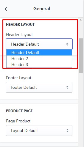
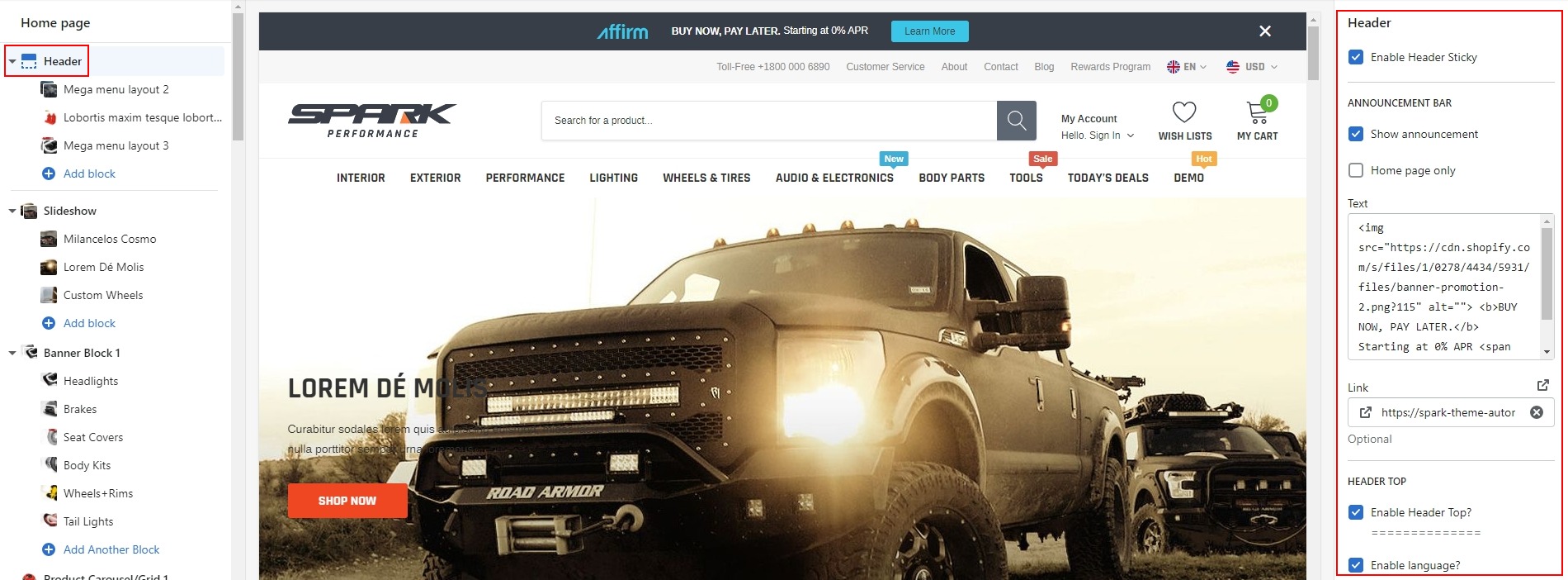
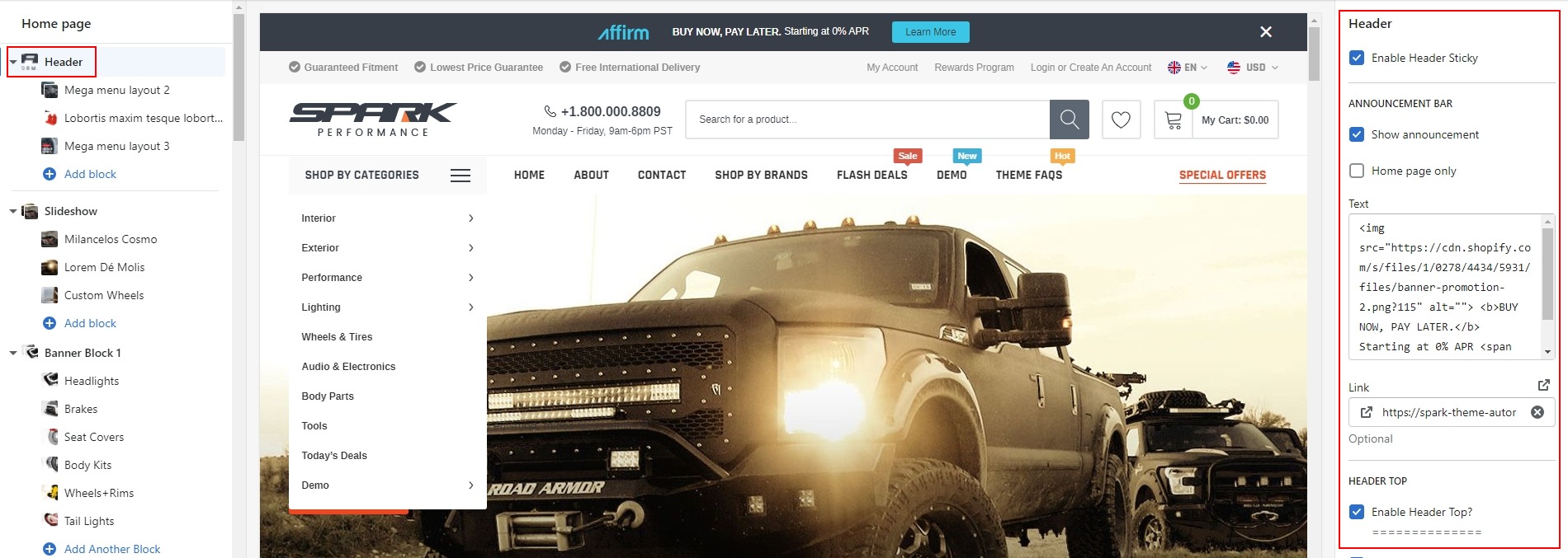
Header
At this time with Spark theme, we offer you 03 Header Layouts. You can choose 1 of 3 layouts for your site:
Please see below for more detailed instruction:
-
In Theme Settings Tab, click General
-
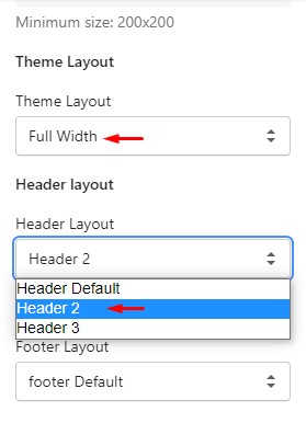
In General, Please scroll to Header Layout and choose 1 of 3 layouts header: Header Default, Header 2 or Header 3.
Header Default
-
At Theme Settings Tab -> General, Please scroll to Header Layout and choose Header Default.
-
On the left side, click Header to open settings for header on the right side.
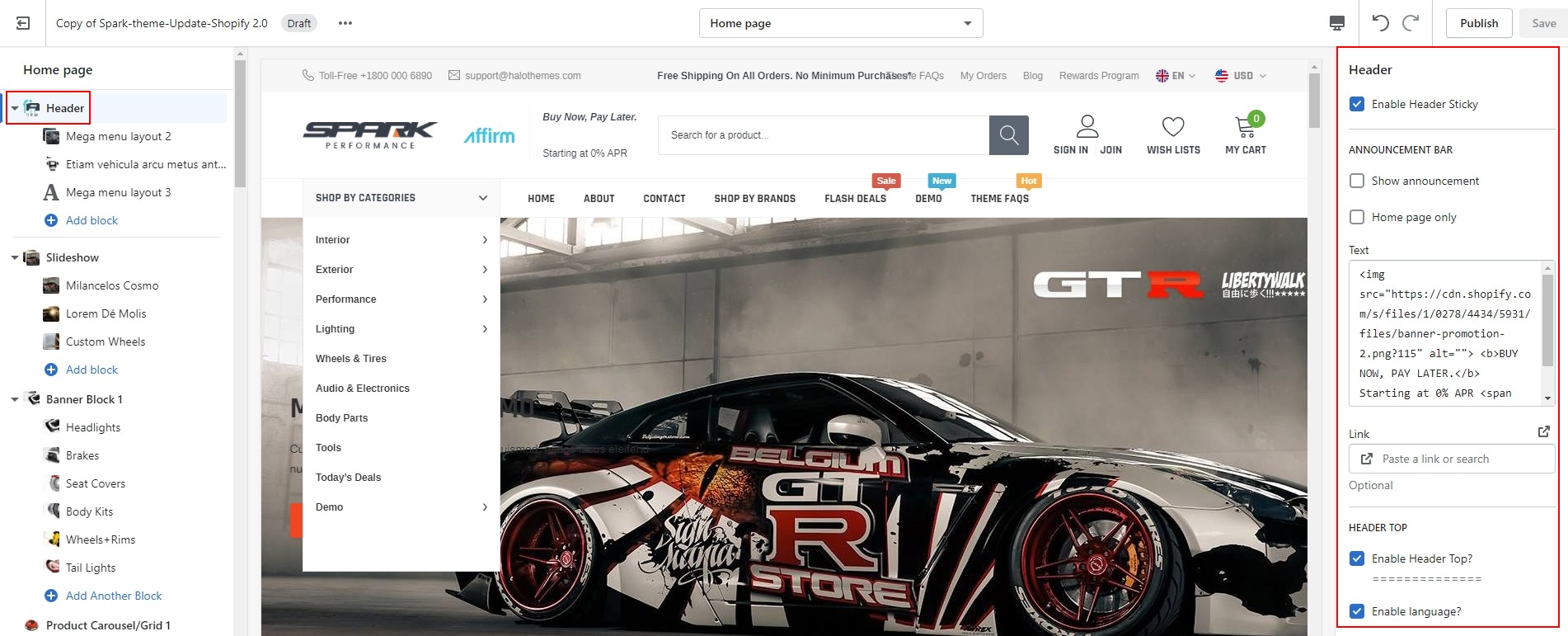
Header 2
-
At Theme Settings Tab -> General, Please scroll to Header Layout and choose Header 2.
-
On the left side, click Header to open settings for header on the right side.
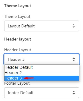
Header 3
-
At Theme Settings Tab -> General, Please scroll to Header Layout and choose Header 3.
-
On the left side, click Header to open settings for header on the right side.
Navigation
Before you begin customizing your store, we would like to notice that this section will help you to have some collections and products added and a blog article written. So if you already had an active store and you are just updating your design, you don't need to read this part. Otherwise, here are some links to help you to set up your new store:
- How to create a collection
- How to create a smart collection
- How to create a product and add it to a collection
- How to create a blog and write an article
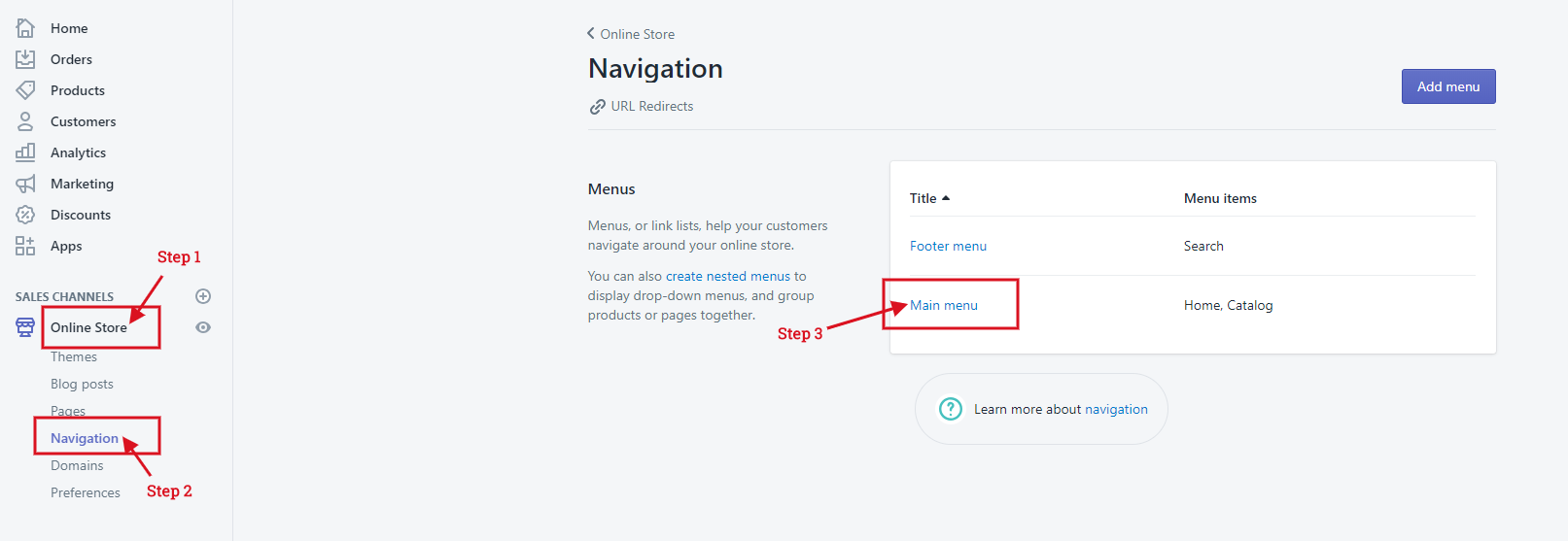
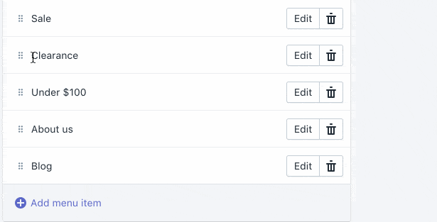
Create a menu
1. From your Shopify admin, click Online Store, then click Navigation:
2. On Main Menu menu, click Edit menu.
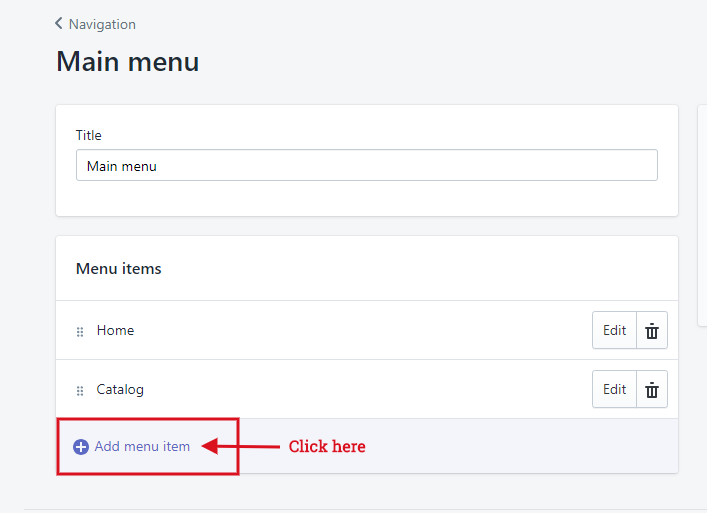
3. Click Add menu item to create a link in main menu.
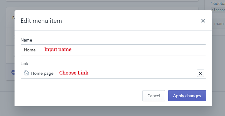
4. Input Name and select link options.
Create multi-level drop-down menu
To add a drop-down menu from the main menu of your online store:
- From your Shopify admin, go to Online Store > Navigation.
-
Click the title of your main menu.
-
Choose one of the menu items to be the header for your drop-down menu, or add a new menu item to be the header. If you don't want the header to link to anything, then you can enter
#in the Link field when you add the menu item. -
Add menu items to include in the new drop-down menu. Click Add menu item, enter the name of the menu item, and enter or select a destination for the link.
-
Click and drag the menu items to nest below the header item:
-
Click Save menu.
Please follow instruction video of Shopify
Setup Label (New, sale, hot)
-
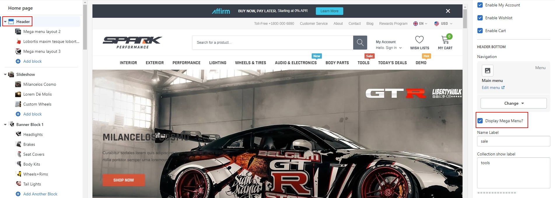
Click Header Tab on the left side.
-
Please Use "," to separate Menu items if you want choose label for multiple Menu items. For ex: Men, Women
-
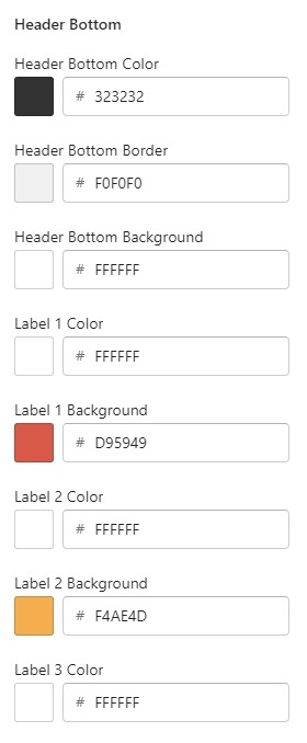
If you want to change color for Label, Click Theme settings tab, and click Color (Header) tab. After, Please scroll to Header Bottom, you can see setting color for label
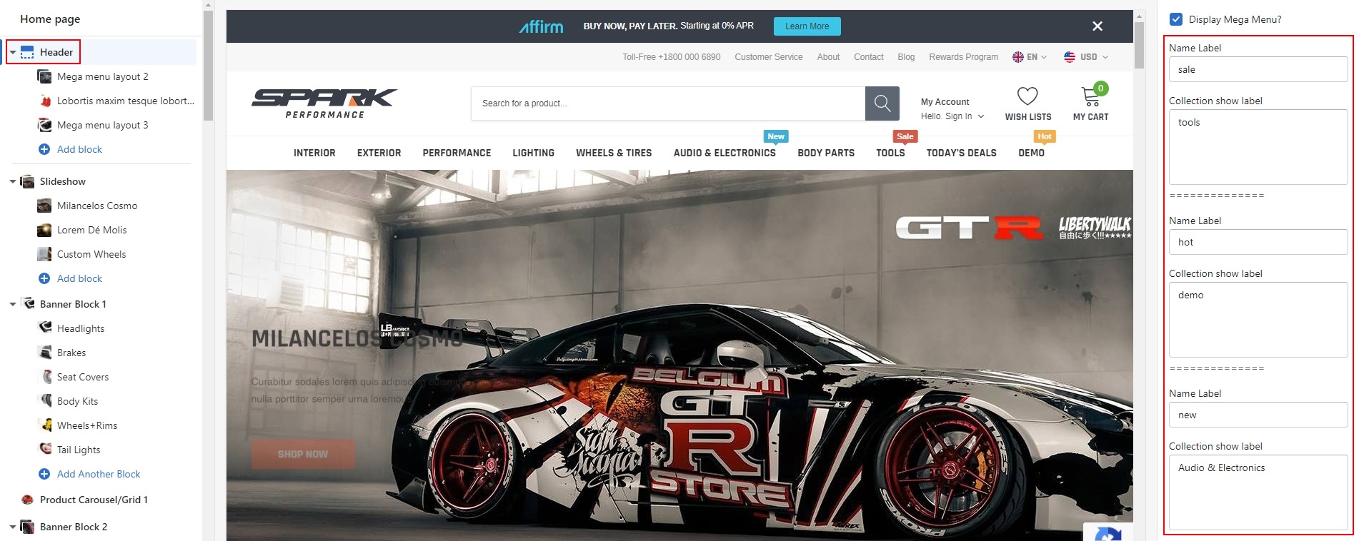
Setup Mega menu
Step 1: To show mega menu layout, you need to create multi-level drop-down menus first.
Step 2: Please click Header tab on the left side.
Step 3: At Header settings, Please scroll to Header Bottom. After that, you need check on Enable Dropdown MegaMenu?.
Step 4: Click Add block to choose style.
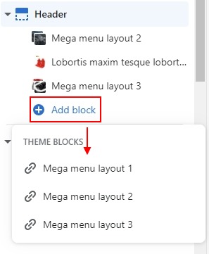
Step 5: Put the name of collections you'd like to show as Mega Menu at Mega Menu Style 1, Mega Menu Style 2, Mega Menu Style 3, and choose the Style Which is suitable for your option in Settings on the right side.
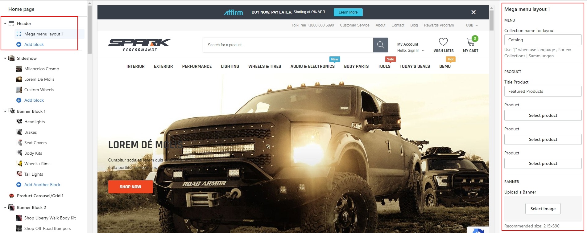
Mega Menu Style 1
You'd like to display Collection "Interior" as Mega menu layout 1, you need to:
- Create the collection "Interior" menu in Navigation and the multi-level drop-down menu belongs to collection "Interior".
-
In settings of Header, at "Add block" click add Mega menu layout 1 and put "Interior" text into Mega menu layout 1.
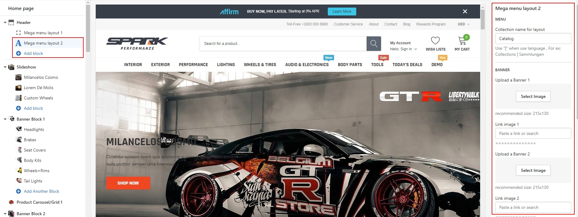
Mega Menu Style 2
You'd like to display Collection "Exterior" as Mega menu layout 2, you need to:
- Create the collection "Exterior" menu in Navigation and the multi-level drop-down menu belongs to collection "Exterior".
-
In settings of Header, at "Add block" click add Mega menu layout 2 and put "Exterior" text into Mega menu layout 2.
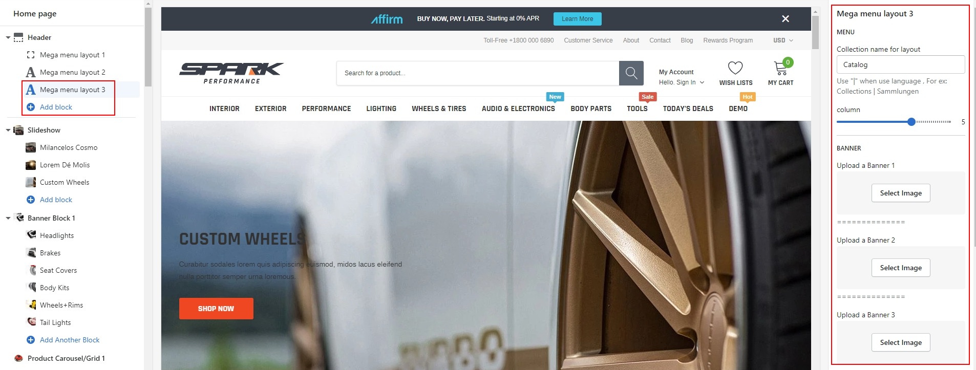
Mega Menu Style 3
You'd like to display Collection "Wheels & Tires" as Mega menu layout 3, you need to:
- Create the collection "Wheels & Tires" menu in Navigation and the multi-level drop-down menu belongs to collection "Wheels & Tires".
-
In settings of Header, at "Add block" click add Mega menu layout 3 and put "Wheels & Tires" text into Mega menu layout 3.
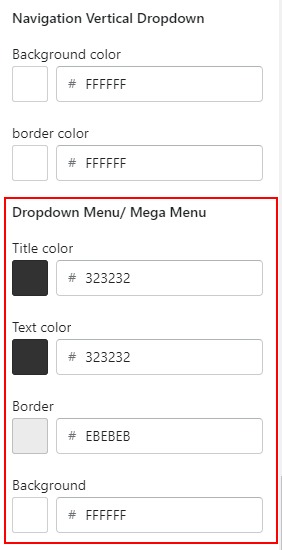
Setup Color Dropdown/Mega Menu
If you want change color for Dropdown/Mega Menu, At Theme settings tab, and click Color (Header) tab. After, Please scroll to Header Dropdown menu, you can see setting color for Dropdown/Mega Menu
Footer Section
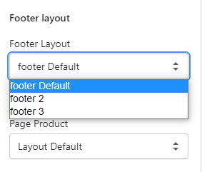
At this time with Spark theme, we offer you 03 Footer Layouts. You can choose 1 of 3 layouts for your site:
Please see below for more detailed instruction:
-
At Theme Settings Tab --> General: Please scroll down to Footer Layout and choose Footer default
-
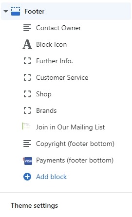
At the left side of editor window, scroll down to bottom and click Footer tab.
-
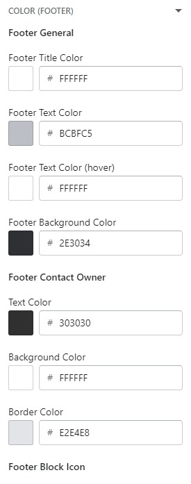
When you want change color for Footer. Please click Theme Settings tab. After, scroll down to Color (Footer) tab.
Collections List
Please follow the detailed instruction below
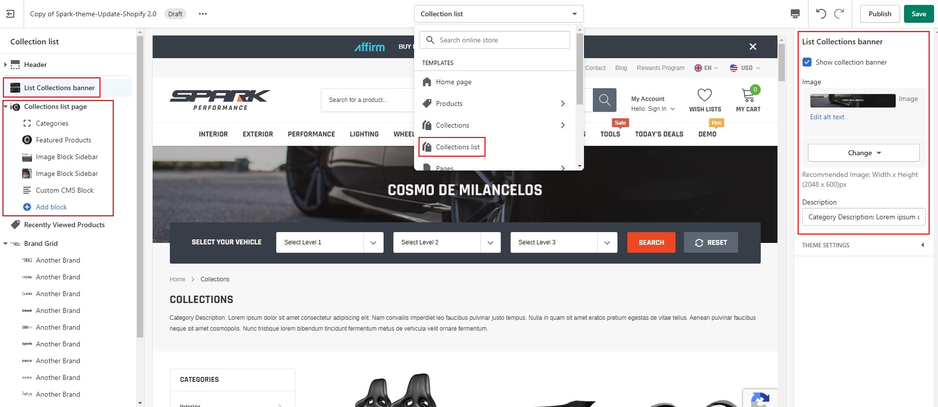
Collections Page
The way to setup for Collections Page in Section Tabs , Please follow the detailed instruction below
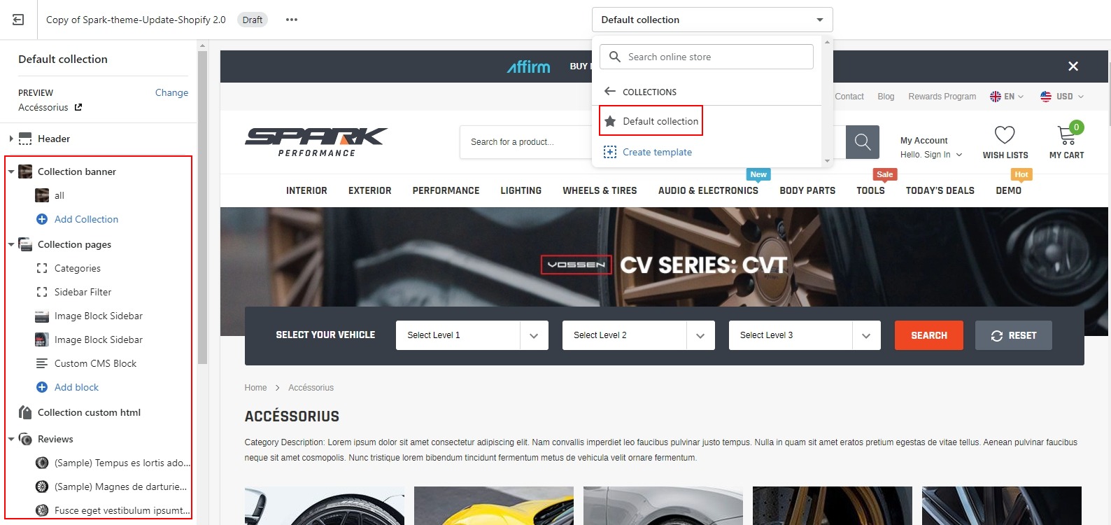
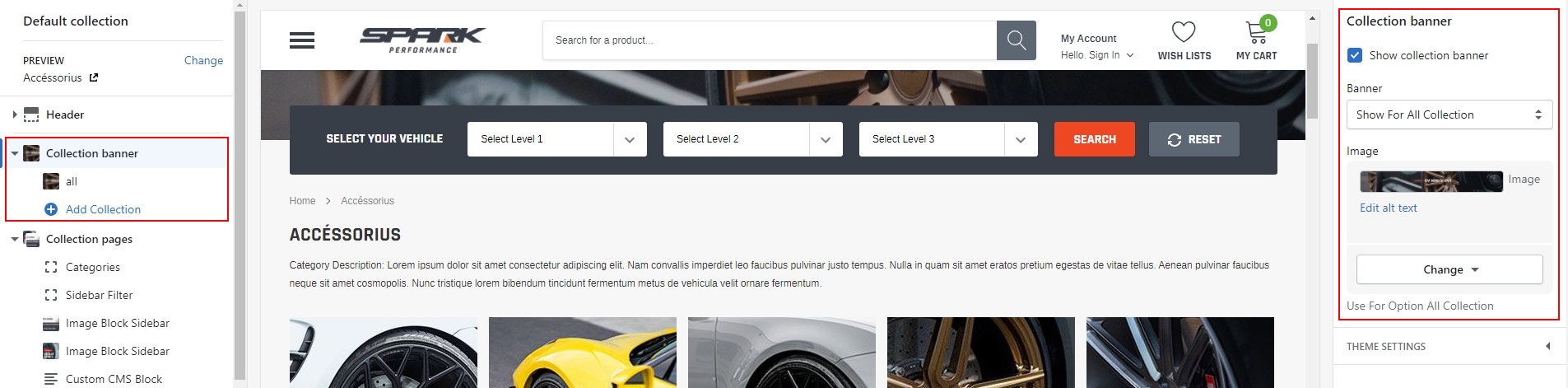
1. Collection banner
The way to setup for Collection banner Tabs , Please follow the detailed instruction below:
2. Collection Sidebar/ Product Filter
-
The way to setup for Collection Sidebar Tabs , Please follow the detailed instruction below:
Product Filter on Spark is DYNAMIC FILTER from Shopify 2.0 and works with automatic product data
To enable Product Filter function please follow below steps
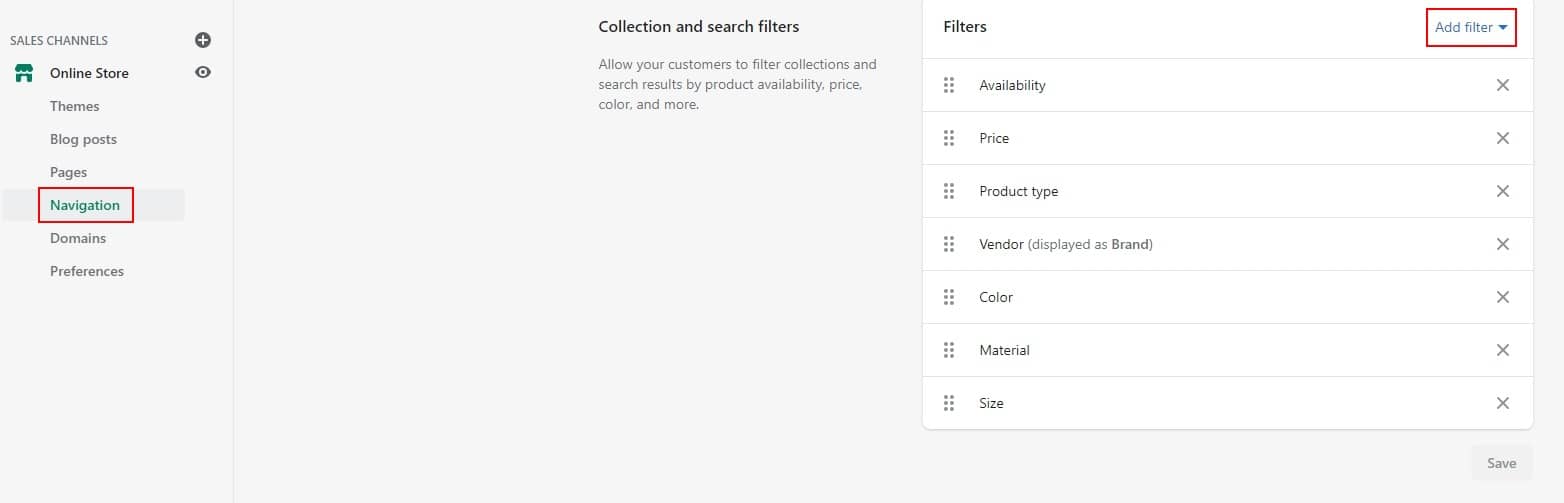
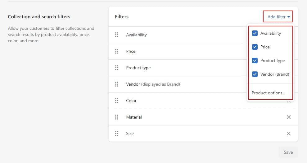
- Step 01: Go to Navigation -> at Collection and search filters -> click Add filter
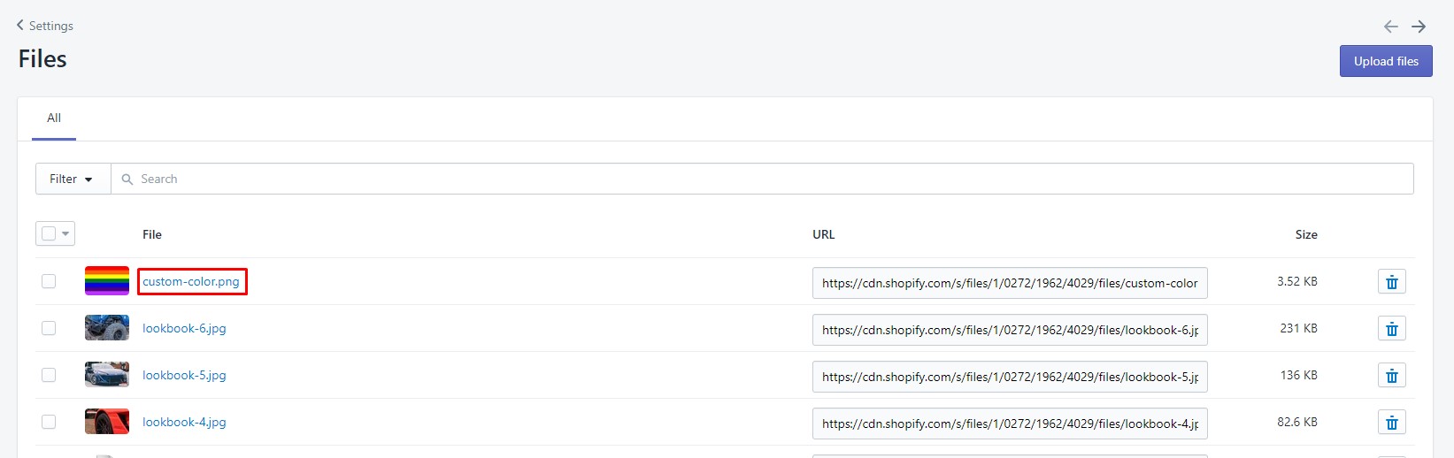
With Color swatches filter option, if your products have custom color/ special color, you can follow below instruction to show
Upload image with the same name as the variant color name (please use PNG image). You need to go to Settings → Files -> Upload Files
Naming convention: Lower cap and use "-" to replace white space.
For example: with the option name "Custom Color" the icon name will be custom-color.png.
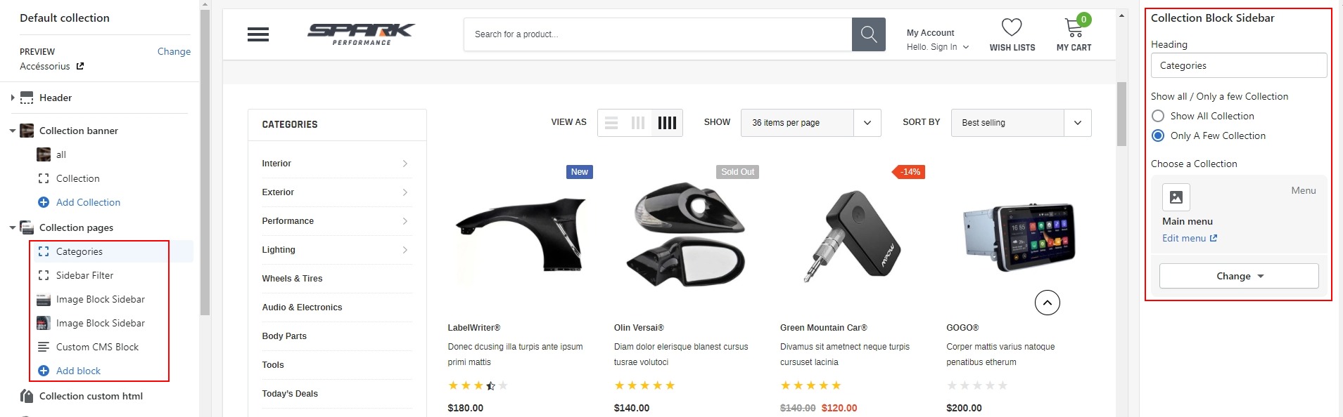
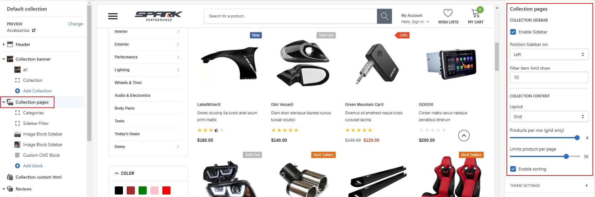
3. Collection Pages
The way to setup for Collection Pages Tabs, Please follow the detailed instruction below:
-
Click Collection Pages tab to edit content for Collection Pages.
-
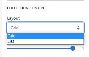
Spark theme has two options for product: Gird and List. You can change option by selecting layout:
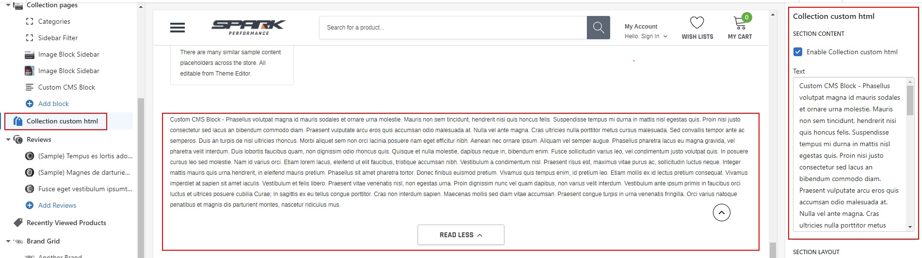
4. Collection Custom HTML
Click Collection Custom HTML tab to edit content for it.
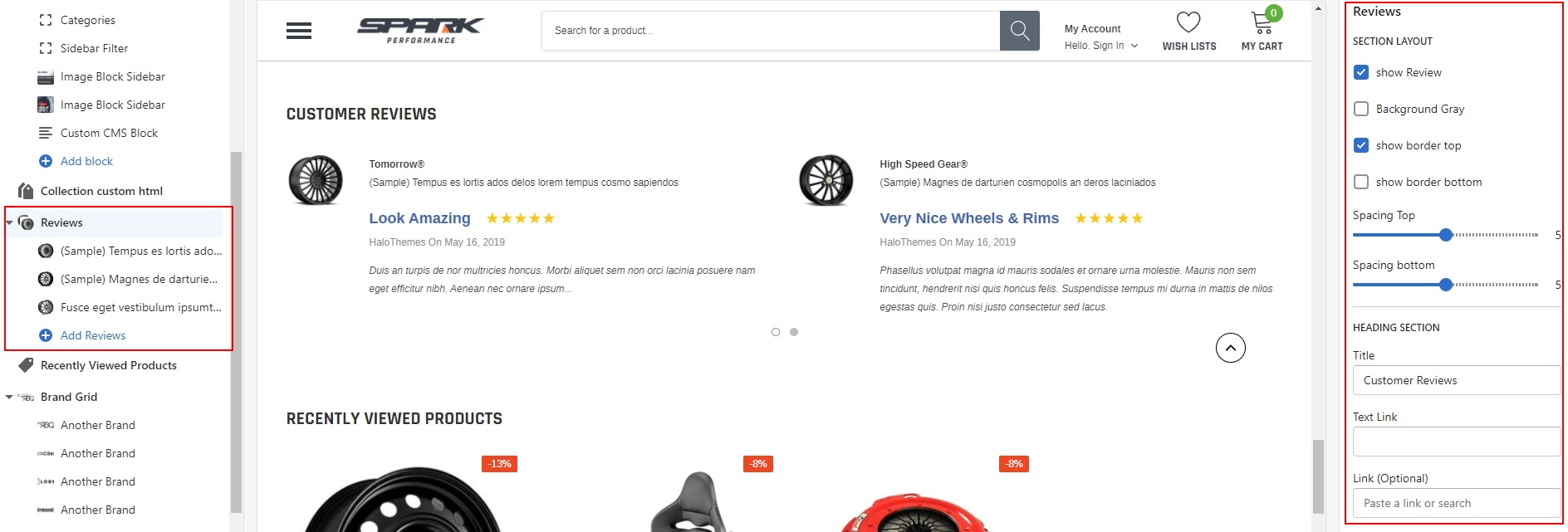
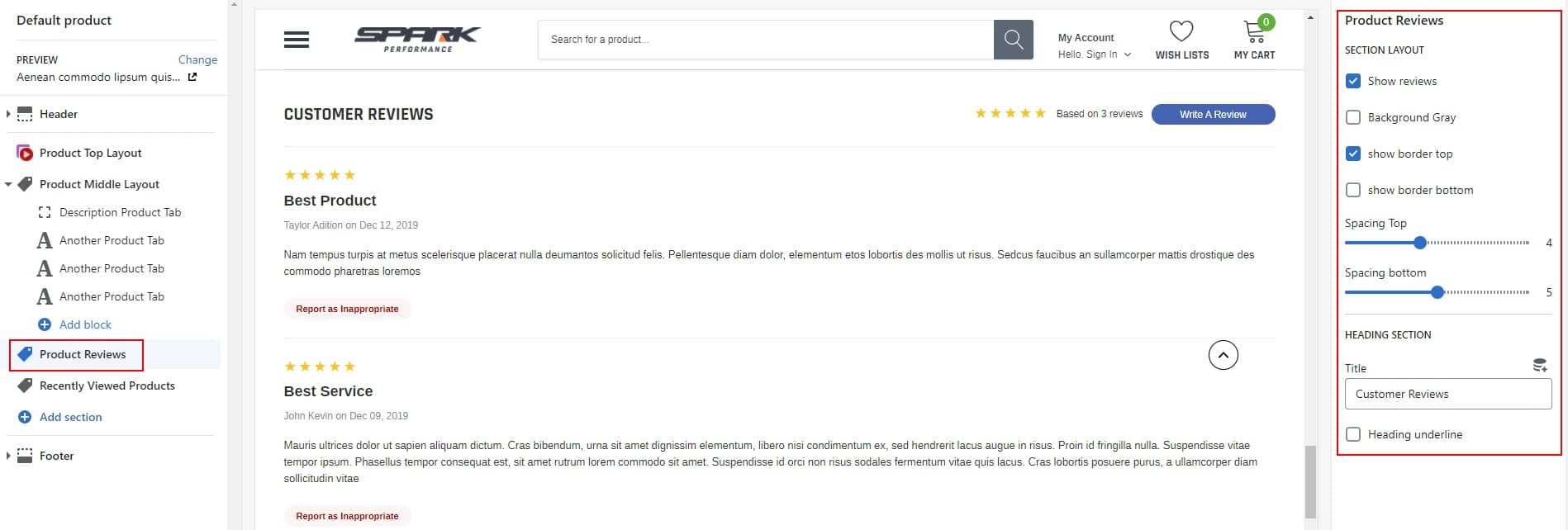
5. Review
Please Click Review tab to edit content for it.
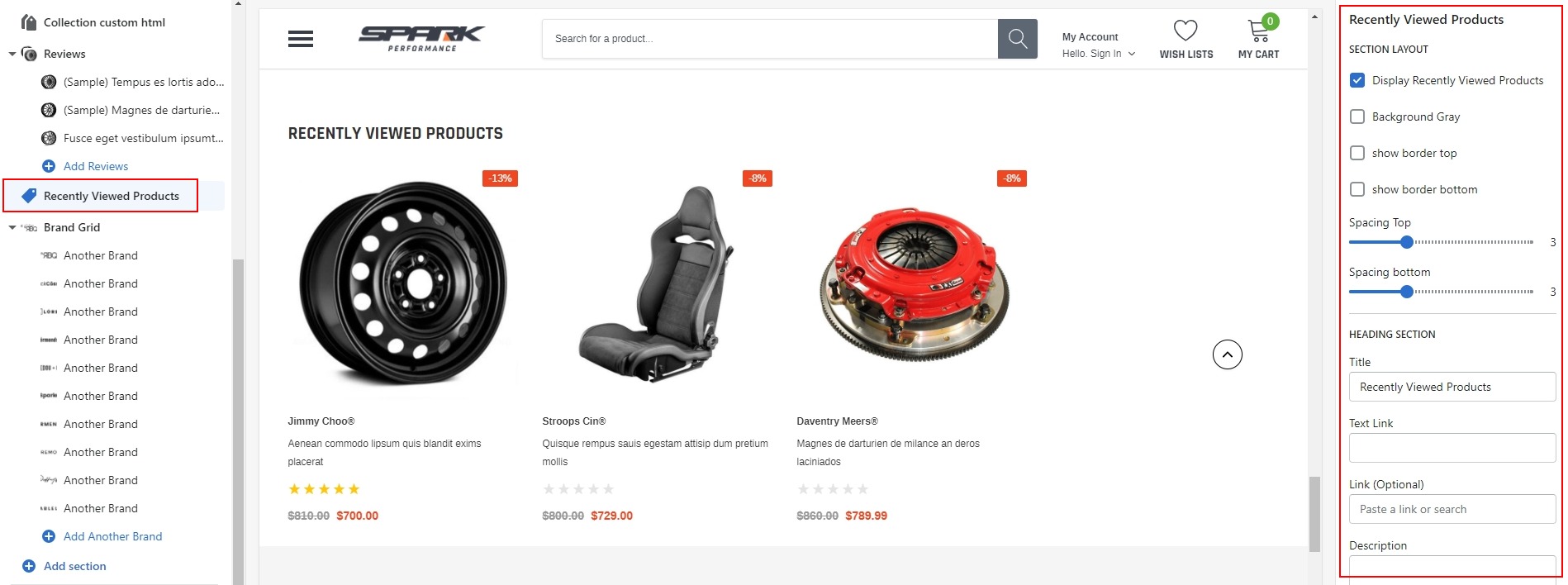
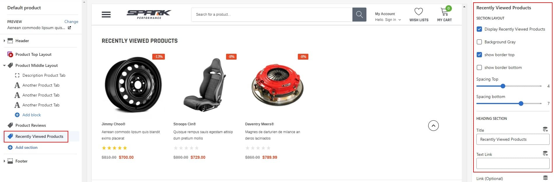
6. Recently Viewed Products
Click Recently Viewed Products tab to edit content for it.
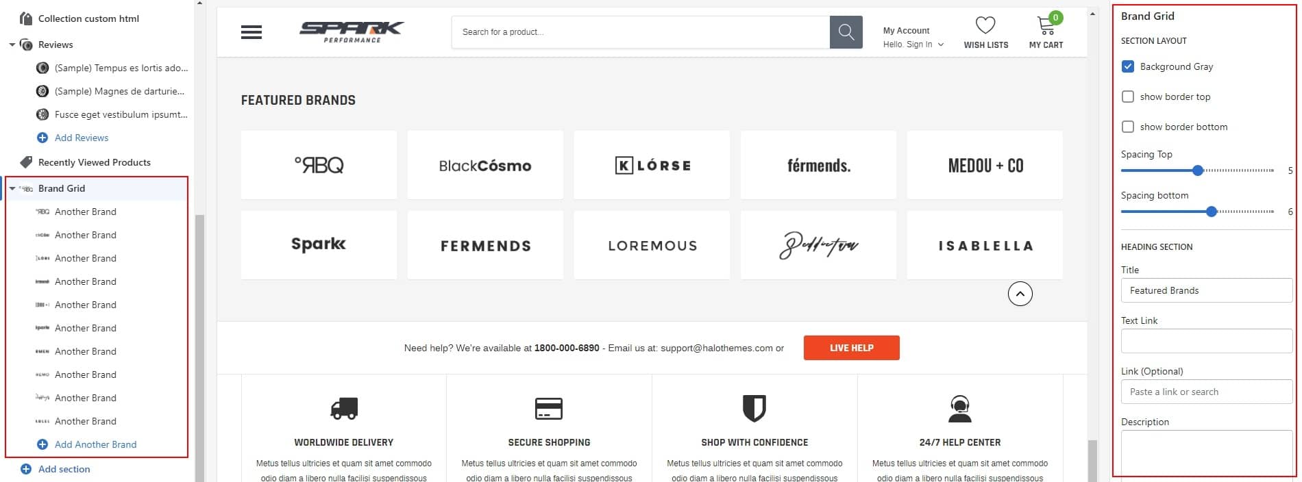
7. Brand Grid
Click Brand Grid tab to edit content for it.
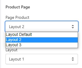
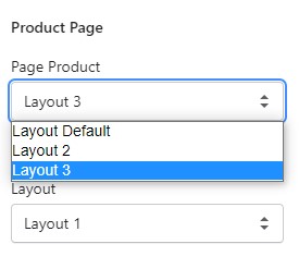
Product Page
At this time with Spark theme, we offer you 03 Product Page Layouts. You can choose 1 of 3 layouts for your site:
Please see below for more detailed instruction:
-
In Theme Settings Tab, click General
-
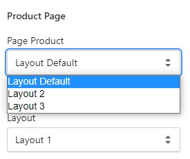
In General, Please scroll to Product Page and choose 1 of 3 layouts Product: Layout Default, Layout 2 or Layout 3.
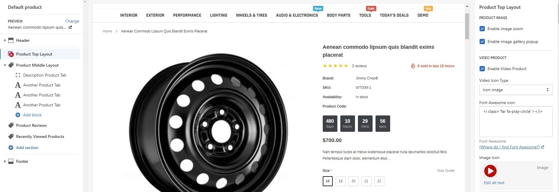
Product Default
-
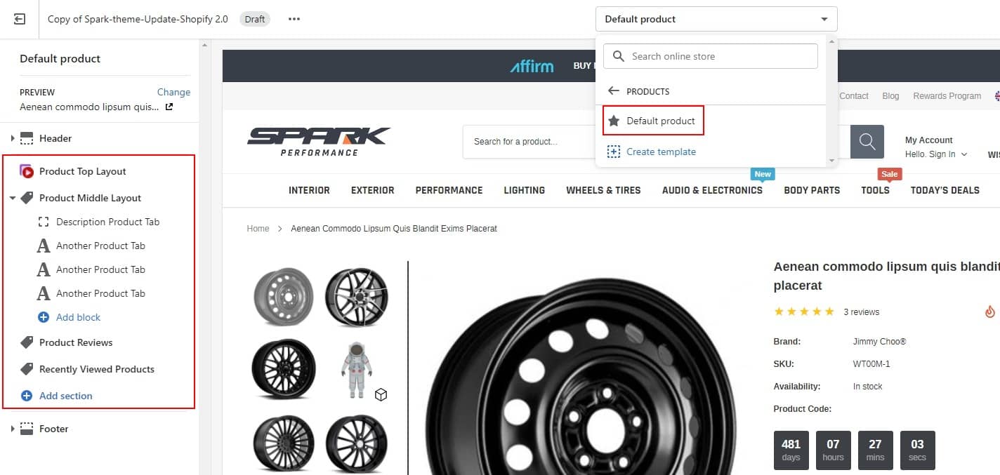
At Theme Settings Tab -> General, Please scroll to Product Page and choose layout Default.
-
Then click Products on the dropdown window, choose Default product tab.
-
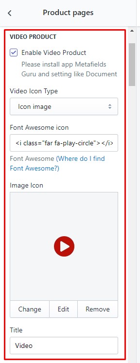
Edit icon video / Instruction / Warranty:
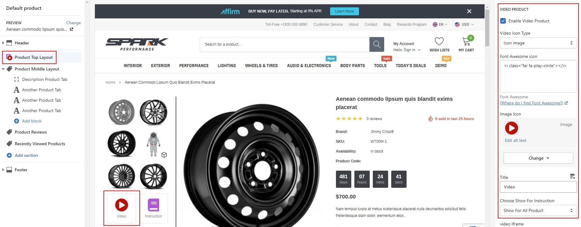

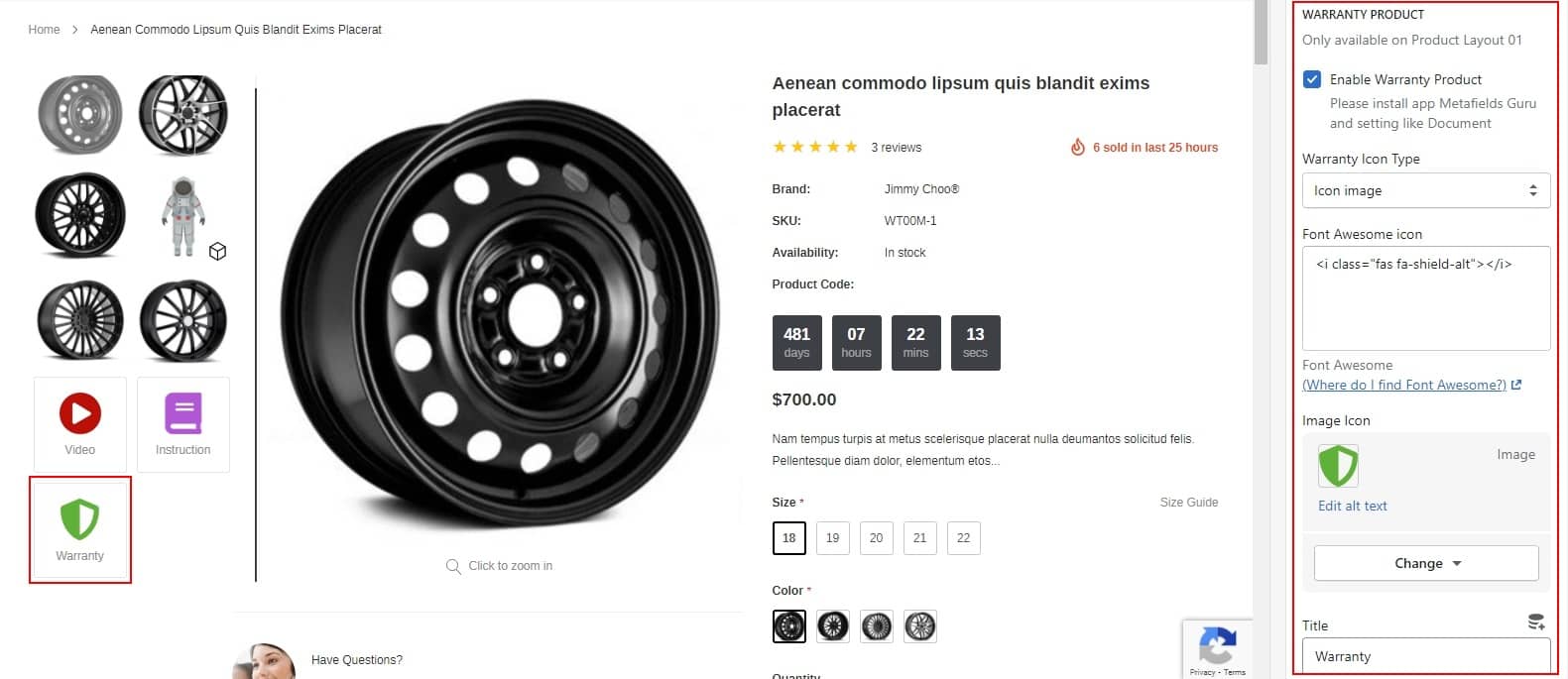
-
Show video popup, Instruction popup, Warranty popup
Step 1: Type All information for section Video product, Instruction product and Warranty product
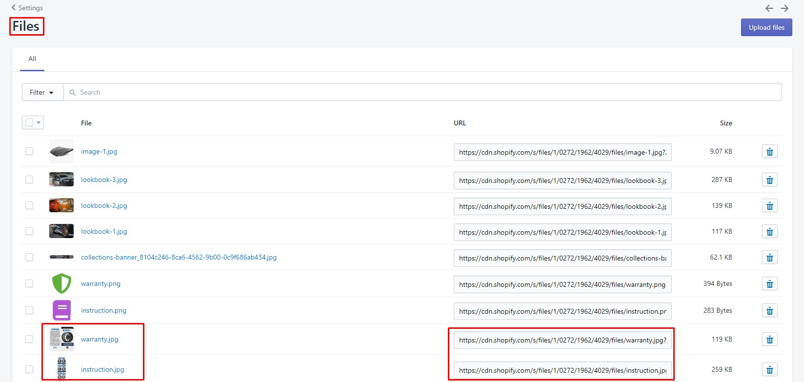
Step 2: Go to file to upload your images and get link of image
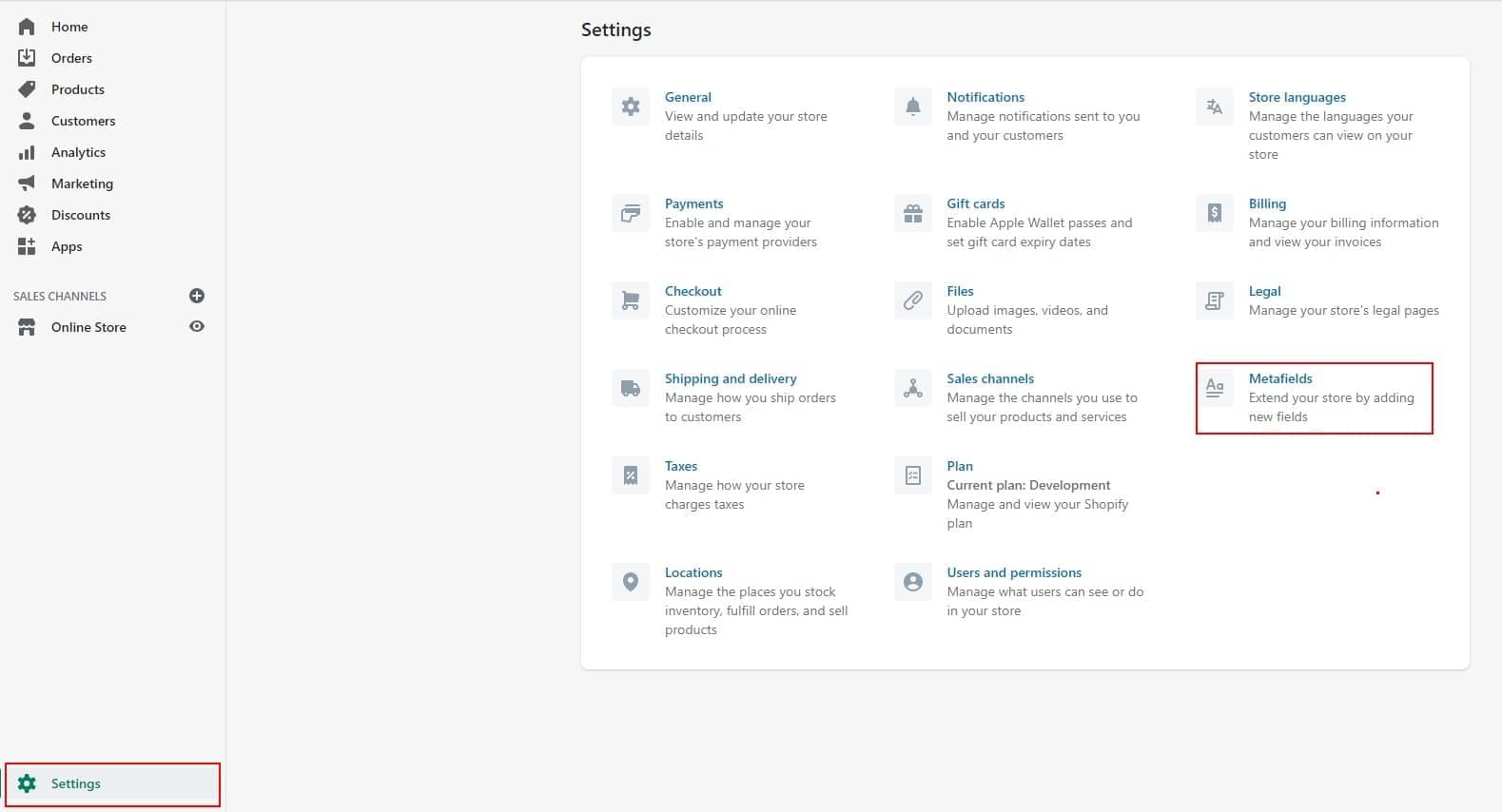
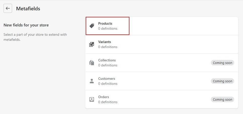
Step 03: From your Shopify admin, go to Settings → Metafields → Click Products → Click Add Definition
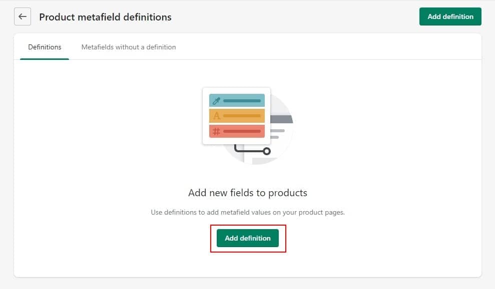
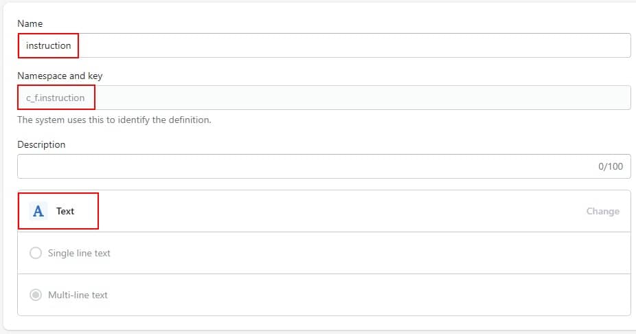
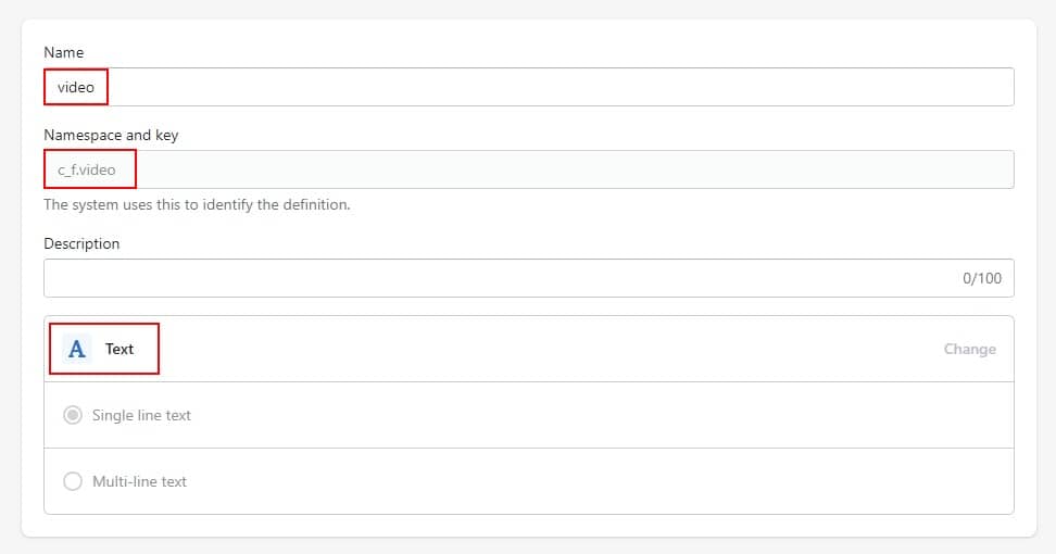
On that page, please enter the information exactly as shown below. Remember to use the correct Namespace and key we noted below
- For Instruction:
Name: instruction
Namespace and key: c_f.instruction
Value type: Text
- For Video:
Name: video
Namespace and key: c_f.video/
Value type: Text
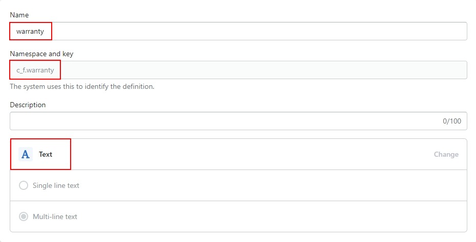
- For Warranty:
Name: warranty
Namespace and key: c_f.warranty
Value type: Text
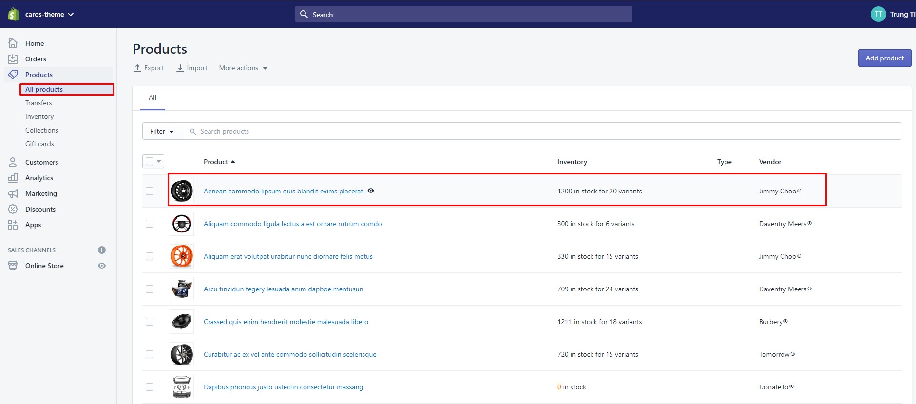
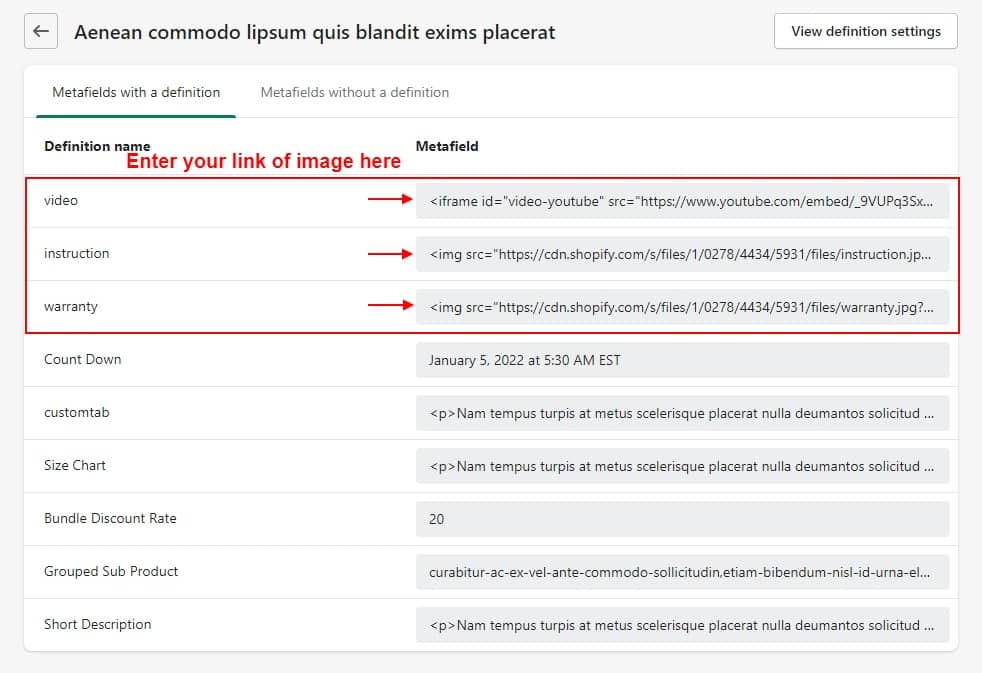
Step 4: Go to product you want show Video product, Instruction product and Warranty product. Scroll down to the bottom at Metafields, click View All
Step 5: Here will appear the Metafields that you created in step 3.
-
Edit Contact:

-
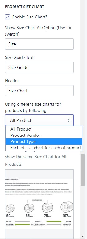
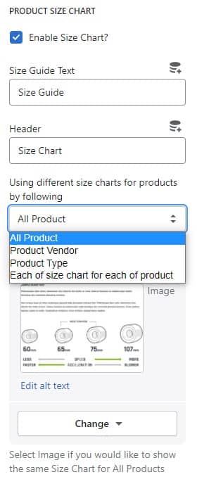
Setup Size Chart:
You have 4 options to show Size Chart: Using a Product Type, Product Vendor, Different for each product or Use the same size chart for all products.
1 - Product Type
Upload image with the same name as the product-type-sizechart (please use JPG image). You need to go to Settings --> Files upload images here.
Naming convention: lower cap and use "-" to replace white space.
For example: with the product type "Loremous Comodous" the image name will be loremous-comodous-sizechart.jpg2 - Product Vendor
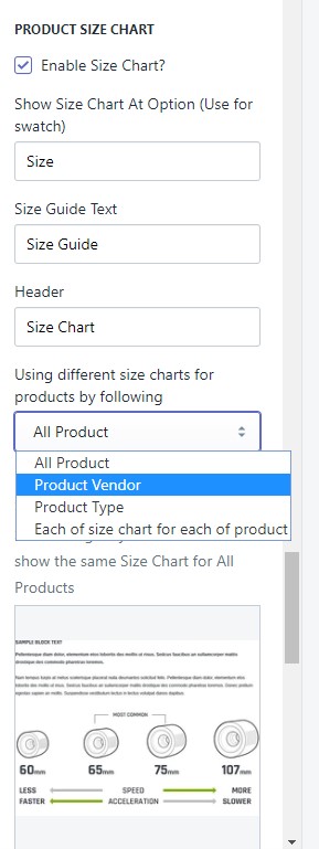
Upload image with the same name as the product-vendor-sizechart (please use JPG image). You need to go to Settings --> Files upload images here.
Naming convention: lower cap and use "-" to replace white space.
For example: with the vendor "Benjamin Button" the icon name will be benjamin-button-sizechart.jpg3 - Use the same size chart for all products.
4 - Different for each product
How to setup Size Chart for each product:
Step 1: Enable Add On Size Chart and choose below option
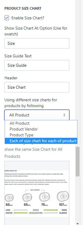
Step 2: In the admin window please select settings
Step 3: Please select Metafields
Step 4: Please select Products
Step 5: Please select Add Metafields
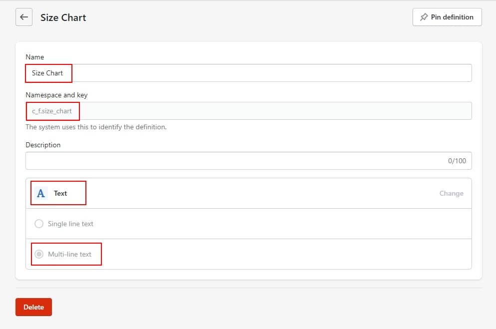
Step 6: Please enter information exactly as described below.
Name: Size Chart
Namespace and key: c_f.size_chart
Value type: Text
Step 7: Go to product you want to show Size Chart. After that, in section Metafields --> Click View all
Step 8: Here will appear the Metafields that you created in step 6.
Step 9: Please navigate to Size Chart and paste your size chart image link.
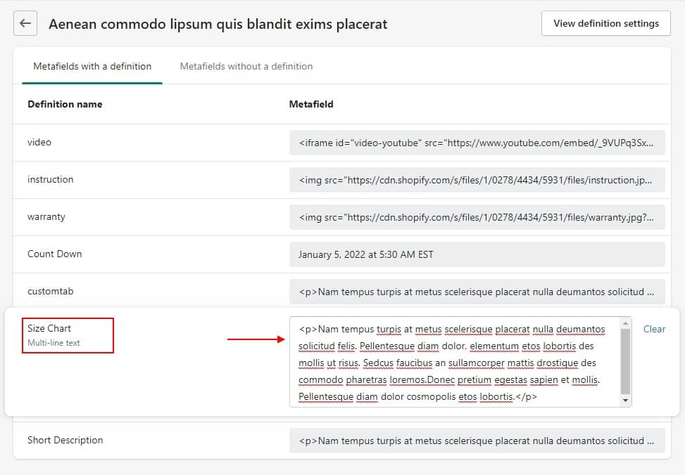
You can use Text, Table, Image for size chart. If you want to show image for size chart, remember to put your image link into this code: <img src="put your image link here" alt=""/>
Example: <img src="https://cdn.shopify.com/s/files/1/0450/6340/5729/files/size-chart.png?v=1614360017" alt=""/>
-
Show Count Down

Step 01: From your Shopify admin, go to Settings → Metafields → Click Products → Click Add Definition
Step 02: On that page, please enter the information exactly as shown below. Remember to use the correct Namespace and key we noted below
Name: Countdown
Namespace and key: c_f.countdown
Value type: Data and time
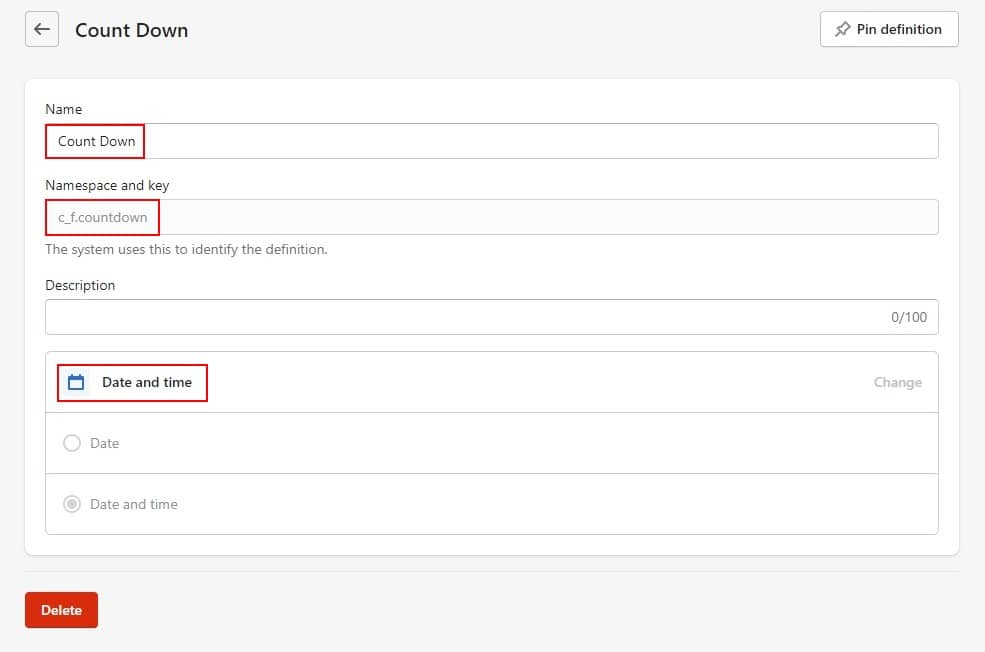
Please use this exact format: yyyy/mm/dd hour/minute/second.
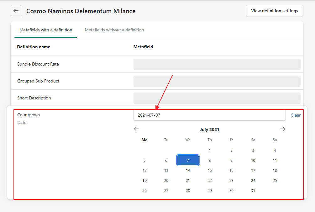
Example: 2020/12/12 0:0:00.Step 3: Go to product you want to show Countdown. After that, in section Metafields --> Click View all
Step 4: Here will appear the Metafields that you created in step 2. Please navigate to Countdown and select the date you want.
Products 02
-
At Theme Settings Tab -> General, Please scroll to Product Page and choose layout Default.
-
Then click Products on the dropdown window, choose Default product tab.
-
You can Edit Product 02 like example product default

Product 3
-
At Theme Settings Tab -> General, Please scroll to Product Page and choose layout Default.
-
Then click Products on the dropdown window, choose Default product tab.
-
You can Edit Product 03 like example product default
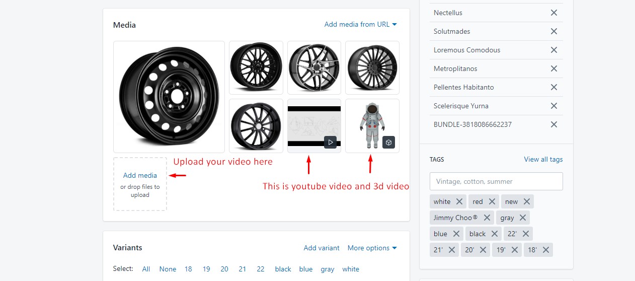
Adding Media Video
There are 2 ways to show Video for each of Product
01: First way: Setting in product using metafield to show video as a popup as we instructed you above here
02: Second way: Add Media such as 3D models, embedded videos, and YouTube videos to show as thumbnail
From your Shopify admin, click Products → Click the product you would like to insert video.
Frequently Bought Together
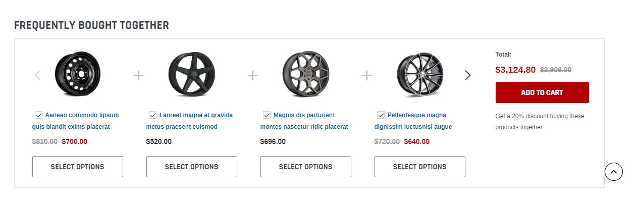
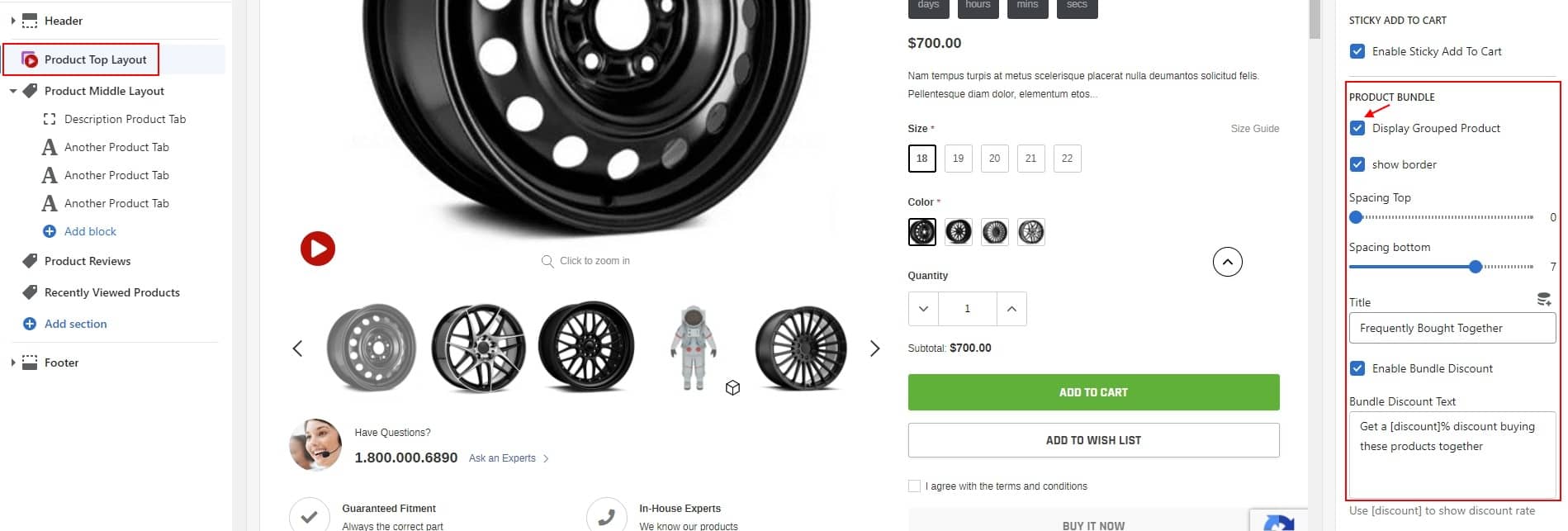
HOW TO CREATE BUNDLE AND SETUP DISCOUNT FOR BUNDLE?
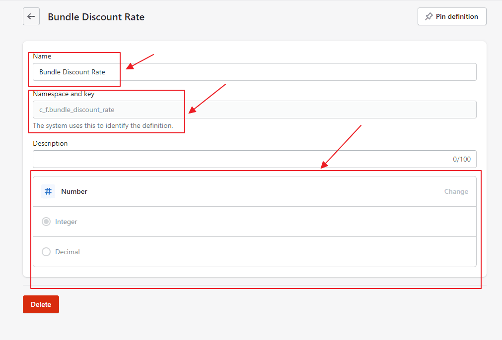
I: Create Bundle Discount Rate.
Please please follow this instructions below:
Step 1: In the admin window please select settings
Step 2: Please select Metafields
Step 3: Please select Products
Step 4: Please select Add Metafields
Step 5: Please enter information exactly as described below.
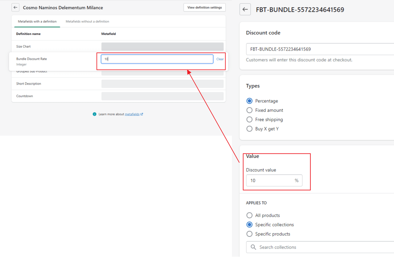
Name: Bundle Discount Rate
Namespace and key: c_f.bundle_discount_rate
Value type: number
Step 6: Go to Main Product admin page of bundle. After that, in section Metafields --> Click View all
Step 7: Here will appear the Metafields that you created in step 5.
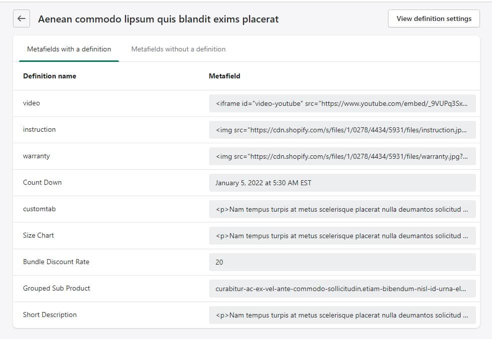
Step 8: Please navigate to Bundle Discount Rate add discount rate equal to Discount value which you have just added in Discount Settings.
II: Create Grouped Sub Product.
Then please please follow this instructions below:
Step 1: In the admin window please select settings
Step 2: Please select Metafields
Step 3: Please select Products
Step 4: Please select Add Metafields
Step 5: Please enter information exactly as described below.
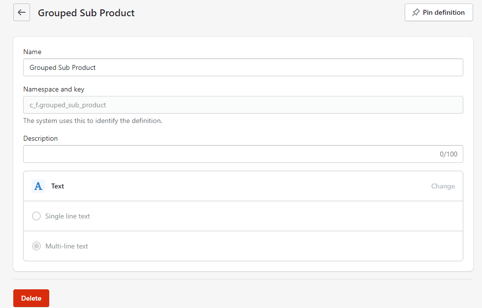
Name: Grouped Sub Product
Namespace and key: c_f.grouped_sub_product
Value type: Text
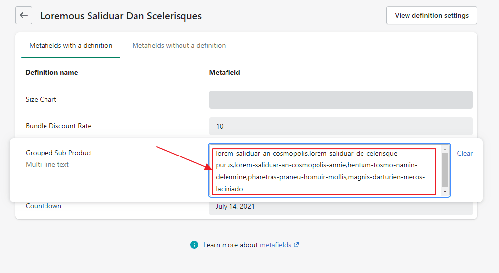
Step 6: Go to Main Product admin page of bundle. After that, in section Metafields --> Click View all
Step 7: Here will appear the Metafields that you created in step 5.
Step 8: Please add the handles of sub products here
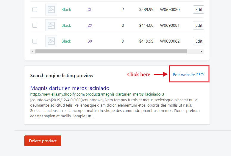
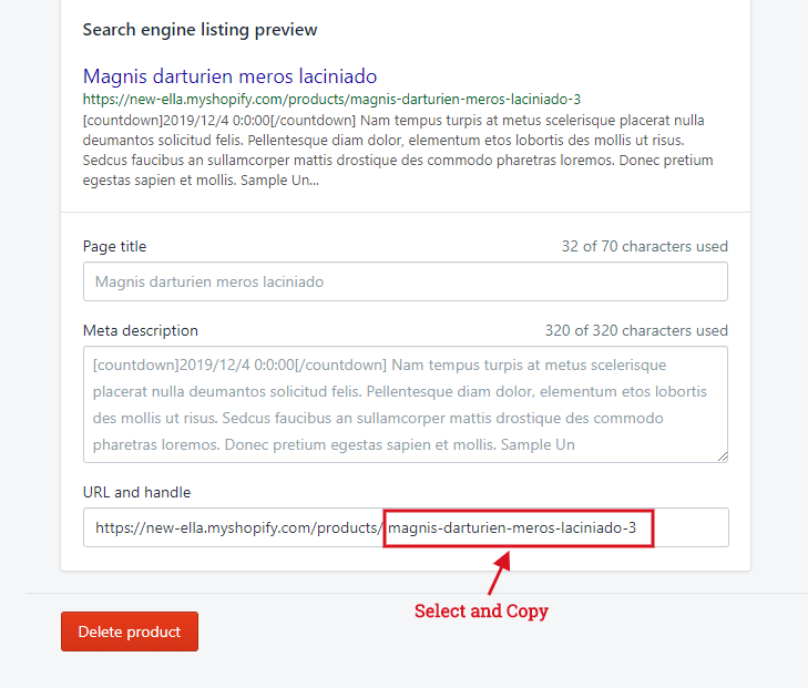
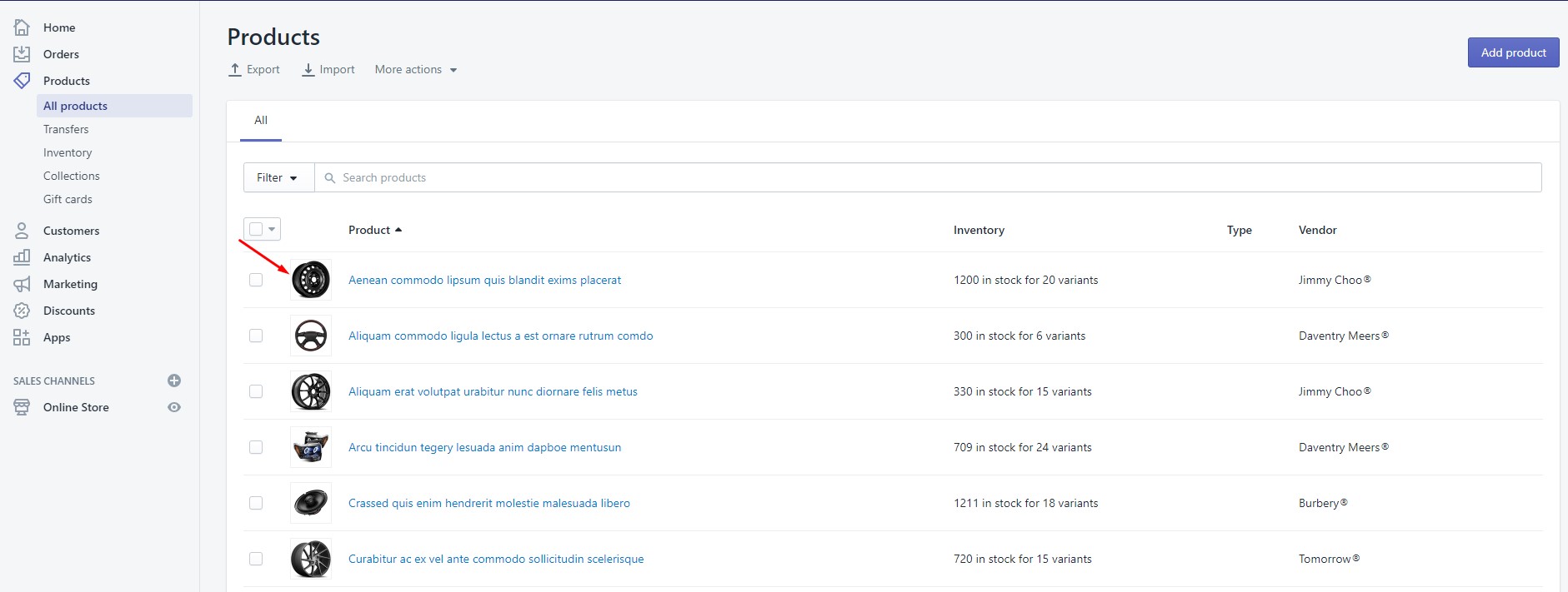
To get Sub product handle, please go to Admin -> Products -> choose Sub Product -> scroll down at the bottom to see Search engine listing preview -> click Edit website SEO -> copy Product handle.
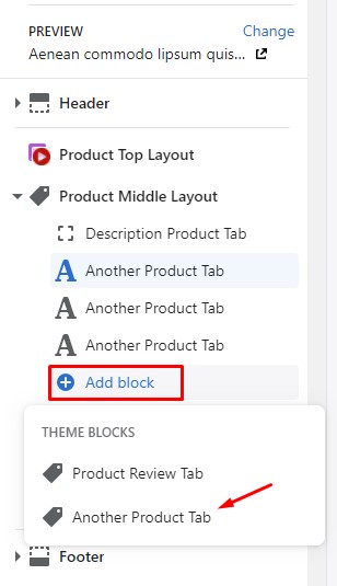
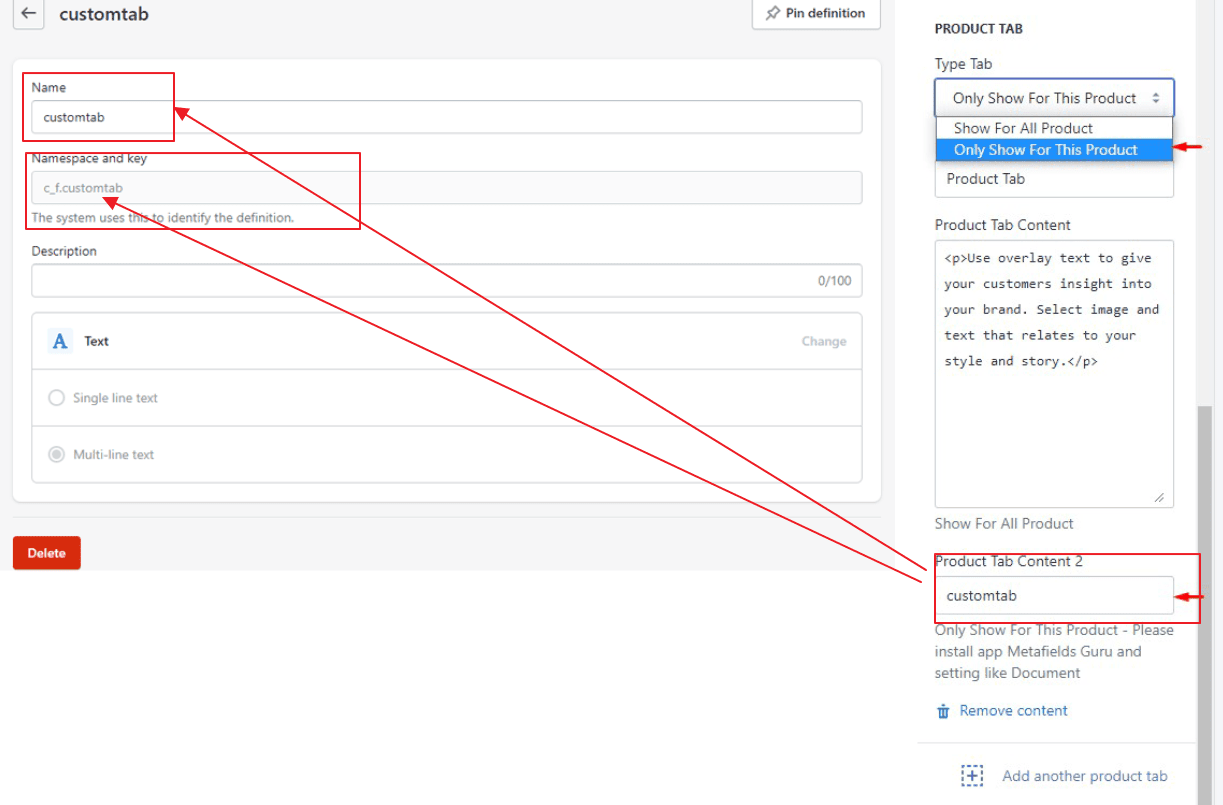
Product Tab
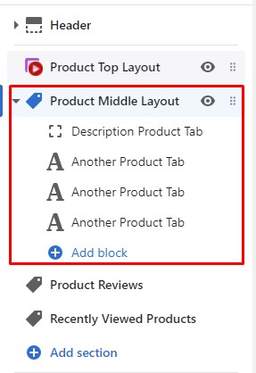
Showing Different content for Custom Product Tab for each of Product
-
Step 1: Create new tab
-
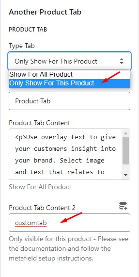
Step 2: In form Type Tab, Please choose "Only show for This Product"
-
Step 3: In form Product Tab Content 2, Please type "customtab"
-
Step 4: In the admin window please select settings
-
Step 5: Please select Metafields
-
Step 6: Please select Products
-
Step 7: Please select Add Metafields
-
Step 8: Please enter information exactly as described below.
Name: Use the same name of what you put in Product Tab Content 2 at Step 3
Namespace and key: c_f.(Use the same name of what you put in Product Tab Content 2 at Step 3)
Value type: Text
Example we are using: customtab
-
Step 9: Go to product you want to show Short Description. After that, in section Metafields --> Click View all
-
Step 10: Here will appear the Metafields that you created in step 8.
-
Step 8: Please navigate to Custom tab and select the date you want.
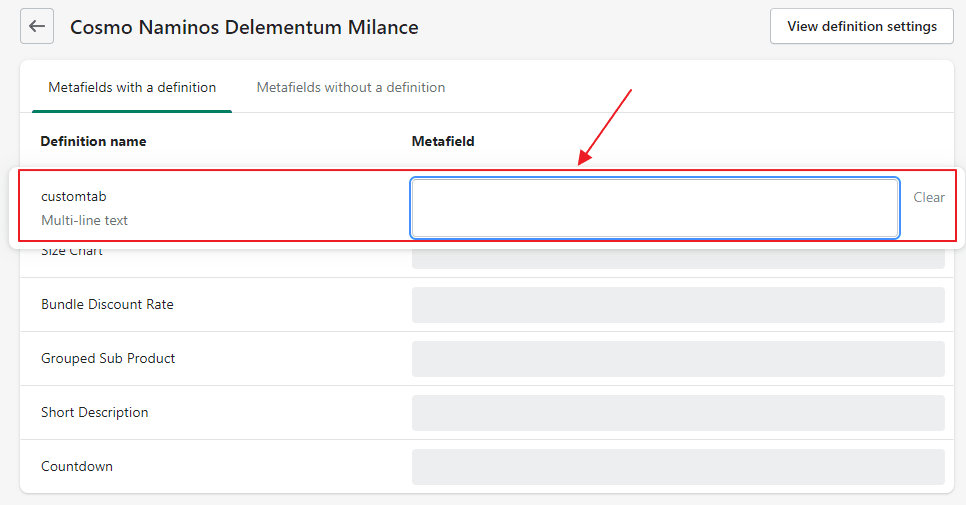
In case you want to create multiple product tabs, make sure the name in Product Tab Content 2 and the Key in metafield for each tab will be different. Example we are using: customtab, customtab1, customtab2
Because FAQ tab has its own style, we will help you use our tool to edit your texts of this tab content and then copy & paste into theme setting below
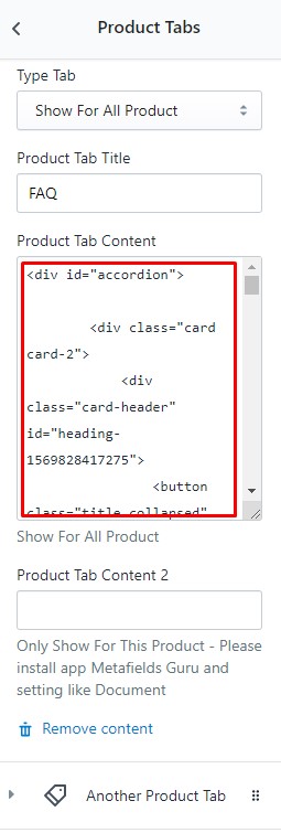
Recommended: HTML for FAQ tab
<div id="accordion">
    <div class="card card-2">
        <div class="card-header" id="heading-1569828417275">
            <button class="title collapsed" data-toggle="collapse" data-target="#1569828417275" aria-expanded="true" aria-controls="1569828417275">
                Will your template be fully compatible with Shopify?
            </button>
            <svg aria-hidden="true" focusable="false" role="presentation" class="icon icon--wide icon-chevron-down" viewbox="0 0 498.98 284.49"><defs></defs><path class="cls-1" d="M80.93 271.76A35 35 0 0 1 140.68 247l189.74 189.75L520.16 247a35 35 0 1 1 49.5 49.5L355.17 511a35 35 0 0 1-49.5 0L91.18 296.5a34.89 34.89 0 0 1-10.25-24.74z" transform="translate(-80.93 -236.76)"></path></svg>
        </div>
        <div id="1569828417275" class="collapse" aria-labelledby="heading-1569828417275" data-parent="#accordion">
            <div class="card-body">
                <p>Yes it is.</p>
            </div>
        </div>
    </div>
    <div class="card card-2">
        <div class="card-header" id="heading-1569828878550">
            <button class="title collapsed" data-toggle="collapse" data-target="#1569828878550" aria-expanded="true" aria-controls="1569828878550">
                I cannot upload the theme to my Shopify store / Shopify alerts that the file is too big to upload, what is the problem?
            </button>
            <svg aria-hidden="true" focusable="false" role="presentation" class="icon icon--wide icon-chevron-down" viewbox="0 0 498.98 284.49"><defs></defs><path class="cls-1" d="M80.93 271.76A35 35 0 0 1 140.68 247l189.74 189.75L520.16 247a35 35 0 1 1 49.5 49.5L355.17 511a35 35 0 0 1-49.5 0L91.18 296.5a34.89 34.89 0 0 1-10.25-24.74z" transform="translate(-80.93 -236.76)"></path></svg>
        </div>
        <div id="1569828878550" class="collapse" aria-labelledby="heading-1569828878550" data-parent="#accordion">
            <div class="card-body">
                <p>Please make sure that you follow below steps:</p>
<p>1/ Download the package from themeforest.net (the file is in zip format)<br><br>2/ Extract the file you've just downloaded.<br><br>3/ Find this file: Spark-1.0.0-sections-ready.zip in the folder Spark Sections Ready 1.0.0, then you just need to upload Spark-1.0.0-sections-ready.zip file to your Shopify store.<br></p>
            </div>
        </div>
    </div>
    <div class="card card-2">
        <div class="card-header" id="heading-1569828968822">
            <button class="title collapsed" data-toggle="collapse" data-target="#1569828968822" aria-expanded="true" aria-controls="1569828968822">
                What I have to do when I need your support?
            </button>
            <svg aria-hidden="true" focusable="false" role="presentation" class="icon icon--wide icon-chevron-down" viewbox="0 0 498.98 284.49"><defs></defs><path class="cls-1" d="M80.93 271.76A35 35 0 0 1 140.68 247l189.74 189.75L520.16 247a35 35 0 1 1 49.5 49.5L355.17 511a35 35 0 0 1-49.5 0L91.18 296.5a34.89 34.89 0 0 1-10.25-24.74z" transform="translate(-80.93 -236.76)"></path></svg>
        </div>
        <div id="1569828968822" class="collapse" aria-labelledby="heading-1569828968822" data-parent="#accordion">
            <div class="card-body">
                <p>To save your time and reach our support quickly, please follow below steps:</p>
<p>1/ Create a staff account for us (with Themes permission and Settings permission) <a href="http://docs.shopify.com/manual/settings/account/staff-members" title="http://docs.shopify.com/manual/settings/account/staff-members" aria-describedby="a11y-external-message">http://docs.shopify.com/manual/settings/account/staff-members</a></p>
<p>2/ Capture screenshot or video for the issue you get.</p>
<p>3/ Specify which template and version you are using.</p>
<p>4/ Describe clearly how to reproduce the issue.</p>
<p>5/ Send all information (staff account, screenshot, video, template name and version, description of the issues, link) to <a href="mailto:support@halothemes.com" title="mailto:support@halothemes.com" aria-describedby="a11y-external-message">support@halothemes.com</a></p>
            </div>
        </div>
    </div>
    <div class="card card-2">
        <div class="card-header" id="heading-1569829479298">
            <button class="title collapsed" data-toggle="collapse" data-target="#1569829479298" aria-expanded="true" aria-controls="1569829479298">
                Would assistance be available to upload the template if needed?
            </button>
            <svg aria-hidden="true" focusable="false" role="presentation" class="icon icon--wide icon-chevron-down" viewbox="0 0 498.98 284.49"><defs></defs><path class="cls-1" d="M80.93 271.76A35 35 0 0 1 140.68 247l189.74 189.75L520.16 247a35 35 0 1 1 49.5 49.5L355.17 511a35 35 0 0 1-49.5 0L91.18 296.5a34.89 34.89 0 0 1-10.25-24.74z" transform="translate(-80.93 -236.76)"></path></svg>
        </div>
        <div id="1569829479298" class="collapse" aria-labelledby="heading-1569829479298" data-parent="#accordion">
            <div class="card-body">

                <p>Yes, we will assist you to install the template if needed</p>
            </div>
        </div>
    </div>
    <div class="card card-2">
        <div class="card-header" id="heading-1569830261920">
            <button class="title collapsed" data-toggle="collapse" data-target="#1569830261920" aria-expanded="true" aria-controls="1569830261920">
                Do you guys offer customisation services for your themes?
            </button>
            <svg aria-hidden="true" focusable="false" role="presentation" class="icon icon--wide icon-chevron-down" viewbox="0 0 498.98 284.49"><defs></defs><path class="cls-1" d="M80.93 271.76A35 35 0 0 1 140.68 247l189.74 189.75L520.16 247a35 35 0 1 1 49.5 49.5L355.17 511a35 35 0 0 1-49.5 0L91.18 296.5a34.89 34.89 0 0 1-10.25-24.74z" transform="translate(-80.93 -236.76)"></path></svg>
        </div>
        <div id="1569830261920" class="collapse" aria-labelledby="heading-1569830261920" data-parent="#accordion">
            <div class="card-body">
                <p>Yes, we do. Please send your customisation requests to <a href="mailto:support@halothemes.com" title="mailto:support@halothemes.com" aria-describedby="a11y-external-message">support@halothemes.com</a>, we will give you our quote. Thank you.</p>
            </div>
        </div>
    </div>
    <div class="card card-2">
        <div class="card-header" id="heading-1569830303138">
            <button class="title collapsed" data-toggle="collapse" data-target="#1569830303138" aria-expanded="true" aria-controls="1569830303138">
                Can I turn on/off Lazy Loading Image / Item Animation / Fade Up on the page?
            </button>
            <svg aria-hidden="true" focusable="false" role="presentation" class="icon icon--wide icon-chevron-down" viewbox="0 0 498.98 284.49"><defs></defs><path class="cls-1" d="M80.93 271.76A35 35 0 0 1 140.68 247l189.74 189.75L520.16 247a35 35 0 1 1 49.5 49.5L355.17 511a35 35 0 0 1-49.5 0L91.18 296.5a34.89 34.89 0 0 1-10.25-24.74z" transform="translate(-80.93 -236.76)"></path></svg>
        </div>
        <div id="1569830303138" class="collapse" aria-labelledby="heading-1569830303138" data-parent="#accordion">
            <div class="card-body">
                <p>Yes. You can turn on/off the animation in the Setting page.</p>
            </div>
        </div>
    </div>
    <div class="card card-2">
        <div class="card-header" id="heading-1569830330055">
            <button class="title collapsed" data-toggle="collapse" data-target="#1569830330055" aria-expanded="true" aria-controls="1569830330055">
                Can I turn on/off some blocks on the page?
            </button>
            <svg aria-hidden="true" focusable="false" role="presentation" class="icon icon--wide icon-chevron-down" viewbox="0 0 498.98 284.49"><defs></defs><path class="cls-1" d="M80.93 271.76A35 35 0 0 1 140.68 247l189.74 189.75L520.16 247a35 35 0 1 1 49.5 49.5L355.17 511a35 35 0 0 1-49.5 0L91.18 296.5a34.89 34.89 0 0 1-10.25-24.74z" transform="translate(-80.93 -236.76)"></path></svg>
        </div>
        <div id="1569830330055" class="collapse" aria-labelledby="heading-1569830330055" data-parent="#accordion">
            <div class="card-body">

                <p>Yes. You can turn on/off almost any blocks on the page (featured products, slideshow, banners, related products, recent products,...).</p>
            </div>
        </div>
    </div>
    <div class="card card-2">
        <div class="card-header" id="heading-1569830354345">
            <button class="title collapsed" data-toggle="collapse" data-target="#1569830354345" aria-expanded="true" aria-controls="1569830354345">
                I want to have the dropdown cart displayed automatically every time clients hover over it (instead of clicking on it). Is it possible?
            </button>

            <svg aria-hidden="true" focusable="false" role="presentation" class="icon icon--wide icon-chevron-down" viewbox="0 0 498.98 284.49"><defs></defs><path class="cls-1" d="M80.93 271.76A35 35 0 0 1 140.68 247l189.74 189.75L520.16 247a35 35 0 1 1 49.5 49.5L355.17 511a35 35 0 0 1-49.5 0L91.18 296.5a34.89 34.89 0 0 1-10.25-24.74z" transform="translate(-80.93 -236.76)"></path></svg>
        </div>
        <div id="1569830354345" class="collapse" aria-labelledby="heading-1569830354345" data-parent="#accordion">
            <div class="card-body">

                <p>Yes, we have a setting for you to switch between these two options: Display on Hover and Display on Click.</p>
            </div>
        </div>
    </div>
    <div class="card card-2">
        <div class="card-header" id="heading-1569830380421">
            <button class="title collapsed" data-toggle="collapse" data-target="#1569830380421" aria-expanded="true" aria-controls="1569830380421">
                What is included in the theme package?
            </button>
            <svg aria-hidden="true" focusable="false" role="presentation" class="icon icon--wide icon-chevron-down" viewbox="0 0 498.98 284.49"><defs></defs><path class="cls-1" d="M80.93 271.76A35 35 0 0 1 140.68 247l189.74 189.75L520.16 247a35 35 0 1 1 49.5 49.5L355.17 511a35 35 0 0 1-49.5 0L91.18 296.5a34.89 34.89 0 0 1-10.25-24.74z" transform="translate(-80.93 -236.76)"></path></svg>
        </div>
        <div id="1569830380421" class="collapse" aria-labelledby="heading-1569830380421" data-parent="#accordion">
            <div class="card-body">
                <p>The theme package includes theme source, Photoshop design files, sample data and manual guide.</p>
            </div>
        </div>
    </div>
    <div class="card card-2">
        <div class="card-header" id="heading-1569830404635">
            <button class="title collapsed" data-toggle="collapse" data-target="#1569830404635" aria-expanded="true" aria-controls="1569830404635">
                I notice that the images used in the theme are all portrait. Will that be a problem if I use square images for our products? How will they be displayed in the theme?
            </button>
            <svg aria-hidden="true" focusable="false" role="presentation" class="icon icon--wide icon-chevron-down" viewbox="0 0 498.98 284.49"><defs></defs><path class="cls-1" d="M80.93 271.76A35 35 0 0 1 140.68 247l189.74 189.75L520.16 247a35 35 0 1 1 49.5 49.5L355.17 511a35 35 0 0 1-49.5 0L91.18 296.5a34.89 34.89 0 0 1-10.25-24.74z" transform="translate(-80.93 -236.76)"></path></svg>
        </div>
        <div id="1569830404635" class="collapse" aria-labelledby="heading-1569830404635" data-parent="#accordion">
            <div class="card-body">

                <p>That is not a problem. You just need to modify the width/height ratio in theme settings.</p>
            </div>
        </div>
    </div>
</div>
Or use this tool to generate the code with your own texts. Fill in your questions & answers and then copy code:
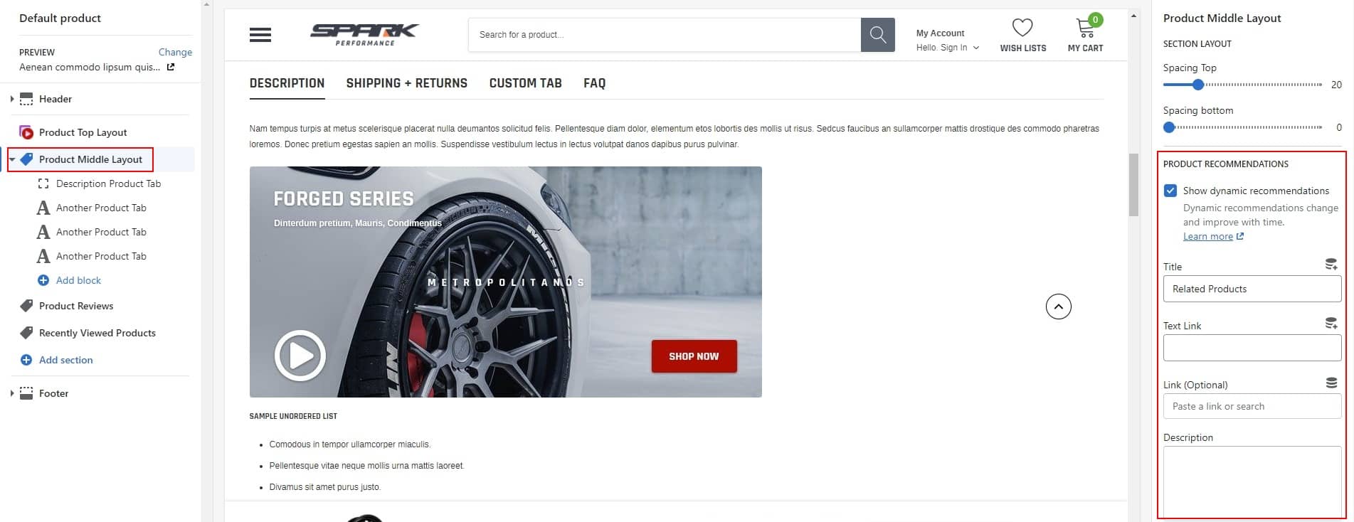
Product Recommendations
Product Review
Recently Viewed Products
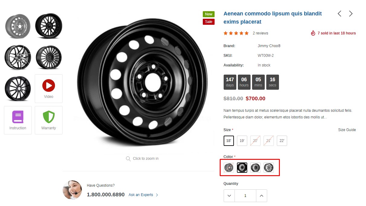
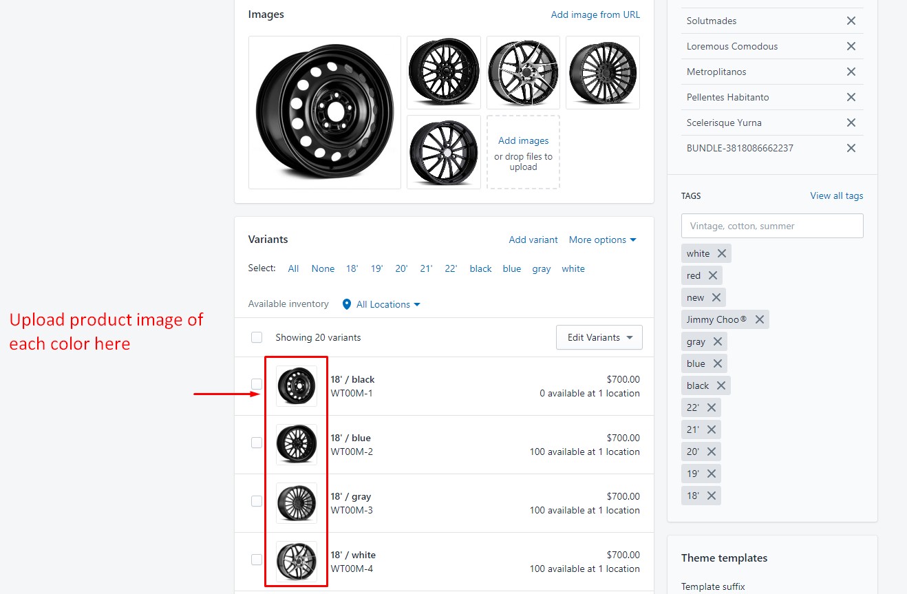
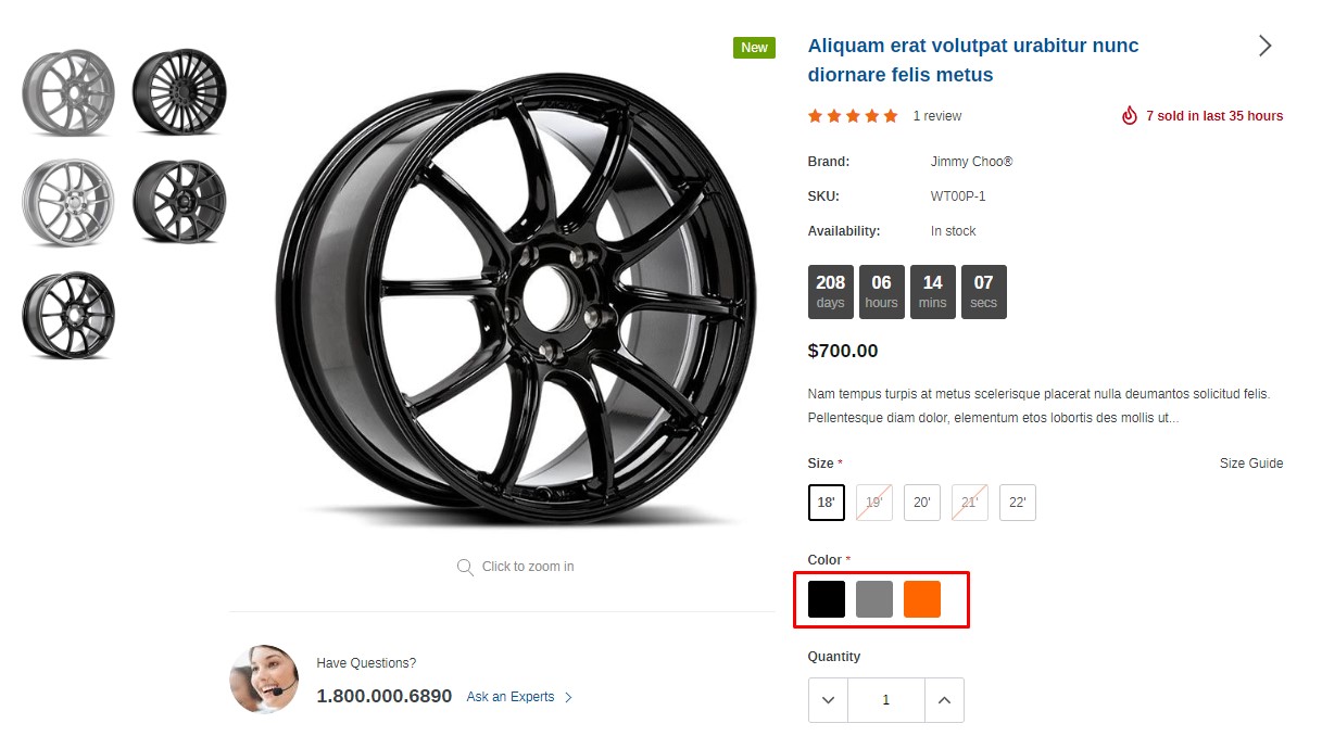
Using of Variant images and Color Variant
With Spark theme, you can show Product variant image or Color variant swatch image like below
A. Add images to your product variants for Color
1. From your Shopify admin, click Products, then click on the product you would like to add
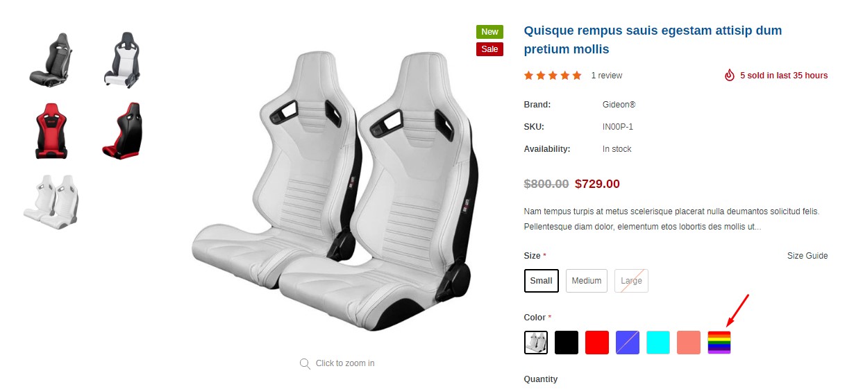
B. Add Color Swatch for product
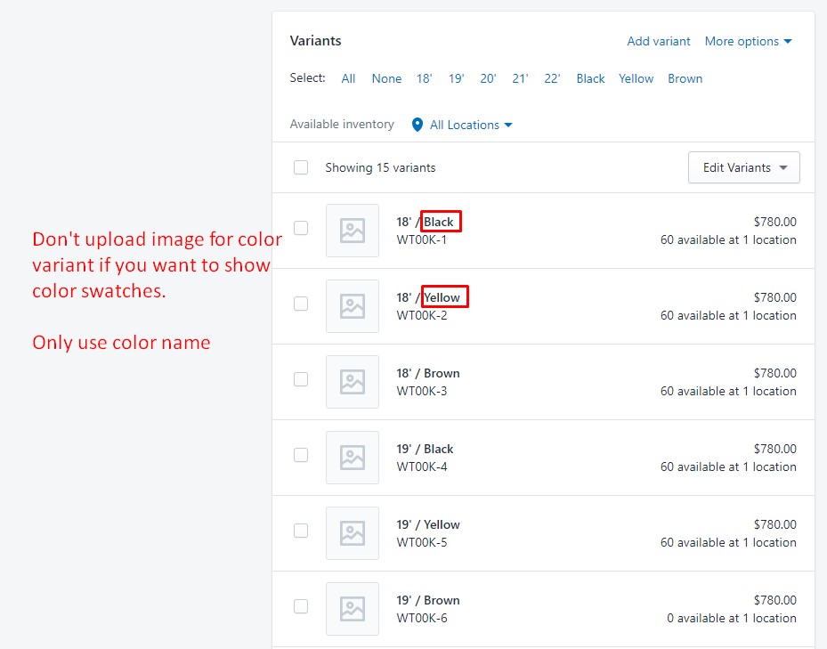
C. Add special color image
In case your products have special color, and you want it to show as color swatch, please use this below instruction
Upload image with the same name as the variant color name (please use PNG image). You need to go to Settings → Files -> Upload Files
Naming convention: Lower cap and use "-" to replace white space.
For example: with the option name "Custom Color" the icon name will be custom-color.png.
Blog Pages
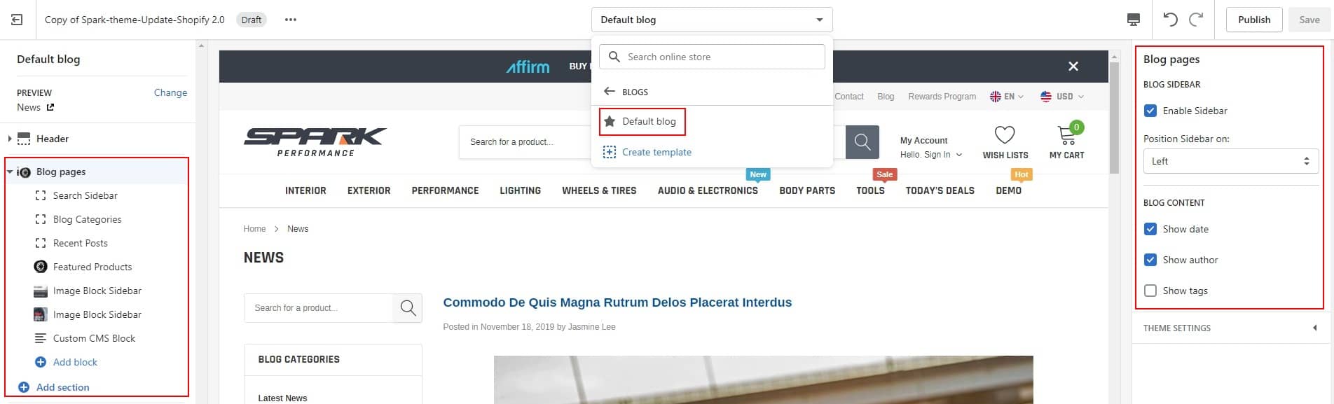
Article Pages
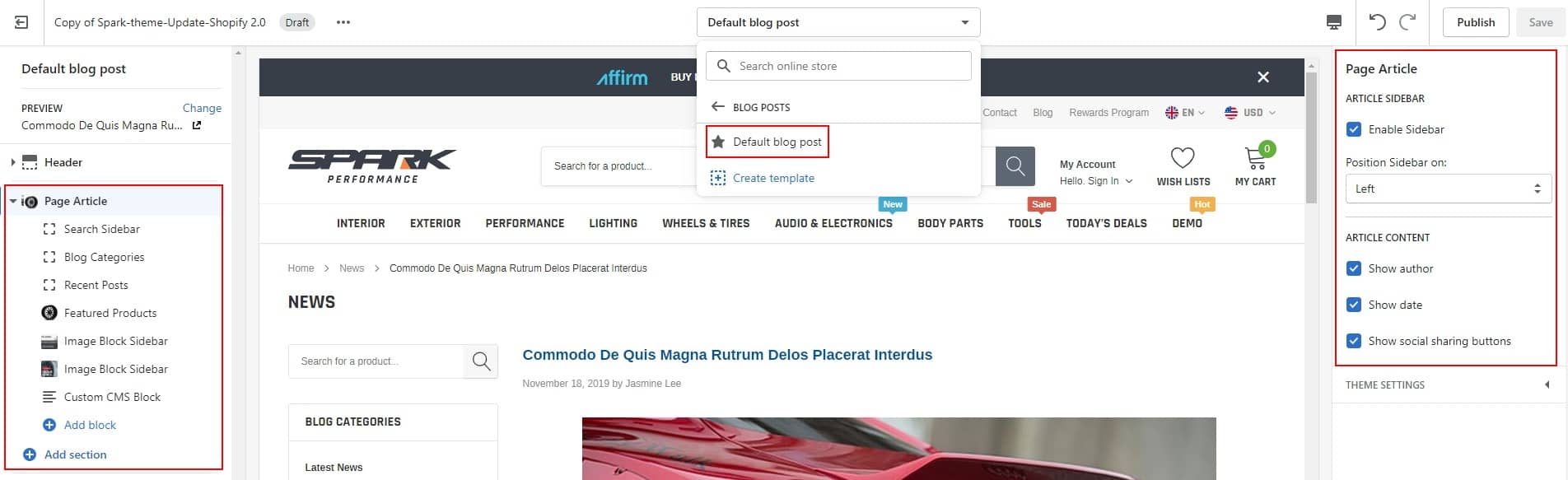
Setup of Page
Please remember that you must publish our theme to be live to create page
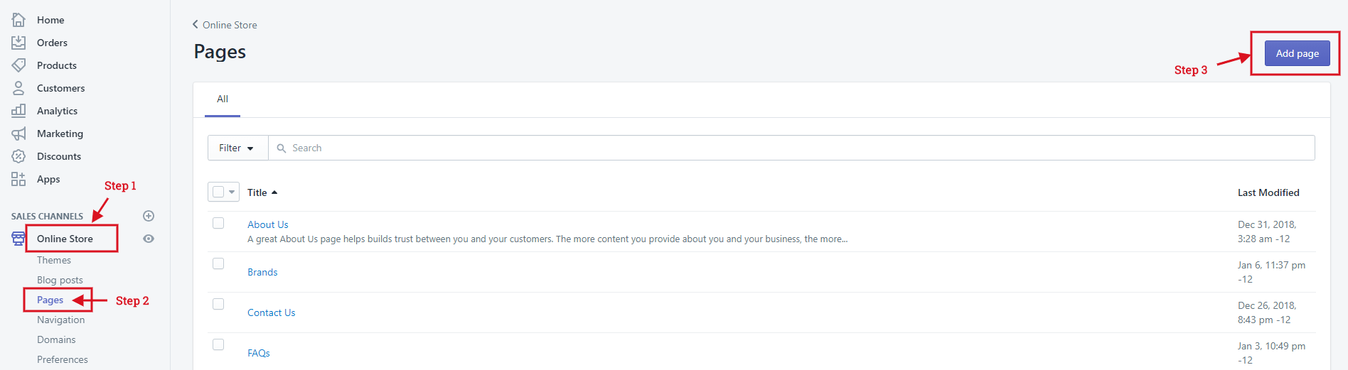
Create Contact Us Page
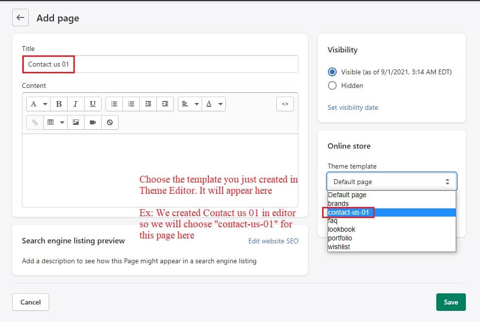
Login to your Shopify admin panel, click Online Store --> Pages --> Add page.
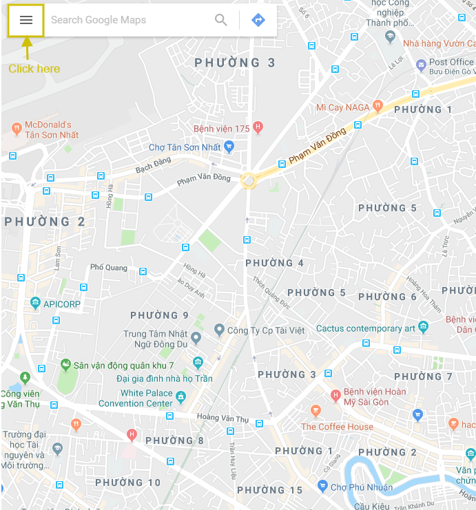
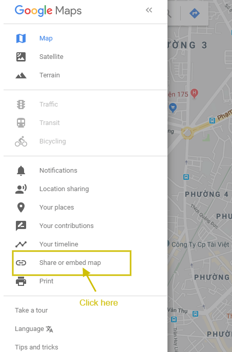
Google maps
There is also a guide of how to embed a goole maps directly into the contact page. Please go to Google maps and find your desired location. Then copy the maps iframe code and paste it into the text editor.

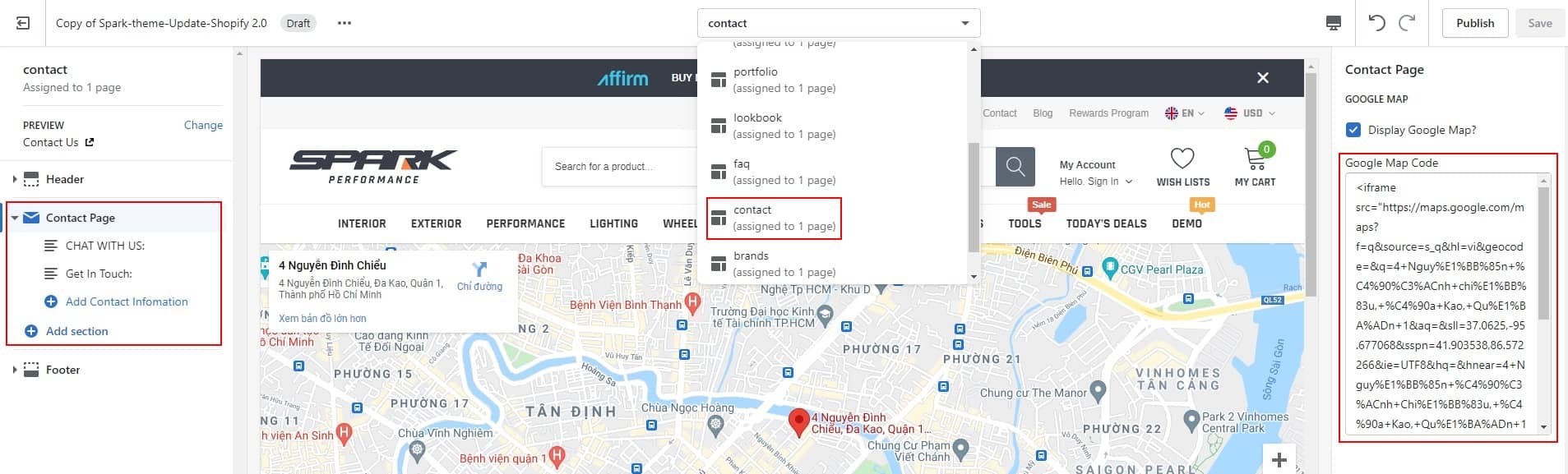
You need to extract the src attributes content. You could have a look at the example of the embedded code. The highlighted part is what you need to copy.
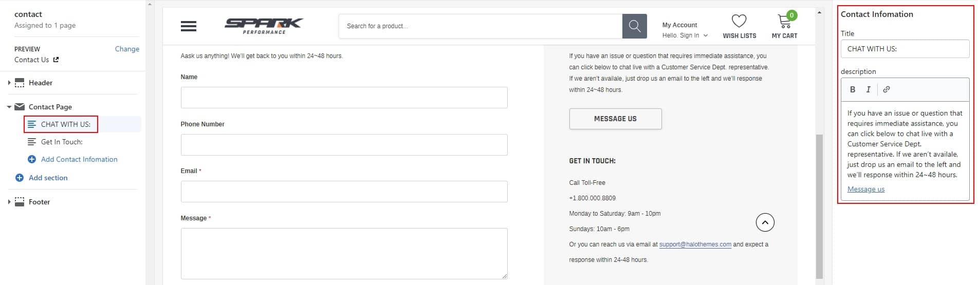
Go to Editor of contact page, paste the embedded code of Google Map into the field Google Map Code and put the content that you'd like to show as the below image.
How to duplicate Contact us page layout for other pages?
If you would like to use Contact us page layout for other pages which has the same layout but different contents, you can follow instruction below:
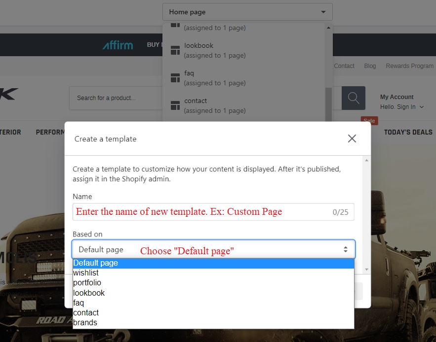
Step 01: In Theme Editor -> Choose Pages from the dropdown window -> Choose Create template
Step 02: Create template and choose Based on "contact"
Step 03: Exit Theme Editor to go to Pages in Online Store -> Click Add page to create your new page
Create Wishlist Page
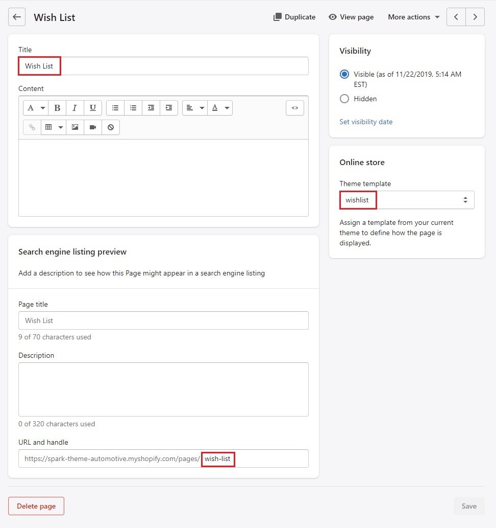
1. Login to your Shopify admin panel, click Online Store --> Pages --> Add page.
2. From the template page, enter a Title and choose the Template look like the below image. Remember: Your wishlist URL must be: /pages/wish-list
3. Click Save.
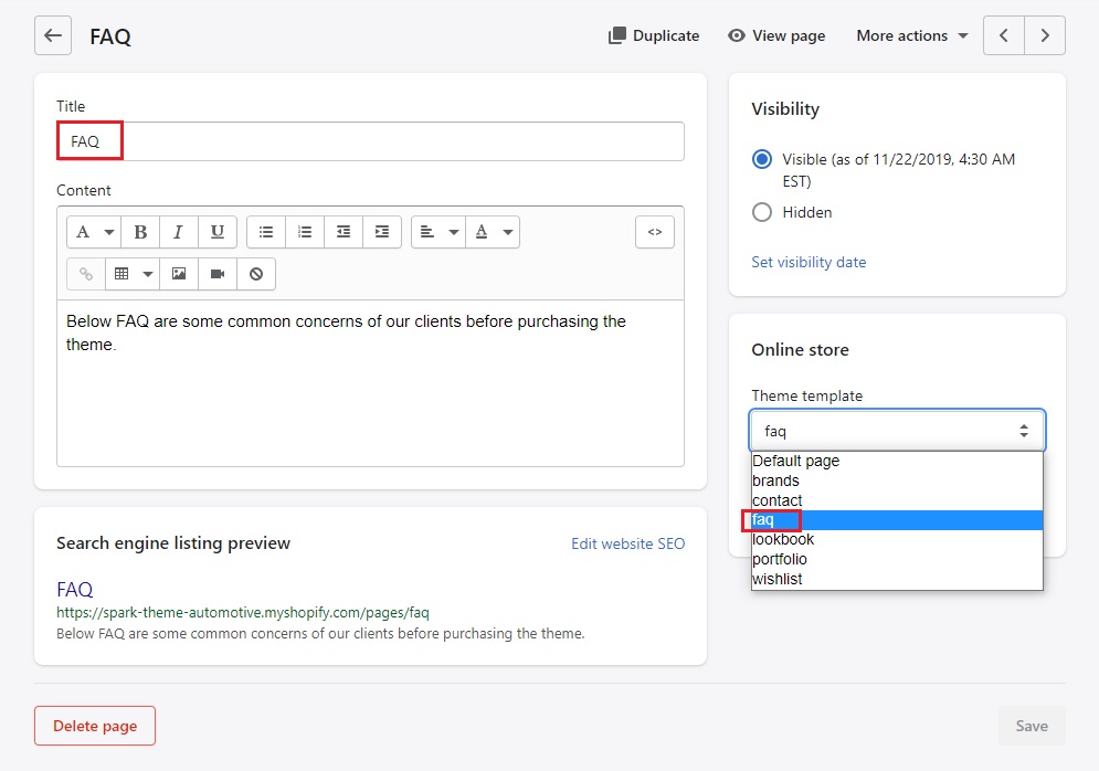
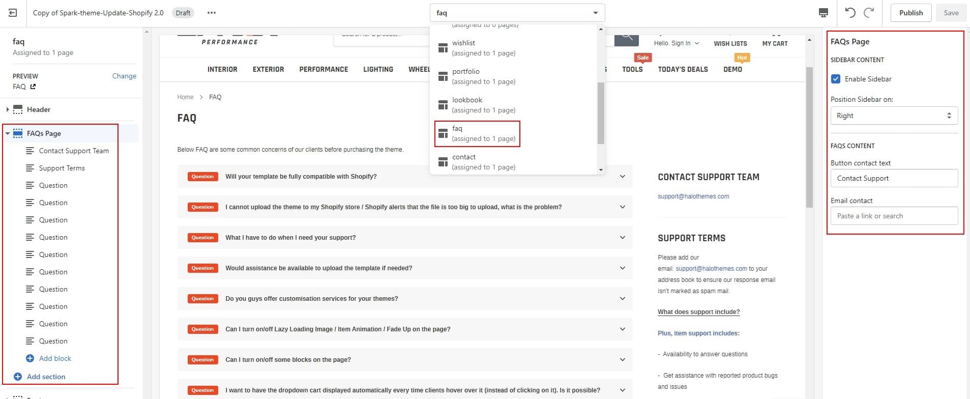
Create FAQs Page
1. Login to your Shopify admin panel, click Online Store --> Pages --> Add page.
2. From the template page, enter a Title and choose the Template look like the below image.
3. Click Save.
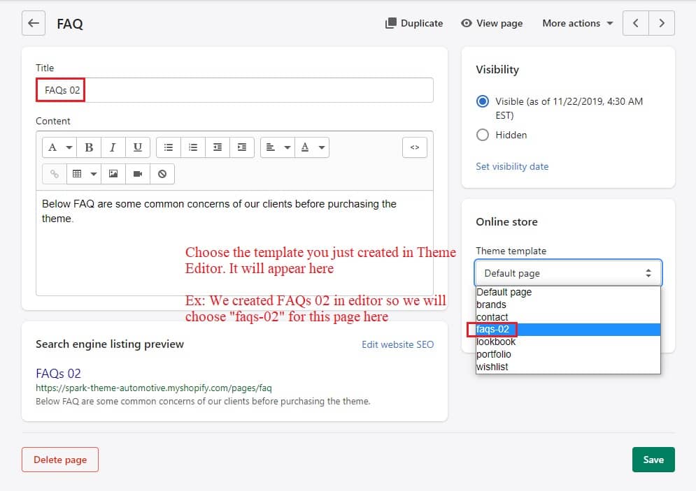
How to duplicate FAQs page layout for other pages?
If you would like to use FAQs page layout for other pages which has the same layout but different contents, you can follow instruction below:
Step 01: In Theme Editor -> Choose Pages from the dropdown window -> Choose Create template
Step 02: Create template and choose Based on "faqs" for FAQs page layout
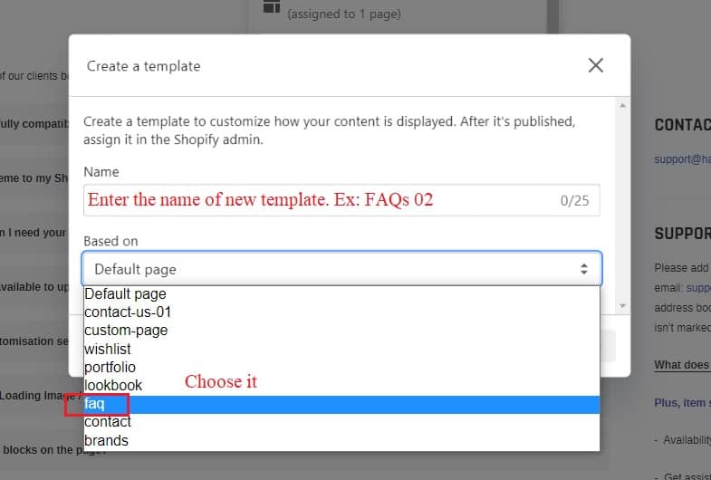
Step 03: Exit Theme Editor to go to Pages in Online Store -> Click Add page to create your new page
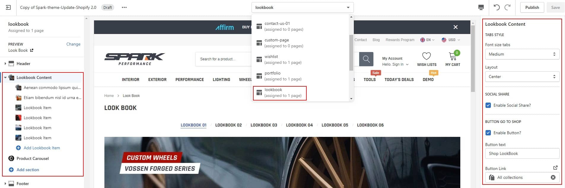
Create Lookbook page
1. Login to your Shopify admin panel, click Online Store --> Pages --> Add page.
2. From the template page, enter a Title and choose the Template look like the below image.
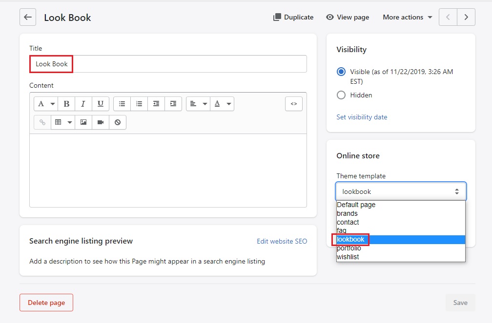
3. Click Save.
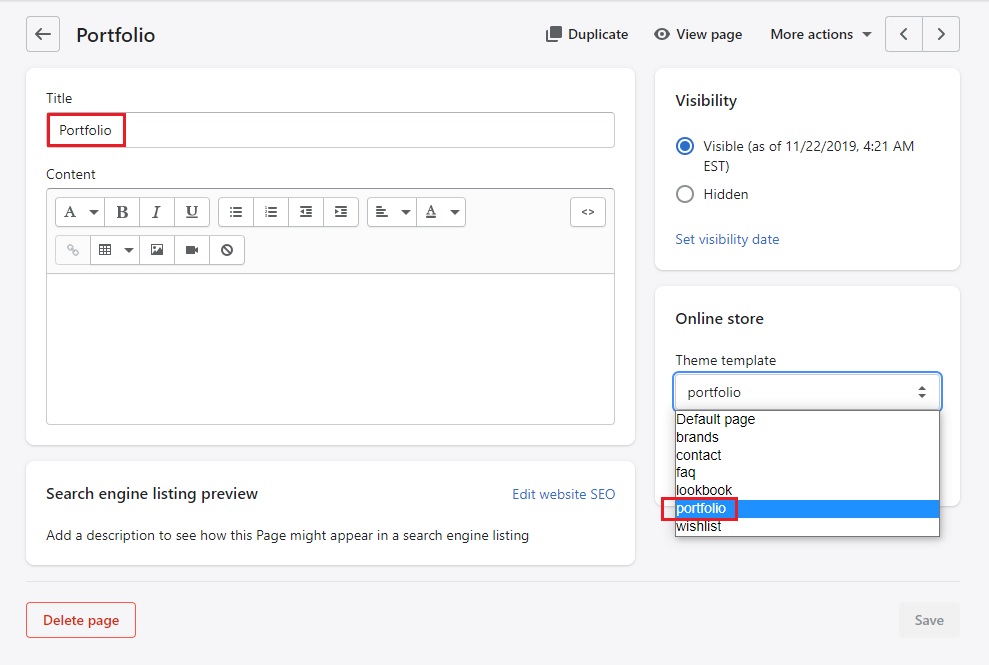
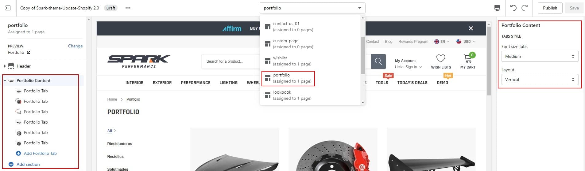
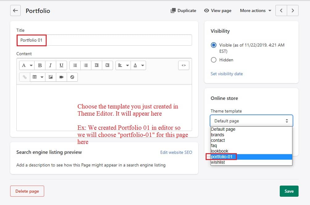
Create Portfolio Page
1. Login to your Shopify admin panel, click Online Store--> Pages--> Add page.
2. From the template page, enter a Title and choose the Template look like the below image.
How to duplicate Portfolio page layout for other pages?
If you would like to use Portfolio page layout for other pages which has the same layout but different contents, you can follow instruction below:
Step 01: In Theme Editor -> Choose Pages from the dropdown window -> Choose Create template
Step 02: Create template and choose Based on "portfolio" for Portfolio page layout
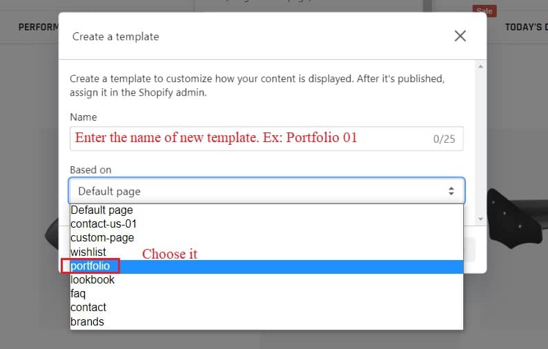
Step 03: Exit Theme Editor to go to Pages in Online Store -> Click Add page to create your new page
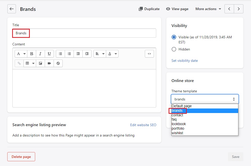
Create brands Page
1. Login to your Shopify admin panel, click Online Store--> Pages--> Add page.
2. From the template page, enter a Title and choose the Template look like the below image.
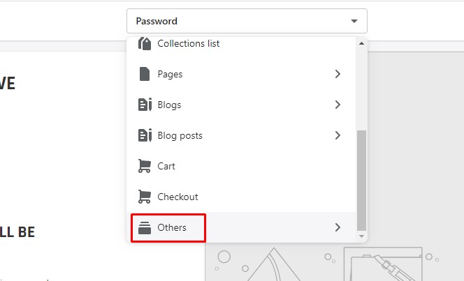
Create Password Page
Go to Customize theme
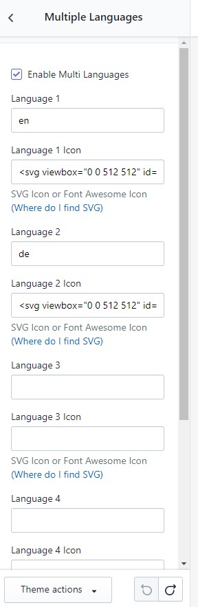
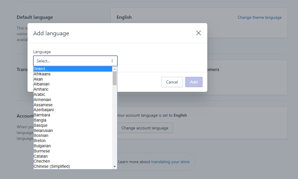
Multiple Languages
How are you going to create a website where can show multiple pages of the same thing, but in different languages? It's easy to use this function in our theme.
Before we begin setting up Multiple Languages, you need to read these below parts.
How To Setup Multiple Languages
-
In Theme Settings Tab. Click Multiple Languages and Enable Multiple Language.
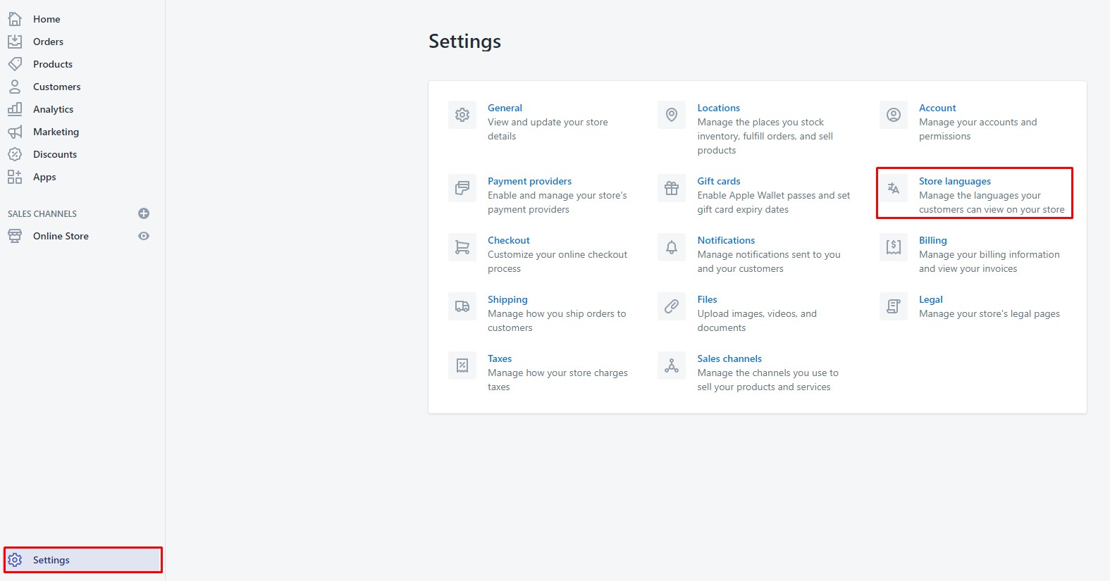
-
In Settings. Go To Store languages.
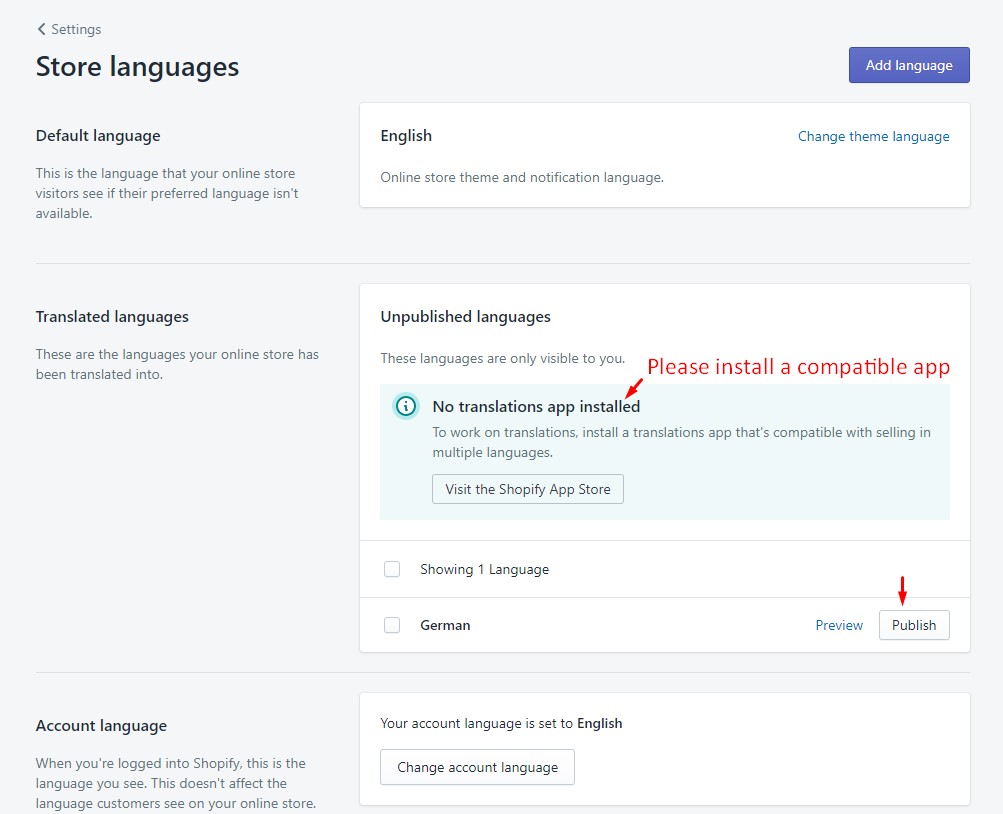
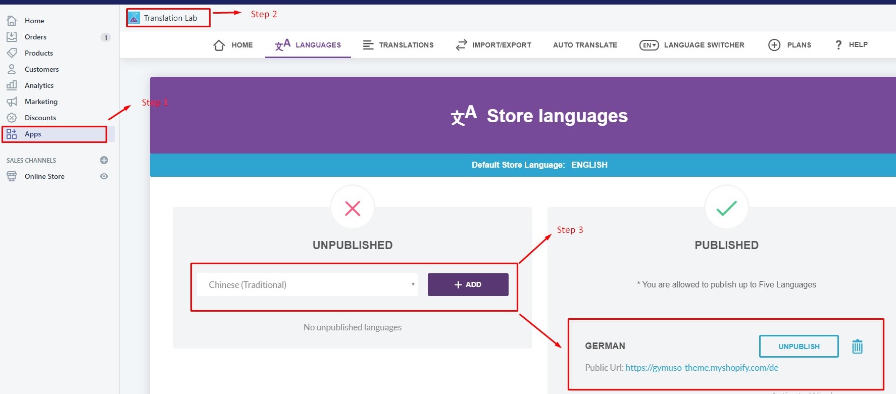
Install App Translation Lab
We recommend you to use this free app: Translation Lab, because it was tested and fully compatible with Gymuso
-
Go to App Translation Lab, Choose and public language you want
Credits
- jQuery Library
- Bootstrap v4.0.0
- Slick js
- Google Maps
Need Help?
If you have any questions, please do not hesitate to contact us at support@halothemes.com. We are happy to help!
Social media
In Theme Settings Tab. Click Social media