Infobar Settings
Content
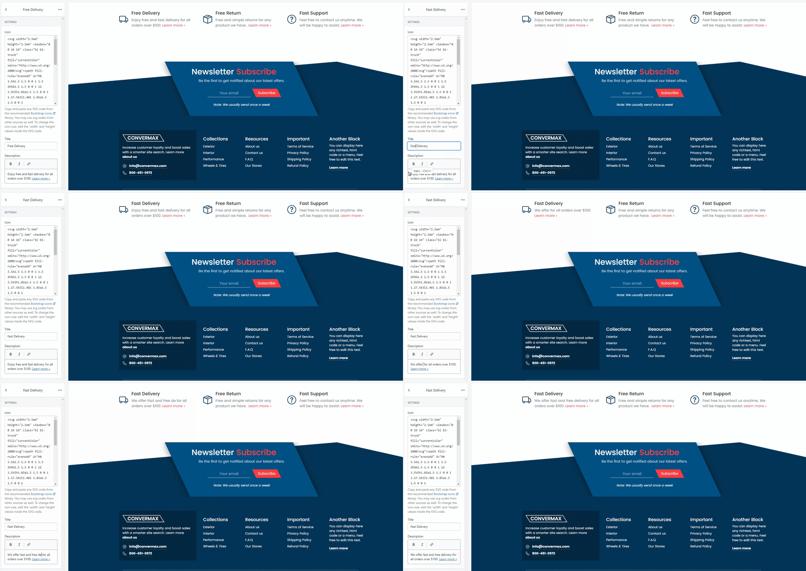
Customize the type of content and its order inside the info bar.

You can create the new one or edit existing content fields.
1. Icon
Copy and paste any SVG code from the recommended Bootstrap icons library. You may use SVG codes from other sources as well. To change the icon size, edit the 'width' and 'height' values inside the SVG code.
2. Icon color
Icon color is the Secondary color by default. To change it, go to Theme Settings.
3. Title
You can set a title for the announcement field.
4. Description
Type in a description text for the announcement.

General
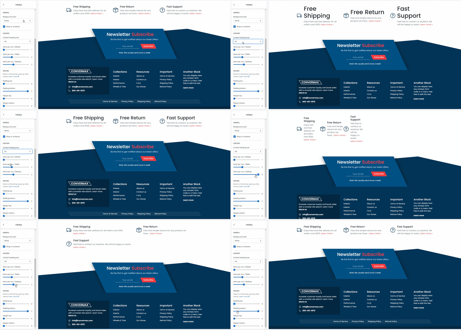
1. Background color
Select a background color from variants (white, light, dark, primary, secondary).

2. Center
You can enable/disable the Announcement positioning in the center. If disabled, the section will stretch to the entire width of the page.
Content

1. Content heading size
Choose the size of the header - H1, H2, H3, H4, H5, H6. Learn more.
2. Items per row / Mobile
Customize the number of items per row in the announcement bar on the mobile version.
3. Items per row / Table
Customize the number of items per row on the tablet version.
4. Items per row / Desktop
Customize the number of items per row on the desktop version.
Spacing
It's based on Bootstrap spacing utility classes. Learn more. Padding is the space between the announcement bar content and its border. You can customize:
- Padding top
- Padding bottom
Margin is the space between the elements’ borders. You can customize:
- Margin top
- Margin bottom