Sections Settings
You can customize, add or hide Home page sections. Choose a section you'd like to edit in the left sidebar.
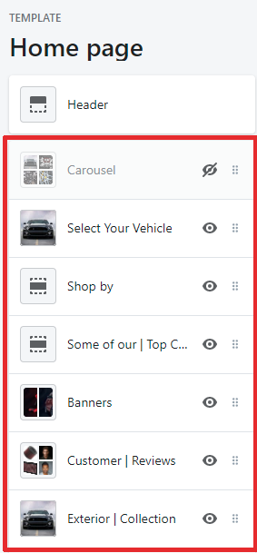
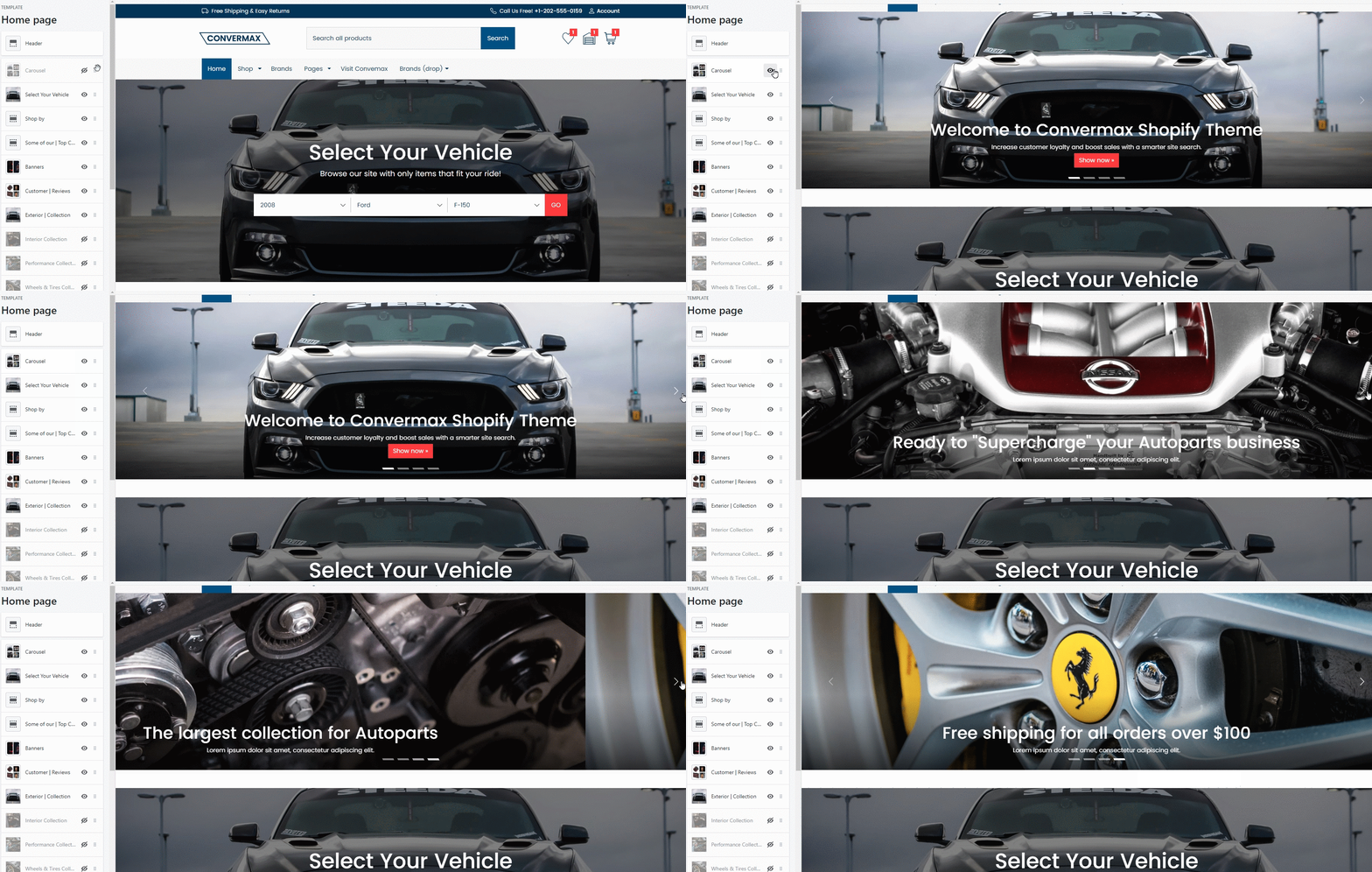
Carousel
You can enable/disable the Carousel section.
Add Image
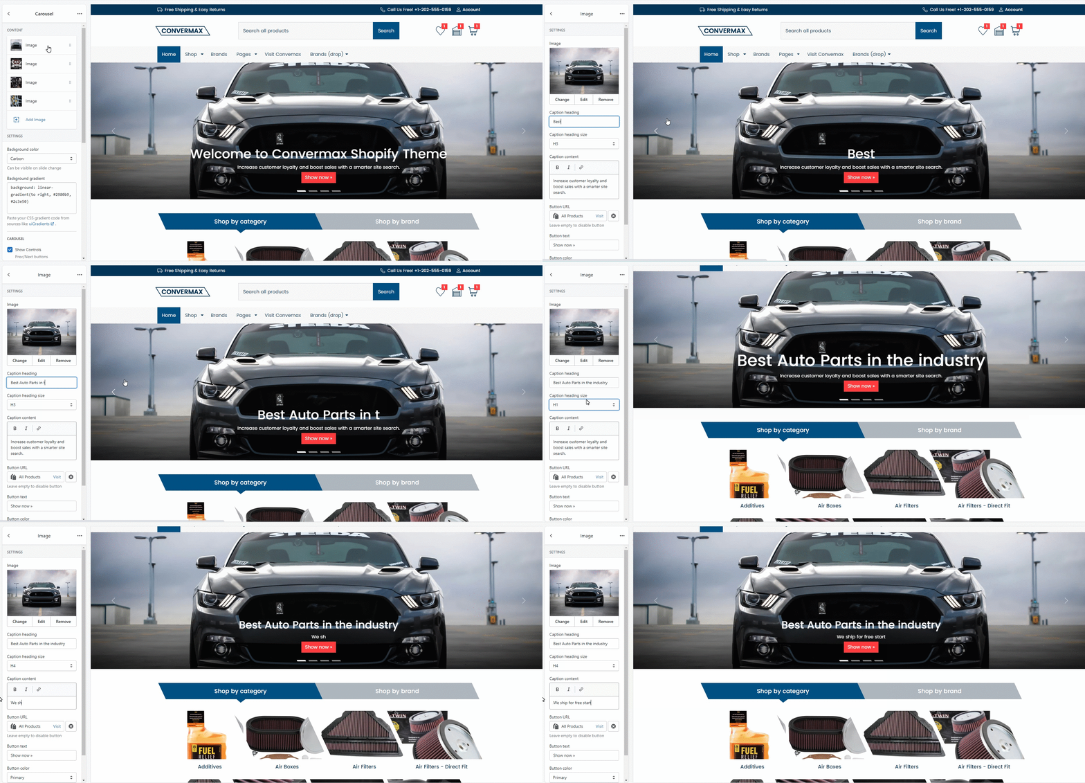
Edit, add, or remove images inside the carousel.
1. Select image
Upload the image you'd like to display in the carousel.
2. Caption heading
Type the title for the image (E.g., Ready to "supercharge" your car).
3. Caption heading size
Choose the size of the title (H1, H2, H3, H4, H5, H6). (Learn more).
4. Caption content
Type the subtitle if you need one. Leave empty to disable.
5. Button URL
Select the link to the page where you'd like to redirect store visitors. Leave the box empty to remove the button.
6. Button text
Type the text you'd like to display on the button.
7. Button color
Choose the button color from the options (white, light, dark, primary, secondary).
8. Button size
Select the size of the button (small, normal, large).
Settings
1. Background color
Choose the background color from the options (white, light, dark, primary, secondary, carbon effect, gradient).
2. Background gradient
Paste your CSS gradient code from sources like uiGradients.
Carousel
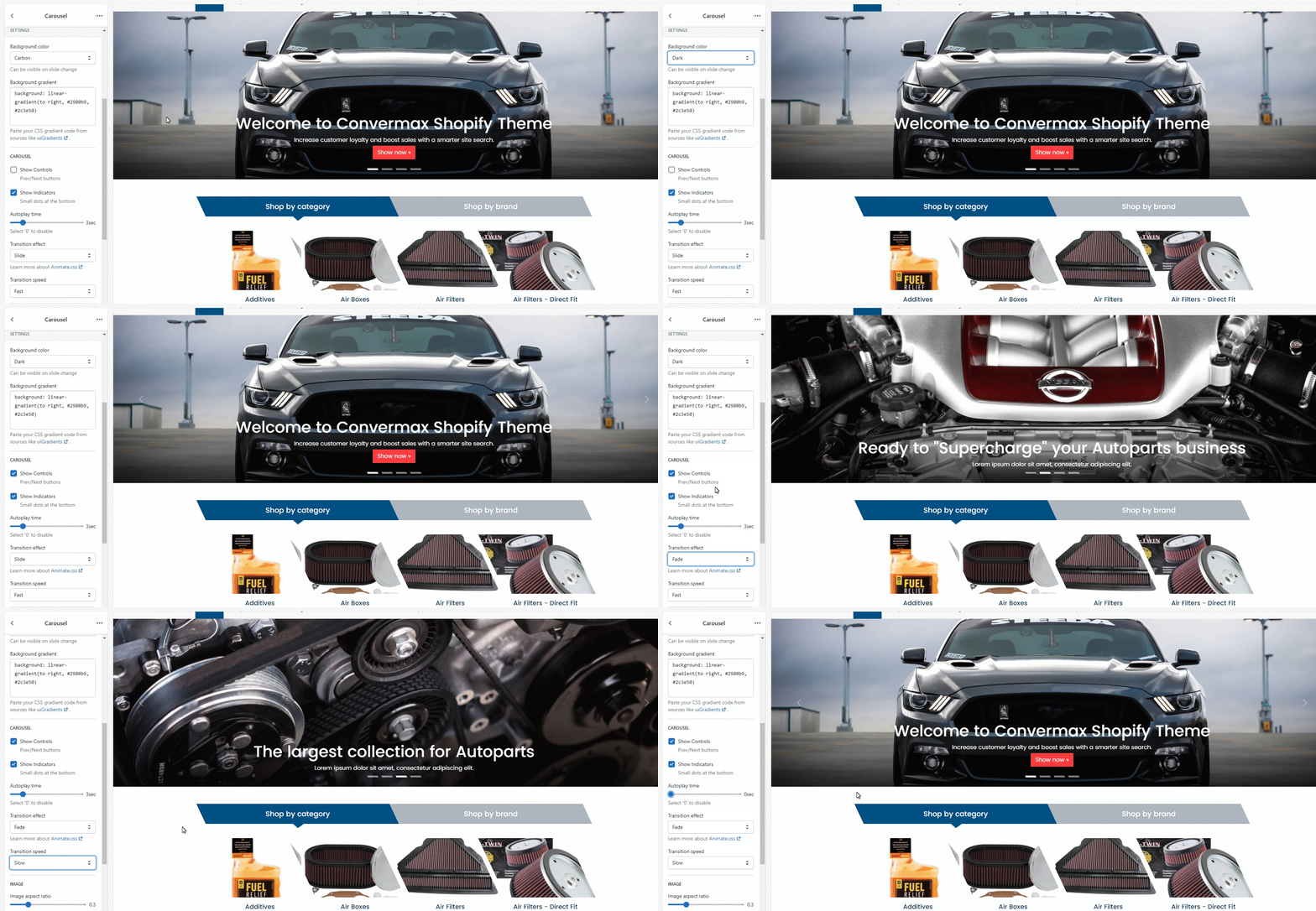
You can manage the way the Carousel is displayed.
1. Show Controls
Enable or disable previous/next buttons.
2. Show Indicators
Enable or disable small dots at the bottom of the carousel. These dots show the number of images in the carousel.
3. Autoplay time
You can enable and set the autoplay time.
4. Transition effect
Customize the way images switch. Select between options (fade or slide).
5. Transition speed
Set the speed for images to switch inside the carousel.
Image
1. Image aspect ratio
Customize the image size. Recommended values are between '0.3' to '0.5'.
2. Image Minimum Height (px)
You can set the image's minimum height. It is useful for a better mobile view.
Spacing
Based on Bootstrap spacing utility classes. Learn more.
Margin is the space between the elements’ borders. You can customize:
- Margin top
- Margin bottom
Year-Make-Model Bar
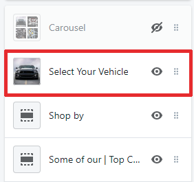
To customize Year-Make-Model Bar, go to the left sidebar and choose the "Select Your Vehicle" section.
Settings
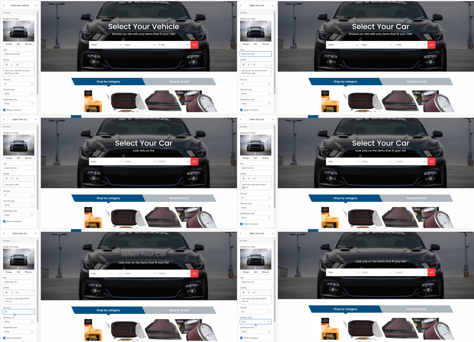
1. Background image
Upload the background image you'd like to be displayed behind the Year-Make-Model bar.
2. Title
Type the title to appear above the Year-Make-Model bar. The industry standard is "Select Your Vehicle".
3. Subtitle
Add subtitle with extra information.
4. Title size
Customize the title size. Choose one of the options (H1, H2, H3, H4, H5, H6).
5. Title text color
Choose the title text color from the options (white, dark, primary, secondary).
6. Subtitle text color
Choose the subtitle text color from the options (white, dark, primary, secondary).
7. Center
You can enable/disable the Year-Make-Model Bar positioning in the center. If disabled, the bar will stretch to the entire width of the page.
Spacing
Based on Bootstrap spacing utility classes Learn more)
Margin is the space between the elements’ borders. You can customize:
- Margin top
- Margin bottom
Shop by
Customize the "Shop by" section.
You can manage which Categories and Brands are displayed in the "Shop by' section. By default, this section loads categories and brands that are illustrated with a picture.
Content
1. Collection
You can choose a collection to add as "Shop by category".
2. Brand
You can choose Brands to be shown in "Shop by brand" section.
Settings
You can customize the way the "Shop by" section is displayed.
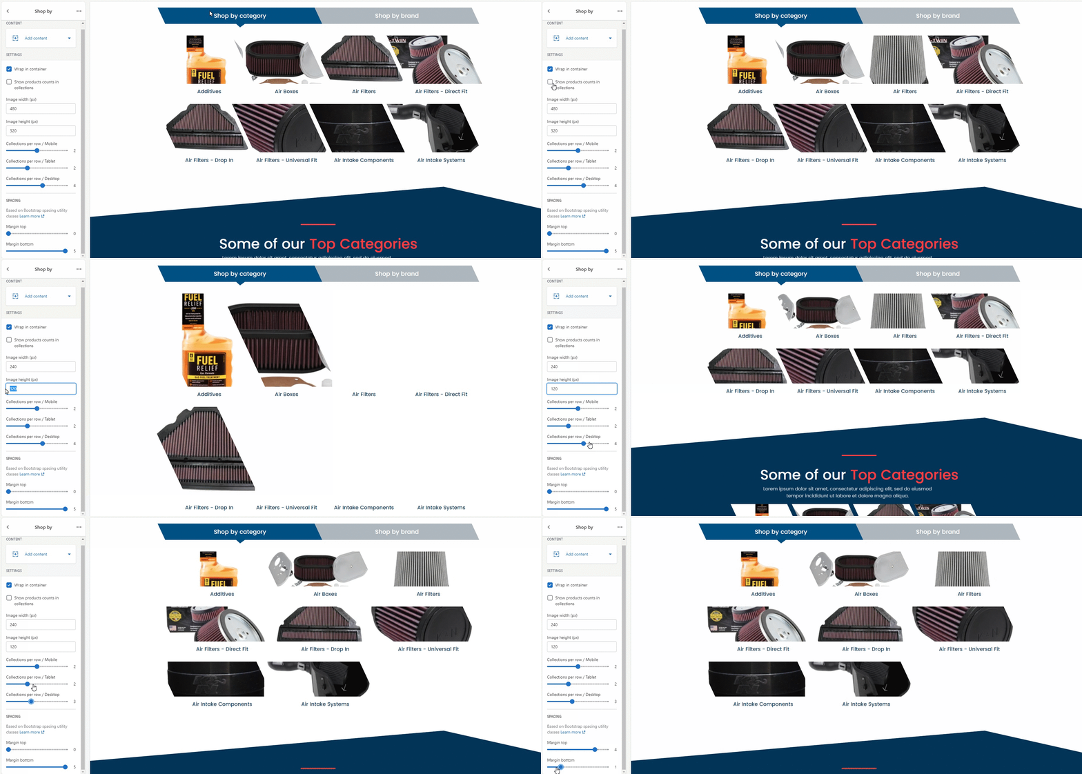
1. Wrap in container
You can enable/disable the Shop by section positioning in the center. If disabled, the section will stretch to the entire width of the page.
2. Show products counts in collections
You can enable/disable product counts in the collections.
3. Image width (px)
Customize the width of product images.
4. Image height (px)
Customize the height of product images.
5. Collections per row / Mobile
Customize the number of items per row in the Collection on the mobile version.
6. Collections per row / Tablet
Customize the number of items per row in the Collection on the tablet version.
7. Collections per row / Desktop
Customize the number of items per row in the Collection on the desktop version.
Spacing
Based on Bootstrap spacing utility classes. Learn more.
Margin is the space between the elements’ borders. You can customize:
- Margin top
- Margin bottom
Top Categories
Collection
Settings
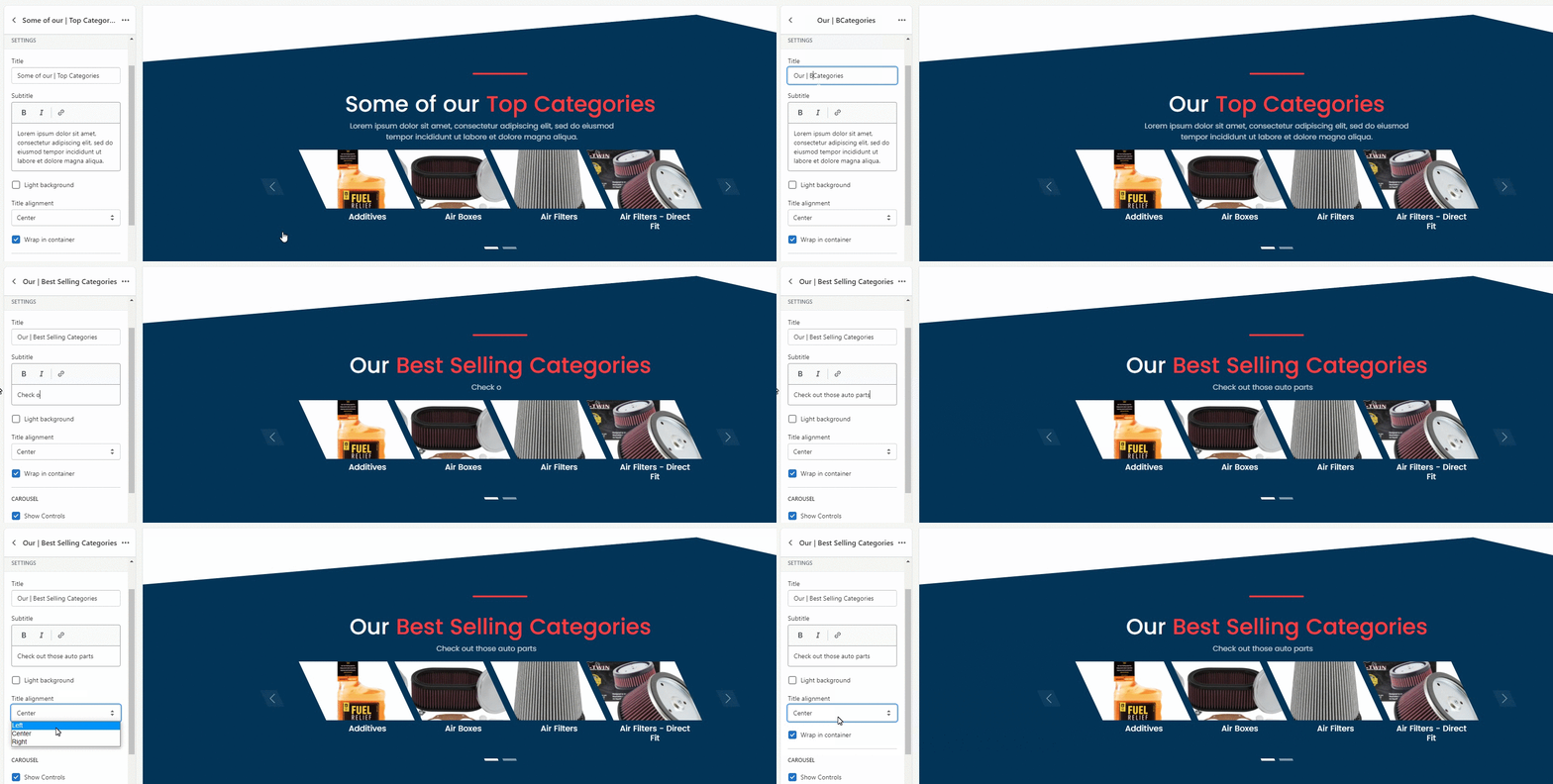
1. Title
Customize the section title.
2. Subtitle
Edit, remove, or add the section subtitle.
3. Light background
You can choose the background color of this section from two options: blue or grey.
4. Title alignment
You can choose the title positioning (left, center, right).
5. Wrap in container
You can enable/disable the Top categories section positioning in the center. If disabled, the section will stretch to the entire width of the page.
Carousel

1. Show Controls
Enable or disable previous/next buttons.
2. Show Indicators
Enable or disable small dots at the bottom of the carousel. These dots show the number of images in the carousel.
3. Autoplay time
You can enable and set the autoplay time.
4. Transition effect
Customize the way images switch. Select between options (fade or slide). Learn more about Animate.css
5. Transition speed
Set the speed for images to switch inside the carousel.
Items
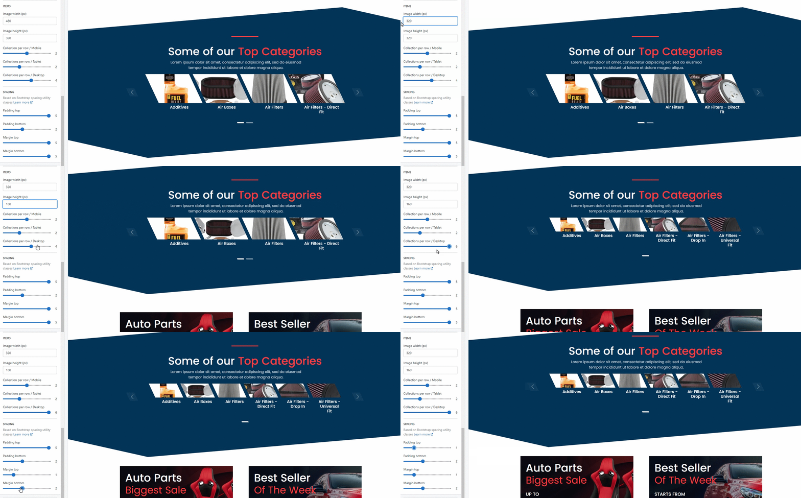
1. Image width (px)
Customize the width of the category image.
2. Image height (px)
Customize the height of the category image.
3. Items per row / Mobile
Customize the number of items per row in the Top Categories on the mobile version.
4. Items per row / Tablet
Customize the number of items per row in the Top Categories on the tablet version.
5. Items per row / Desktop
Customize the number of items per row in the Top Categories on the desktop version.
Spacing
Based on Bootstrap spacing utility classes. Learn more.
Padding is the space between the announcement bar content and its border. You can customize:
- Padding top
- Padding bottom
Margin is the space between the elements’ borders. You can customize:
- Margin top
- Margin bottom
Banners
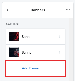
You can add, delete or edit banners.
Banner
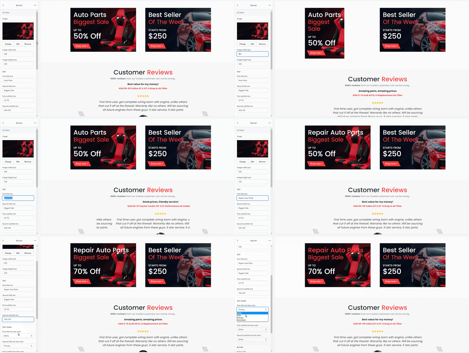
1. Select image
Select the image you'd like to display as a banner.
2. Image width (px)
Customize the width of the banner's image.
3. Image height (px)
Customize the height of the banner's image.
4. First title line
Customize the banner's first title.
5. Second title line
Customize the banner's second title.
6. First subtitle line
Customize the banner's first subtitle.
7. Second subtitle line
Customize the banner's second subtitle.
8. First title line text color
Customize the color of the first title line.
9. Second title line text color
Customize the color of the second title line.
10. First subtitle line text color
Customize the color of the first subtitle line.
11. Second subtitle line text color
Customize the color of the second subtitle line.
12. Button URL
Select the link to the theme page. Users will be redirected there if they press the button. Leave the box empty if you want to remove the button.
13. Button text
Type the text you'd like to be shown on the button.
14. Button color
Select one of the color options for the button (white, light, dark, primary, secondary).
Settings
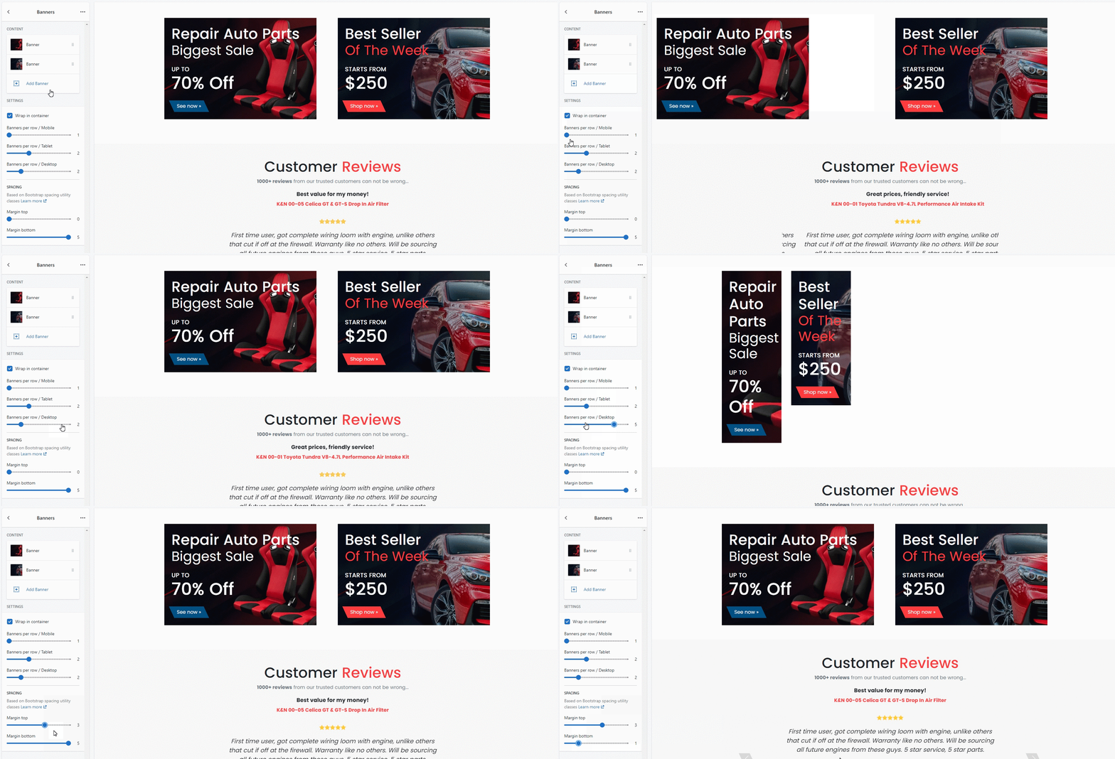
1. Wrap in container
You can enable/disable the Banners positioning in the center. If disabled, the banners will stretch to the entire width of the page.
2. Banners per row / Mobile
Customize the number of banners per row on the mobile version.
3. Banners per row / Tablet
Customize the number of banners per row on the tablet version.
4. Banners per row / Desktop
Customize the number of banners per row on the desktop version.
Spacing
Based on Bootstrap spacing utility classes. Learn more.
Margin is the space between the elements’ borders. You can customize:
- Margin top
- Margin bottom
Testimonials
Add Testimonial
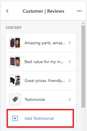
You can add, edit or remove reviews on definite products in the Testimonials sections.
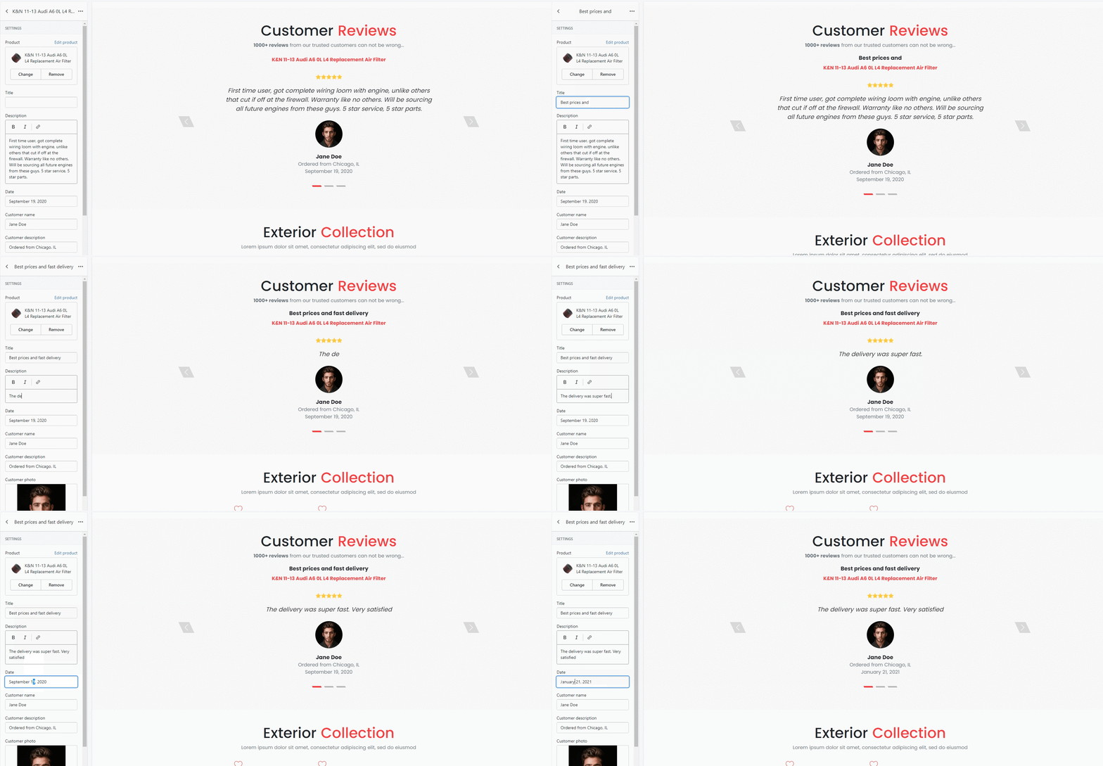
1. Select product
Select a product to be shown in the section.
2. Title
Type in the title for the product review.
3. Description
Type in the review message.
4. Date
Type in the review date.
5. Customer name
Type in the customer's name.
6. Customer description
Type in the place from where product was ordered.
7. Customer photo
Upload the customer's photo.
Settings
Customize the way the Testimonials section looks like.
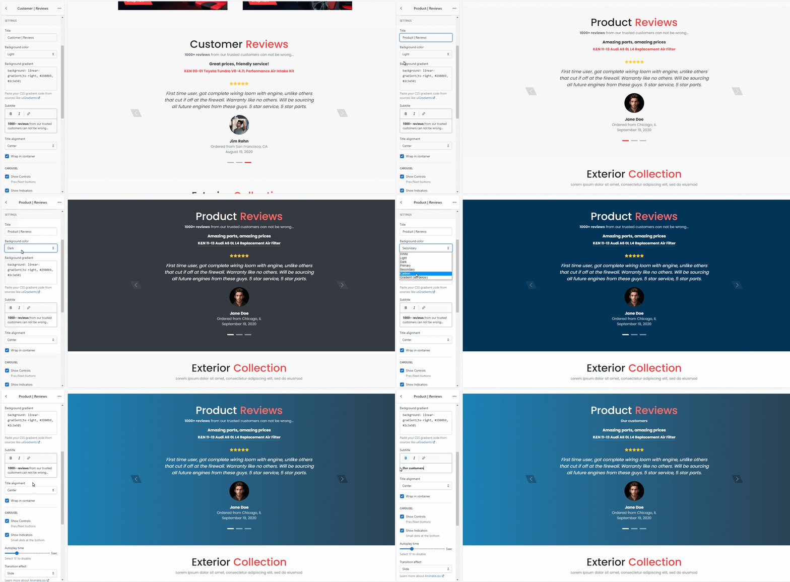
1. Background color
Select a background color from variants (white, light, dark, primary, secondary, carbon effect, gradient).
2. Background gradient
Paste your CSS gradient code from sources like uiGradients.
3. Title
Type in the title for the section.
4. Subtitle
Type in the subtitle for the section (the extra information you'd like to be displayed).
5. Title alignment
Select the title positioning (left, center, right).
6. Wrap in container
You can enable/disable the Testimonials positioning in the center. If disabled, the section will stretch to the entire width of the page.
Carousel
1. Show Controls
Enable or disable previous/next buttons.
2. Show Indicators
Enable or disable small dots at the bottom of the carousel. These dots show the number of images in the carousel.
3. Autoplay time
You can enable and set the autoplay time.
4. Transition effect
Customize the way images switch. Select between options (fade or slide). Learn more about Animate.css
5. Transition speed
Set the speed for images to switch inside the carousel.
Image
1. Customer photo circle
Enable/disable the customer photo to be in circle.
2. Customer photo size (px)
You can manage the size of customer photo in the section.
Spacing
Based on Bootstrap spacing utility classes. Learn more.
Padding is the space between the section content and its border. You can customize:
- Padding top
- Padding bottom
Margin is the space between the elements’ borders. You can customize:
- Margin top
- Margin bottom
Featured collection
You can add one or more Featured collection sections to the Home page. It can be useful if you want extra attention to a specific product category.
Collection
Select the product collection you'd like to be featured on the Home page.
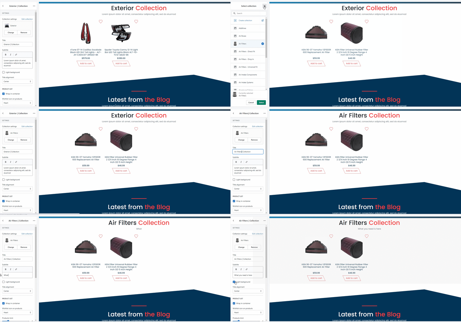
Settings
1. Title
Type in the title for the section.
2. Subtitle
Type in the subtitle for the section.
3. Light background
Customize background color. You can choose between options (white or grey).
4. Title alignment
Customize the title positioning (left, center, right).
Product list
1. Wrap in container
You can enable/disable the products list in the center. If disabled, the section will stretch to the entire width of the page.
2. Wishlist icon on products
Customize the icon of wishlist shown on products. You can choose from options^ star or heart.
3. Products limit
Manage the number of Products to be shown in the section.
4. Products per row / Mobile
Customize the number of items per row in the section on the mobile version.
5. Products per row / Tablet
Customize the number of items per row in the section on the tablet version.
6. Products per row / Desktop
Customize the number of items per row in the section bar on the desktop version.
Spacing
Based on Bootstrap spacing utility classes. Learn more.
Padding is the space between the section content and its border. You can customize:
- Padding top
- Padding bottom
Margin is the space between the elements’ borders. You can customize:
- Margin top
- Margin bottom
Blog section
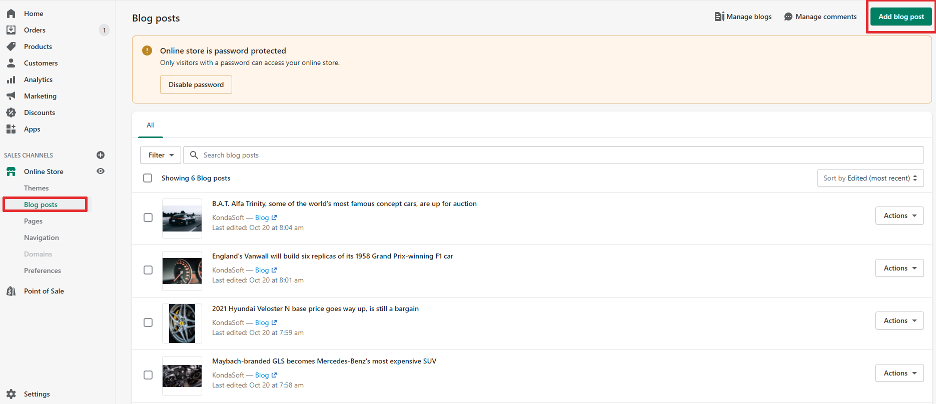
To add or edit blog post, go to the Shopify admin panel -> Blog.
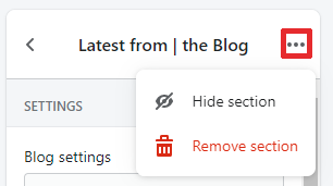
To remove or hide section, click three dots above.
Blog
Select the blog you've created in the Shopify admin panel.
Settings
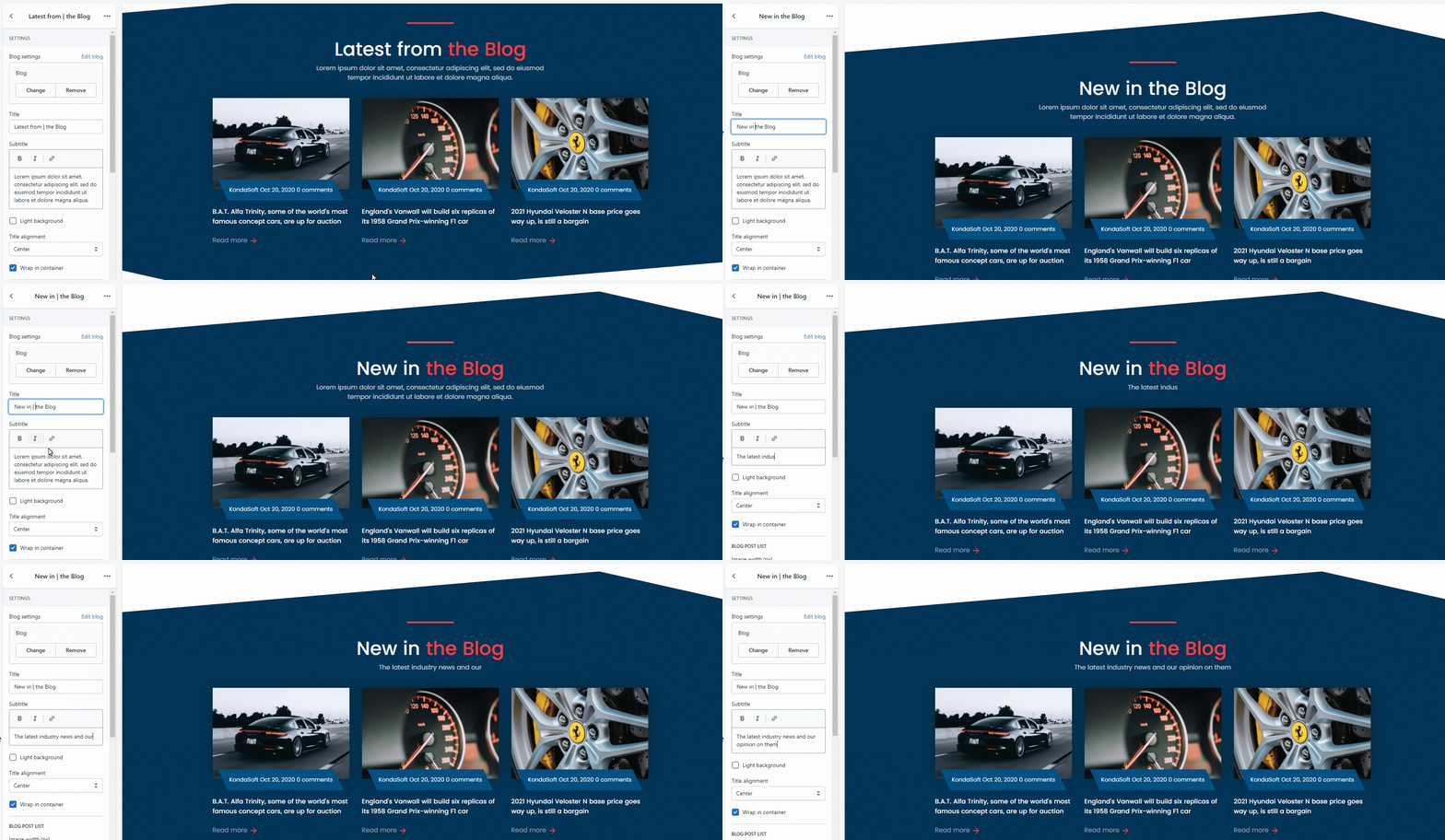
Customize the way the "Latest from the Blog" section looks like.
1. Title
Type in the title for the section.
2. Subtitle
Type in the subtitle for the section.
3. Light background
Customize background color. You can choose between options (white or grey).
4. Title alignment
Customize the title positioning (left, center, right).
5. Wrap in container
You can enable/disable the Blog section positioning in the center. If disabled, the section will stretch to the entire width of the page.
Blog post list
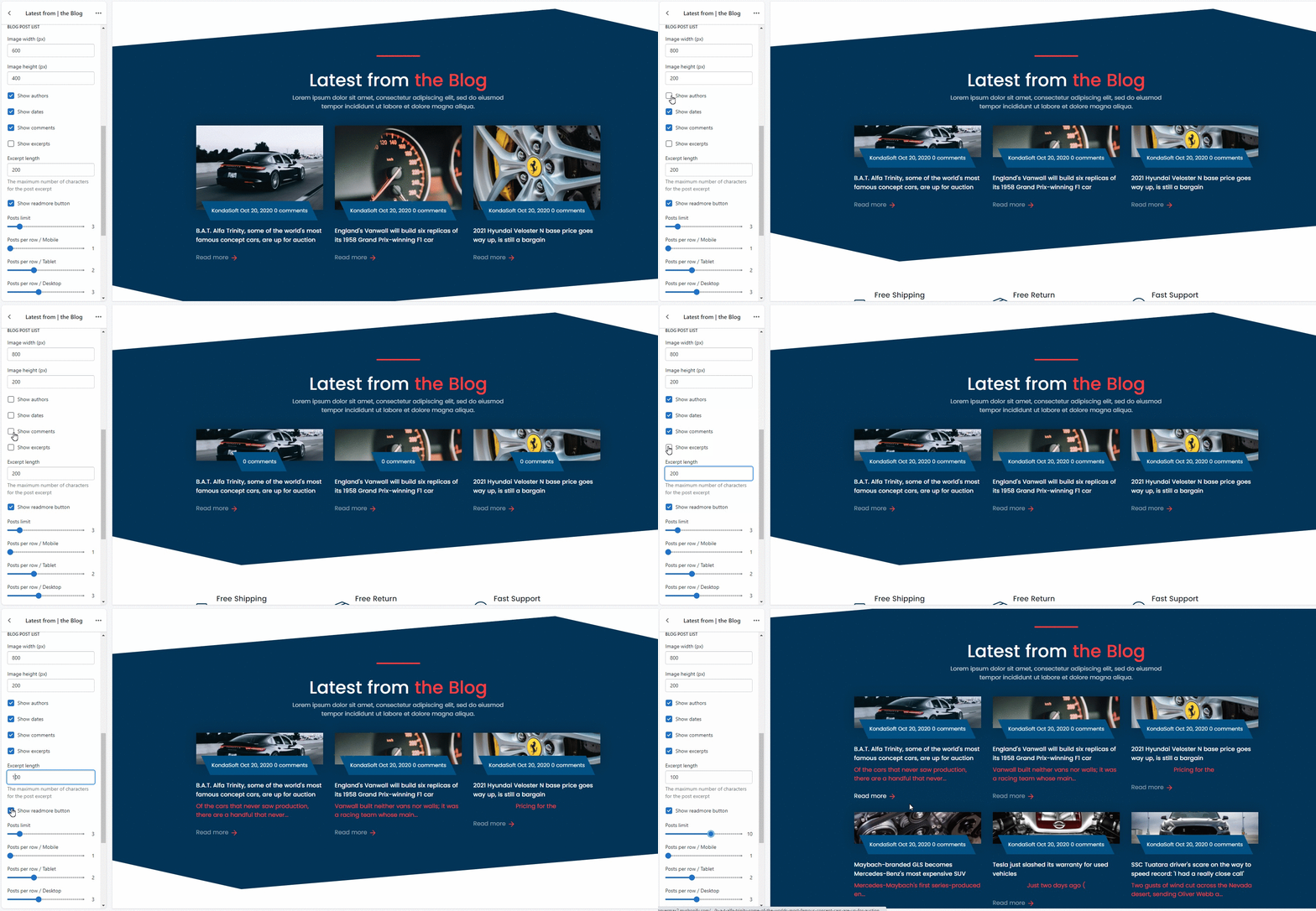
1. Image width (px)
Customize the width of the blog post preview's image.
2. Image height (px)
Customize the height of the blog post preview's image.
3. Show authors
Enable/disable the authors display.
4. Show dates
Enable/disable the dates display.
5. Show comments
Enable/disable the comments display.
6. Show excerpts
Enable/disable the excerpts display.
7. Excerpts length
Regulate the excerpts length by limiting the maximum number of characters.
8. Show readmore button
Enable/disable the "Read more" button under blog post preview.
9. Posts limit
Manage the maximum number of posts to be shown.
10. Posts per row / Mobile
Customize the number of posts per row in the section on the mobile version.
11. Posts per row / Tablet
Customize the number of posts per row in the section on the tablet version.
12. Posts per row / Desktop
Customize the number of posts per row in the section on the desktop version.
Spacing
Based on Bootstrap spacing utility classes. Learn more.
Padding is the space between the "Latest from the Blog" content and its border. You can customize:
- Padding top
- Padding bottom
Margin is the space between the elements’ borders. You can customize:
- Margin top
- Margin bottom
Brands
Enable/disable Brands section.
Image
Add a brand image and link to the brand collection in your store.
Settings
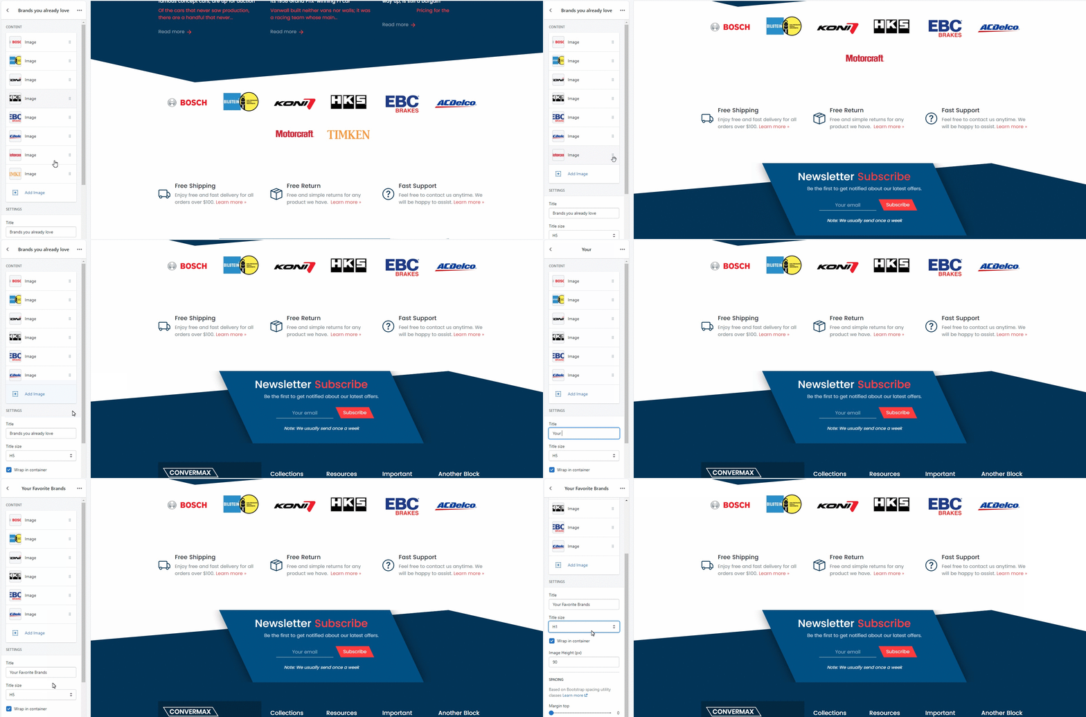
1. Title
Customize the section's title.
2. Title size
Customize the title size. You can choose from options (H1, H2, H3, H4, H5, H6).
3. Wrap in container
You can enable/disable the Brands section positioning in the center. If disabled, the section will stretch to the entire width of the page.
4. Image Height (px)
Customize the height of the brand's image.
Spacing
Based on Bootstrap spacing utility classes. Learn more.
Margin is the space between the elements’ borders. You can customize:
- Margin top
- Margin bottom
Separator
You can add Separator section where you need one.
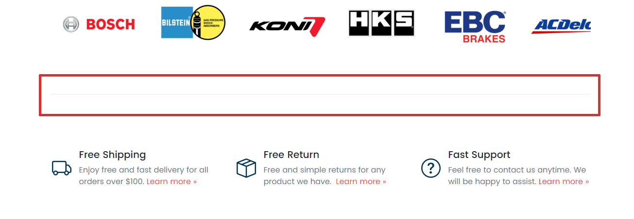
1. Wrap in container
You can enable/disable the Separator positioning in the center. If disabled, it will stretch to the entire width of the page.
2. Spacing
Based on Bootstrap spacing utility classes. Learn more.
Margin is the space between the elements’ borders. You can customize:
- Margin top
- Margin bottom
Featured Product
By adding this section, you can highlight a specific product on the Home page.
Content
Manage the additional product information placed in tabs under the product images.

Settings
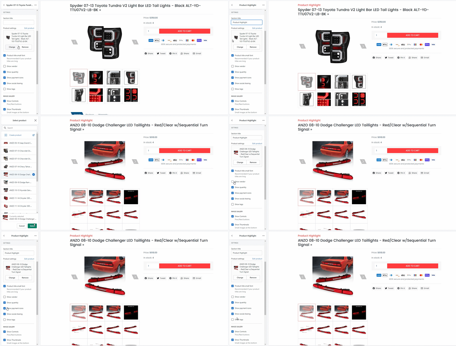
1. Section Title
Customize the title for this section.
2. Product
Choose a product you'd like to highlight.
3. Product title small font
You can enable/disable the small font for the product title. It’s recommended if your product titles are long.
4. Show vendor
Enable/disable the vendor name display.
5. Show quantity
Enable/disable quantity display.
6. Show payment icons
You can enable/disable the payment icons display.
7. Show social sharing
You can enable/disable social media icons display.
8. Show tags
Enable/disable the tags display.
Image gallery
1. Show Controls
You can enable/disable the toggle previous/next image buttons.
2. Show Indicators
You can enable/disable toggle next image previews under the main image.
3. Transition effect
You can choose between two effect options: slide or fade. It will impact the way switching images looks like. Learn more about Animate.css
4. Thumbnails per row
You can control the number of small image previews under the main image.
Spacing
Based on Bootstrap spacing utility classes. Learn more.
Margin is the space between the elements’ borders. You can customize:
- Margin top
- Margin bottom
Instagram embed (not working yet)
- Instagram username
- Title
- Posts count
- Wrap in container
- Show likes
- Show comments
- Light background - changes background color from white to grey
- Thumbnail size - small, medium, large
- Spacing (Based on Bootstrap spacing utility classes Learn more)
- Padding top
- Padding bottom
- Margin top
- Margin bottom