

Add Year Make Model Tabs
The Year Make Model Tabs block lets customers search by vehicle, wheel size, tire size, or keywords. It can be added only to the Home page template or to the Header group (then it shows on every page).
Add the block
Section titled “Add the block”- Go to your theme editor: Admin → Sales channels → Online Store → Themes → (on the desired theme) Customize
- Select the Home page template in the dropdown at the top
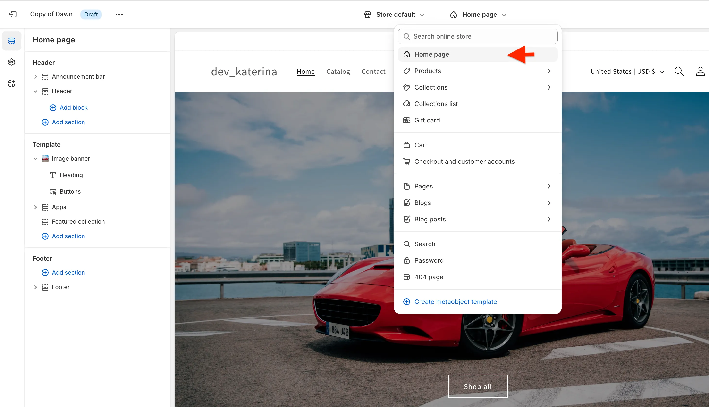
- Click Add section in the Template area (or in the Header area to show the block on every page)
- Open the Apps tab and select Year Make Model Tabs
- Drag the block to the desired position
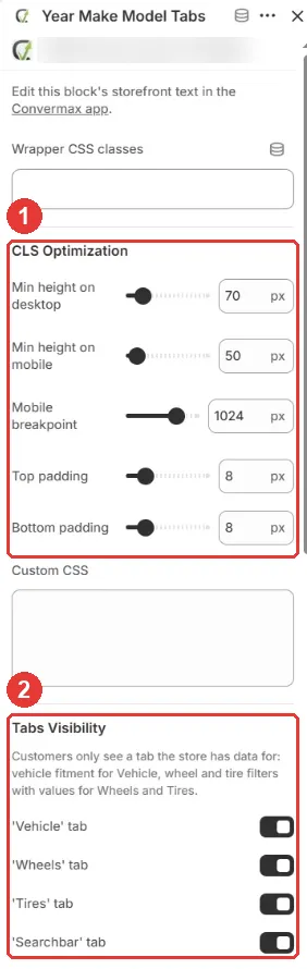
- In the block settings, set the CLS Optimization values (1) and turn on the tabs you need under Tabs Visibility (2)
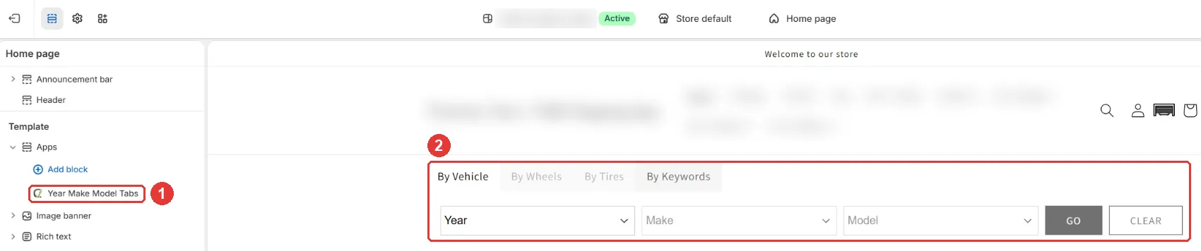
- Click Save in the top-right corner. The block appears in the template list (1) and in the preview (2)
| Tab on the storefront | Setting | Enabled by default | What it needs |
|---|---|---|---|
| By Vehicle | ’Vehicle’ tab | Yes | Products with fitment data from a fitment source or the Fitment Editor, indexed |
| By Wheels | ’Wheels’ tab | No | Values in the wheel diameter, width, or bolt pattern filter. See Wheel and tire search tabs |
| By Tires | ’Tires’ tab | No | Values in the tire width, aspect ratio, or rim filter. See Wheel and tire search tabs |
| By Keywords | ’Searchbar’ tab | No | A search box with autocomplete; results appear after the first indexing |
The By Keywords tab:

Customers see a tab only when the store has data for it. In the theme editor, a tab without data stays visible but greyed out; when you open it, a note explains what is missing:

The storefront tab names can be changed in the app under Settings → Translations.
Other settings
Section titled “Other settings”- Behavior → YMM initially collapsed on mobile: shows the vehicle selector collapsed on small screens
- Colors and Tabs Layout & Borders: tab colors, gaps, corner radius, border width, and font size
- Custom CSS: additional CSS rules for the block
CLS Optimization
Section titled “CLS Optimization”These settings reserve space for the block while it loads, so the page does not jump:
- Min height on desktop and Min height on mobile: the block height after it renders
- Mobile breakpoint: the screen width below which the mobile height is used
- Top padding and Bottom padding: space around the block
To find the right height, open the storefront, press F12, select the block with the element picker, and copy its rendered height.