Deploy YMM Search on Shopify
How the integration process occurs:
Section titled “How the integration process occurs:”Which theme are we integrating into?
- If the task explicitly specifies a particular one, then into it.
- If the store is under a password or it is clearly visible that it’s under development: a fresh, not fully configured theme, the store is only on the Shopify dev domain, or it’s a new site from an agency and they are just setting it up, then we apply to the live theme.
- Otherwise, make a copy of the live theme and apply our search to this copy.
First step:
Go to Apps → Convermax: Year Make Model → Theme Integration: 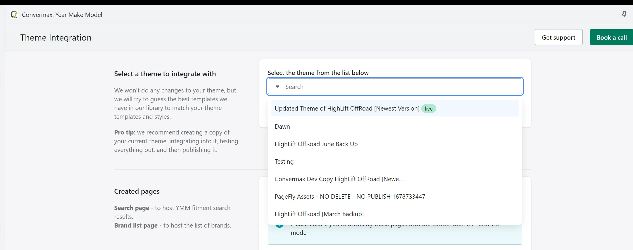
Select the theme and click Next, in the next window there will be an option to check the box next to Custom Build. This setting determines whether the store will be on one of the generic themes we have or if it will have a custom build.
Custom build - this is when we create a store folder under source control, and there we create for the store config.js, schema.yaml, search.css, etc. Usually, we use it when a client requests something we cannot accomplish simply using a generic theme.
Second step:
Go to Online Store → Themes and click Customize for the theme we've integrated into: 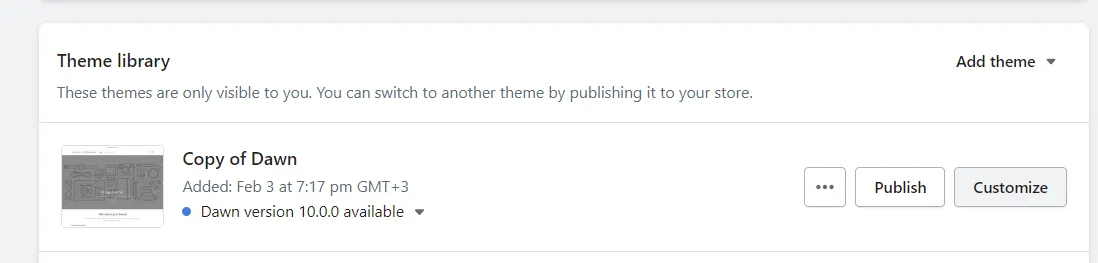
Next, theme customization will open, scroll down the left sidebar to Add section and click there. If there were no other YMM widgets before us, find our widget and place it where it will look good, usually after the header:
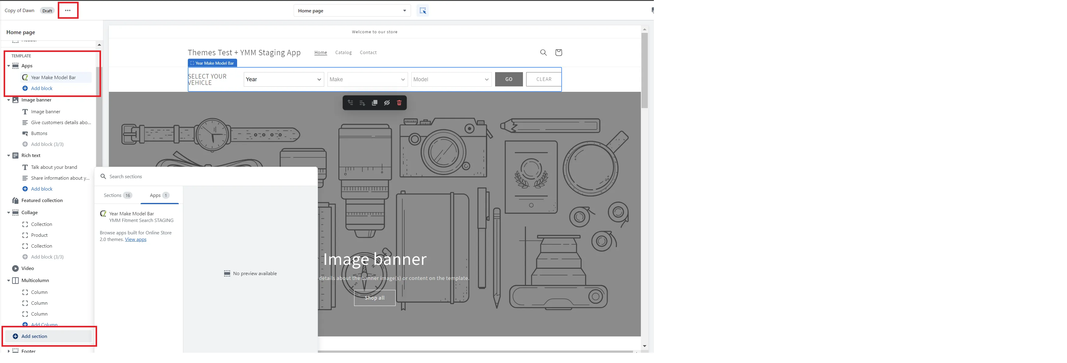
… then Edit Code. After that, find the template where the widget was before us and open it:

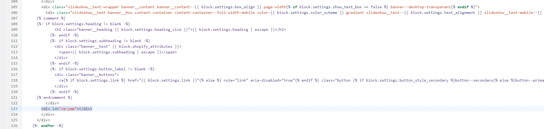
Find the place where the widget needs to be replaced, use {% comment %} and {% endcomment %} to comment out the excess and insert the block where the widget should be <div id="cm-ymm"></div>, save and check:
The entire process is repeated with each of our widgets; if it is possible to integrate through Customize, it is better to integrate through it so that the client can later manually move/hide the widget if they wish. If there is no option, then through Edit Code.
Additionally, in the app itself (Apps → Convermax: Year Make Model → Theme Integration) there is an integration guide for each widget and two methods of its integration:
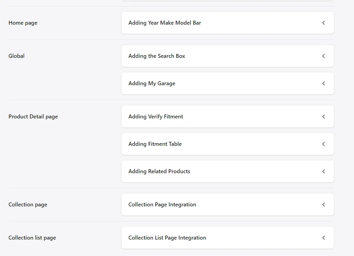
Where widgets usually reside:
Section titled “Where widgets usually reside:”Mobile widgets do not always need to be integrated. For example, cm-mobile-garage often does not need to be integrated; whether we need to integrate such a widget depends on whether it displays the same on mobile and desktop. If it is okay on desktop but disappears on mobile, then it needs to be integrated.
#cm-search-box (Search Box) integrated in place of the native search box
#cm-mobile-search-box (Button to open search box dialog) integrated in place of the magnifying glass icon on mobile if it exists, otherwise left, as the first icon in the header, adjusted in size, and aligned relative to other icons.
This is not always a mandatory widget. For example, on the shopify-warehouse-generic theme, it is not obligatory; there, the dialog is opened with the usual #cm-search-box because on the theme design input is displayed on the mobile as it is on the desktop.
#cm-garage integrated as the first icon in the header, before the cart/account icons.
#cm-mobile-garage integrated as the first icon in the header, after the button to open the search box dialog and before the cart/account icons.

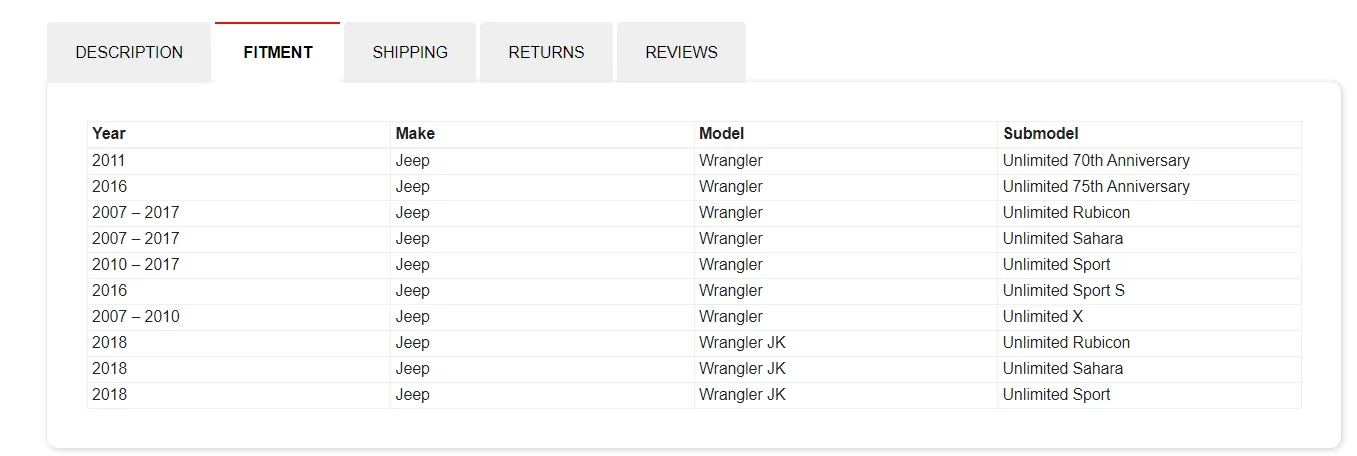
#cm-fitment-table if there are tabs on the product page, then integrate the fitment table into tabs as well, create a separate tab and name it Fitment, in the tab content place <div id="cm-fitment-table"></div>, otherwise insert after the product description.
#cm-verify-fitment usually inserted before the Add to cart button or after the product option select fields, for example: 
#cm-collection-page inserted through Customize, then hide the Shopify grid (you will need to click the eye icon in the sidebar). If it’s not possible to do everything through Customize, then go to Edit code → find and open the template containing the collection results → comment out Shopify’s grid and add our div with id="cm-collection-page".
#cm-collection-list inserted through Customize, then hide the Shopify collection listing. If it’s not possible to do everything through Customize, then go to Edit code → find and open the template containing the collection results → comment out Shopify’s listing and add our div with id="cm-collection-list".
Style requirements:
Section titled “Style requirements:”-
When integrating a widget, try to keep it as close as possible to how it was before us, i.e., if we are inserting a search box, we write styles or apply the theme’s classes to the block with the search box so that it looks as close as possible to how it did before our integration.
-
If the store is not on
Custom Build, write styles directly in Shopify. Most themes have acustom.cssfile. If it exists, then write styles for our widgets in it, otherwise create it and connect intheme.liquid, analogous to how othercssfiles are connected there and write styles in it. -
Try to avoid
!important. If it’s not possible to override styles by increasing nesting, then you can use!important. -
If the store is on
Custom Build, in our style file maintain the structure as in other files under source control. When we useSASS, address nested elements first withelement, then with.class, then_class, and finally__class. Media rules are usually written at the end after all the styles for the class that needs the media rule, and if there are several, sort them in order from largest to smallest. For example:
.cm_search-box-root {  span{    color: red;  }
  .cm_dropdown .section {    margin: 0;  }
  &:not(&__dialog){    .search-bar {      opacity: 0;    }  }
  &__dialog {    .search-bar {      opacity: 1;
      @media(max-width: 480px){        width: 200px;      }
@media(max-width: 320px){ width: 150px; } } }}- If it’s a
shopify-generictheme, i.e., a common theme for everyone, go to the product page and see if there’s a product card there (for example, in the Related products or Recently viewed section). If there is, then style it on our results the same way. For instance, if there’s a product card on the product page but it doesn’t have anAdd to Cartbutton and the fonts are different, do the same on our results.
Fitments:
Section titled “Fitments:”In general, we now pull tokens for fitment data sources from the app and then attempt to find fitments for products.
But sometimes a store might have a data source token like SDC but after indexing, fitments don’t appear in the store. In such cases, during integration, it’s necessary to investigate why the token exists but we didn’t find any fitments; the most common reason is something with the products’ SKU. To verify, open the SDC index, browse the store, and find products that have vehicles in the title, then try searching in the SDC index by the product’s SKU.
Once we understand the reason for the absence of fitments and can fix it, we immediately correct it while integrating the store.
If the store doesn’t have tokens but does have custom fitments, like a spreadsheet and fitments are in a format we can parse out-of-the-box, just connect like this: 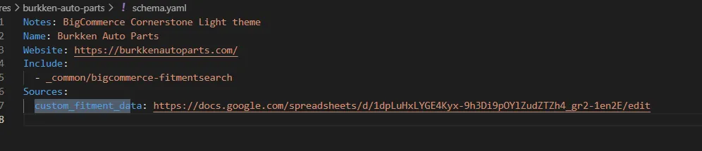
And if there are several spreadsheets, then like this, specify the path to the folder with the spreadsheets: 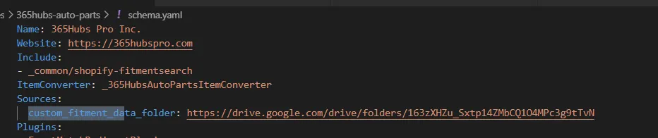
If the format of fitments in spreadsheets is not default, it will be necessary to create StoreNameItemConverter.cs in the store folder and connect it in the store’s schema, then connect these fitments there so we can find fitment data for products.
What to pay attention to:
Section titled “What to pay attention to:”After the store is integrated, browse the store and check our widgets on all widths from desktop to mobile. It’s better not to use breakpoints provided by the Device toolbar for testing at different widths (325px/768px/1024px), but to enable maximum width in the Device toolbar, then manually reduce that width in the Device Toolbar from the largest to 320px. This way, you can track all cases where styles break on a custom width.
If something breaks at some widths, it must be fixed.
Also, ensure that when our widgets load, they don’t “jump”, at least for garage/search box/YMM. If they jump, a placeholder should be added, or height and width should be reserved for our widgets while they are :empty.
This is necessary due to the CLS (Cumulative Layout Shift) metric. The more the layout jumps, the worse this metric, and the worse this metric, the more likely the client will come and ask to fix it.